
Nov 07, 2008
Sep 28, 2008
In praise of inconsistency
One of the occupational hazards of being a designer is that you want everything to be designed.
And worse than that you normally want everything to be well laid out, structured and with a good hierarchy of information.
I saw this the other day and whilst the typography leaves a lot to be desired it's a very useful piece of communication. Building number, street name and postcode. Brilliant. Common sense. Useful.

Because you see this a lot. It's a building number. This one happens to be 87A.

But what street is it on? Sometimes it's easy to work that out, but often it isn't. Especially if it's a big long street.
If you're one of those designers that's been a postman or a delivery boy you'll prefer street numbers to look like this.

Or, fuck it, let's go the whole hog. Name, number, rank, street, post code, inside leg. Yeah, that's better.

Let's pass legislation to make all buildings display their full address outside on metal plate. In the same colour, the same font. That would make life easier and it would look better. That's good communication, right?
But here's the problem. Scroll back up the page - all those signs are from the same street. Look at the difference. The inconsistency. The accidental. The unintentional. Looks great, doesn't it?
Sometimes it's better when things aren't designed. It took me a while to learn that.
Sep 18, 2008
Kerning Crunch
It won't have escaped your notice that there's a crisis happening in the banking world. All the big household names are affected. It's slowly engulfing us all and it gets closer to home every day. I've resisted writing about it for a long time but I can hold off no longer.
Ladies and Gentlemen allow me to introduce the Kerning Crunch.
Let's look at Lehman Brothers first. A big, strong, confident piece of typography. Standing squarely at the helm, staring rivals in the face. No problems over here matey.
But look a little bit closer. In particular take a look at the A.
Is that acceptable? Too close for comfort? Should the authorities be called in? 
The O and T are gentler, but still a teeny bit close for my liking. The problem is that the Kerning Crunch causes us to question our existing value systems. Perhaps we've been sailing too close to the wind for a long time. How close do we want to get?

Lloyds are making the best of bad lot. They've done a decent job of rescuing that O, Y and D. But they can't save everyone.
The worst offender has been glossed over by the main stream media. But, have no fear, that's what this esteemed blog is for. Take a closer look at the L and A in Barclays.

Trouble lies ahead my friends.
Some of these banks are their own worst enemies. L, A, Y and S are never going to be an easy set of letters to kern.
But these guys are all about taking risks, aren't they?
Sep 16, 2008
The worst kerning ever?

Gary from Oxford sent this in. Simple question, is this the worst kerning you've ever seen?
Jun 30, 2008
S

Have you ever wondered how to make a 3D polystyrene S stand up in a window display?
Simple. You cut the bottom off. And it still looks OK because on paper the bottom of the S would sit below the baseline anyway. That's that mystery solved.

Jun 03, 2008
Linzie's Lettering Sketch Book
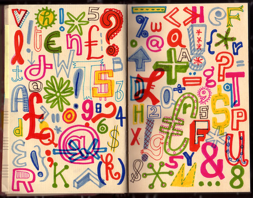
Absolutely bloody gorgeous isn't it. Many more here.
May 30, 2008
Devil May Care

Wednesday saw the release of the first 'real' James Bond book in years. The first as in the first official book, written in the style of Ian Flemming. Officially sanctioned by the International Committee of Flemmings. Trust me, it's exciting news.
I bought a copy. And it occurred to me that it's the first time for a while that I've opted for the thing as opposed to the digital version. You know, audio book, dvd, iTunes etc. So let's take a look at the graphic design of said object.

First up the cover, or more accurately the dust jacket. I don't like it at all. The type is OK. I like the full cap DEVIL MAY CARE. I can't (quickly at any rate) work out what font it is. It's Gill Sans esque, but it's not Gill. The foil embossing works well and it's a decent tight little unit.
The woman / flower graphic is an OK idea, very Bond, but it's badly executed. The two different styles, one for the woman and one for the flower, clash horribly. It's not a seamless segueway. The shapes are nice but they don't seem to work together.
The dust jacket itself is glossy and shiny and doesn't really feel special. Nothing like those little special editions Penguin were doing a few years ago. I don't feel like I'm being rewarded for buying the actual thing. In fact, I binned the cover straight away, much to the chagrin* of my colleagues. I always bin the dust jackets. These days they look shit and they just get in the way. They're cumbersome and besides, the books look so much better without. Don't ya think?

Much better. There's that nice little 007 Penguin logo. I like that. Do you?

There are end papers too, which is a nice change. They're OK.

But, you know what, everything is OK and OK just isn't good enough. Especially when I've gone and bought the actual thing. You'd think that designing the cover for the first official Bond book in years was a dream brief for many a young designer, wouldn't you? And it's for Penguin too! Not good enough.
There are some special editions kicking around and they look pretty decent. This is probably the best one.

That's more like it. I know they can't make special editions for everyone, but they could have copied some of the graphic style.
What do you think?
* Devil May Care joke.
May 07, 2008
Nice Type

Some lovely type over on Christian Robert-Tissot's site. There's some crap as well, but most of it, like these the picture above, is great.
I'd love to do some big type like that.
Apr 24, 2008
Vote Univers
There's been a lot of talk about the design of ballot papers.

This one for the London Mayor elections looks OK to me. By that I mean it's simple, clear and easy to see what you have to do. It's even done in Univers. Which will make Bruno happy.
Apr 18, 2008
Type Anatomy

Useful. Via Armin Vit.
Apr 04, 2008
AYE
The other day Tom saw some great big letters for sale on the internet. But they only had AEYVG left.
Being a Yorkshire man he thought it would be good to get the following:
Mar 30, 2008
T5 - the infographics airport
On Friday I flew into the brand spanking new Terminal 5.
Seeing as you've asked my flight landed 10 minutes early, my baggage wasn't lost and I didn't feel the need to swear loudly at BA staff. But this a graphic design blog and not Lonely Planet, so onwards and upwards with the infographics reviews.

I flew in from Romania and funnily enough when we were there we cited infographics as a huge trend in graphic design right now. The new T5 is full of them.


Already they look dated. They're not brilliantly designed and they just feel dated (all those silhouettes?). Surely the information will date super quick too? (Imagine if T1 said "we're the only building in Great Britain to have two escalators running side by side.) There's a lack of future proofing there. Plus - who cares how long the baggage conveyor belt is?


There's even a whole infographics pod!
I know this kind of information (how do I get to Central London etc) is very important. But it seems they got a little carried away with the screen and the use of English over symbols. It all looks very futuristic, but it isn't. Look at the amount of text on those screens. And as far as I could see the screens stay static.

The spaces are huge and the signage is small. Shortly after being told off for taking this photo I got told off for walking into the crew Passport Control area. If only they'd seen my bottle of Evian I could have been in real trouble.

Those yellow and black signs, are they official airport signage? I seem to recall reading that they were. Is that right?
They work and they look good, but it all feels a bit hospital. A bit too official. There's no wit there, which would be fine but then they're not functioning that well either. They're like new versions of the old signs. No one has taken the opportunity to rethink the signage they've just carried on as they were before.
That sums up my whole feeling about the airport really, it's a version 2 of what's been before. Nothing new, no big leaps ahead. It's a cleaner, bigger, shinier version of T4. Which seems like a huge opportunity missed.
Mar 24, 2008
Connect

This holiday we played Connect, Ken Garland's brilliant board game (card game?). If you're a graphic designer this is about as good as parlour games get.

I don't know about you but when I see a collection of shapes and lines like that I instantly think - could I make an alphabet out of that?

The Os are normally easy. And seeing as this one is based loosely on a digital style grid the U is pretty easy too. And the N.

The M isn't quite as elegant, but it looks cool.

The connect game doesn't only consist of three lined squares though. And to be honest all these letterforms remind me a bit too much of the Mexican Olympics and all those Helveticalovers. You know the type.
So this M is a little more fun. And more appropriate for the game.

But making a full alphabet is hard. And it's a bank holiday weekend. Easter weekend. So back in the box they go. Until another time.

Still, at least I got enough letters to make COMMUNE.

Mar 16, 2008
Numbers and lights

At the weekend graphic designers do stuff like this. As we used to say at college, "you could hand that in".
Mar 10, 2008
Typography of Heroes
More tales from Chicago.
We were lucky enough to have a visit to the Hillside Fire Dept. If this was a different blog I'd say how kind they were for showing us round and how brilliant the tour was. Hero is one of those tags that gets bandied about too easily, but people that run into burning building for a living qualify in my book.

Anyway. This is a graphic design blog so take a look at some of the gorgeous hand painted typography. A few more pictures over here.
Feb 28, 2008
Jan 30, 2008


Jan 24, 2008
Data, Branding, Web Design, Pouring Acid Into My Eyeballs and What Graphic Design Is For.
There have been about 3 posts in my drafts folder for ages. And then today, like Paul on the road to Damascus they've all come together in one delightful little package.
Let's start with data.
Everyone is very excited about data right now. Data is everywhere. Google are to blame for quite a lot of it, but so are things like the Freedom Of Information Act, the Internet, Andy Gray, Sky Sports and a whole bunch of other stuff we call the Information Age. Nothing new there.

Just look at the watch in that photo.
Except that now we're starting to see this data used and reused and repackaged and (crucially) redesigned in lots of different ways. Redesigned in sexy ways, redesigned in innovative ways and redesigned in different ways to suit different audiences. Same info, different look.
Lets take a look at one of my favourite examples of this. On One Map.

That site uses a Google Map and pulls in data from estate agent's websites and Government statistics. It can tell me there's a 2 bed flat for sale for £895k and four mobile phone masts 400ft from the office. All of this data is (sort of) freely available. I'm no Property Geek but what I love most about this site is how you can search for a new house by visible map rather than funny drop down boxes. So you can look for properties near Drury Lane rather than searching for <1-2 bed> <£500k-£1000k> <flat>. That map is a much more intuitive, easy to understand device.
There are some absolutely fabulous examples of data being redesigned in all sorts of ways over here so I'll steal a few of them below.


All data that's freely available to you or me. But it's not just online. Take a look at these gorgeous data representations from Global Cities exhibition.


That's just some boring stats made to into a must see 3D thing.
And here's a film of Lisa Strausfield's model of downtown Manhattan in action.
It's just data. But incredibly beautiful.
So, effectively you can now get your data styled however you like. This is a huge step and has massive implications for designers.
Let's take something as ubiquitous as Google Maps. You could (nowadays) have a widget that printed off your map in the same style as an A-Z for Black Cabbies, in the style of a Beck Tube Map for Graphic Design Geeks and in the style of the Alliance to Restore the Republic for Sci Fi fans. That is not only possible, it's probable.

Where the users of Dopplr went last year. Borrowed from Matt Jones.
So this changes the game a little bit for designers and brand owners, because you could easily end up losing control. You might not want your data redesigned as a Tube map. But you can't stop this stuff happening so what do you do?
Obviously some brands (and designs, branding work etc) are already kitted out for this world.
Here's a simple example; imagine some copy from an innocent bottle written in a light serif font and then written again in a heavy mock Western font. Visually that would give off a totally different vibe, right? Yet it would still be unmistakably innocent.

Likewise, The Economist can shoe horn that red and white into just about any form of media and (love it or hate it) it's still The Economist.
Orange - if they'd stuck closer to the path they started on - would now be the complete masters at this. Visual style, colour, tone of voice, it would all be set up in one orange pixel.
Becuase what we're talking about is proper branding. The kind of branding Wally Olins spoke about at the RSA in the 70's.
So it might be possible control the output of this data by cleverly structuring, or designing, the data in the first place. (Governments are good at this - all those expensive inquiries where the 'terms of reference' are so narrow only one answer is ever going to be found.)
But we're seeing this in more immediate, less expensive areas too. The humble RSS feed is a great example of how users can design your content however they want.
Some people say MySpace is "like pouring acid into your eyeballs" but what if it's just design by, err, non designers? Or is it design by a committee of 24 million? Whatever it is it's a trend and you're gonna see more of it. Take a look at this brilliantly comprehensive post by Michael Johnson on flexible identity schemes. Don't tell me that in at least one of those meetings someone didn't ask for "a MySpace"?
But it's not just data and identity it's the web too. Have you tried designing a website recently? Those things just won't stay still.
I was talking to someone the other day about the difference between print design and web design and I listed three things that are true for print design but not true for web design.
In print design you control the experience.
In print design everyone has the same experience.
In print design history is a reliable guide.
These things just aren't true in web design. People have different browsers, different screens, different font sizes. The conventions change from one month to the next, what worked last year doesn't work this year. Peole don't start at the start. There is no start. And so on and so on.
Designers have been told to worry about this for years, but only now is this era truly upon us.
In fact it seems to me we're going back to what graphic designers were originally intended for - wading through information and making it easier for people to take in. That's the difference between a designer and someone who just makes stuff look good.

That's what designers have always been doing until everyone went a bit of track in the eighties and nineties (can you ever imagine David Carson wading through information and making it easier for people to take in?). Mabye the information age is helping bring back some purpose to design. Read this article about the redesign of the US road signage to see how valuable clarity in design is.

Which leads me on to one of my favourite things - hierarchies. Every good designer should be able to design a great hierarchy. Almost every piece of communication will be improved by a good hierarchy.
But I've probably bored you all now. Hierarchies will be another day.
Jan 14, 2008
SMILE

I got sent these great cut out / pop out letters by Lauren today.
No reason, she just thought I'd like them. Which I do. A lot. The thing is Lauren lives in Australia, so it took a little more effort than usual. Thanks Lauren! (Speaking of Lauren, read this and try not to see red with envy.)
If you want to send me nice stuff please do. Please don't ask me to blog about parties that I wasn't invited too.
They look cool on my oh-so-modern all white desk ensemble, don't they?

Jan 09, 2008
Vote for AceJet170
Random House and Creative Review have been running a competition for designers to design the new cover for Jeff Howe's new book Crowdsourcing. (Did you see what they did there?) All the entries get uploaded and you can vote for your favourite.
Richard AceJet170 has submitted his entry and it's lovely.

I'm not just saying this because Richard is a friend, I'm saying it because the typography is nice and it's sensitively handled. The image is intriguing, relevant on several levels and beautifully shot. All this and it's clever too.
So vote for Richard.
Recent Posts
- Years in the domain, like tears in the rain
- Printing is still too hard
- No innovation until everything works
- "They'll be dancing in the streets of Total Network Solutions this evening"
- It was a pleasure
- Public Digital has won a King’s Award for Enterprise in International Trade
- Kids describing fashion ads
- Art at Mount St Restaurant
- Post match squeeze
- Unbelievably tickets are still available
Recent Comments