Wednesday saw the release of the first 'real' James Bond book in years. The first as in the first official book, written in the style of Ian Flemming. Officially sanctioned by the International Committee of Flemmings. Trust me, it's exciting news.
I bought a copy. And it occurred to me that it's the first time for a while that I've opted for the thing as opposed to the digital version. You know, audio book, dvd, iTunes etc. So let's take a look at the graphic design of said object.
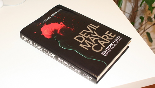
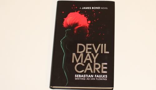
First up the cover, or more accurately the dust jacket. I don't like it at all. The type is OK. I like the full cap DEVIL MAY CARE. I can't (quickly at any rate) work out what font it is. It's Gill Sans esque, but it's not Gill. The foil embossing works well and it's a decent tight little unit.
The woman / flower graphic is an OK idea, very Bond, but it's badly executed. The two different styles, one for the woman and one for the flower, clash horribly. It's not a seamless segueway. The shapes are nice but they don't seem to work together.
The dust jacket itself is glossy and shiny and doesn't really feel special. Nothing like those little special editions Penguin were doing a few years ago. I don't feel like I'm being rewarded for buying the actual thing. In fact, I binned the cover straight away, much to the chagrin* of my colleagues. I always bin the dust jackets. These days they look shit and they just get in the way. They're cumbersome and besides, the books look so much better without. Don't ya think?
Much better. There's that nice little 007 Penguin logo. I like that. Do you?
There are end papers too, which is a nice change. They're OK.
But, you know what, everything is OK and OK just isn't good enough. Especially when I've gone and bought the actual thing. You'd think that designing the cover for the first official Bond book in years was a dream brief for many a young designer, wouldn't you? And it's for Penguin too! Not good enough.
There are some special editions kicking around and they look pretty decent. This is probably the best one.
That's more like it. I know they can't make special editions for everyone, but they could have copied some of the graphic style.
What do you think?
* Devil May Care joke.


is the typeface not Avant Garde? The R certainly looks familiar...
Posted by: Matt | May 30, 2008 at 13:16
Pretty sure cover was designed by The Partners
Posted by: Andy | May 30, 2008 at 13:17
Much better covers and original artworks for all the Bond books here:
BOND BOUND: IAN FLEMING AND THE ART OF COVER DESIGN
22nd April - 28th June 2008
http://www.flemingcollection.co.uk/index.php
Posted by: James | May 30, 2008 at 13:21
That is a horrible cover. The flower and the woman is just cheese.
That special edition Bond book though is fantastic. Reminds me of Argyle socks.
Posted by: Dave Bowker | May 30, 2008 at 13:32
It's definitely NOT Gill - nothing like! More like Avant Garde, although the R is slightly different.
Posted by: Coops | May 30, 2008 at 14:19
I keep thinking that Bond must be such a relatively easy sell that it's about time someone did something genuinely "new" with it. Something we haven't seen before rather than something that looks "Bond" or something that is just a homage.
Like what Pan did in the 70s when they brought out the photo covers - nothing like what they'd been doing before.
http://www.creativereview.co.uk/crblog/james-bond-and-the-decline-of-western-civilization/
(God awful stamps!).
Posted by: Richard | May 30, 2008 at 15:55
Consider yourself lucky with an OK design.
When you look at the version we have in France, you realise something's been lost in translation.
http://www.jamesbond-fr.com/le-diable-lemporte.php
Posted by: Loïc Boyer | May 30, 2008 at 16:23
One must ask oneself if a continuation of the over sexualised and sickeningly abused image of the female (being shot in the head) is acceptable these days.
Posted by: Tom | May 30, 2008 at 16:43
Give me a cover by David Pearson anyday...
Posted by: claire | May 30, 2008 at 17:21
Avant Garde. This is kind disappointing compared to Penguin's recent re-design and re-release of other Bond books. I think the illustration and design of those were brilliant, if not a bit too psychedelic and 70s, which may not have fit this theme.
Posted by: haracas | May 30, 2008 at 17:29
How thick is that special edition version??! Is it special because its huge print for people with cataracts?
Posted by: Mat Ranson | May 30, 2008 at 18:00
The type on the normal one is massive = 13.5 to be precise.
Posted by: Ben | May 30, 2008 at 18:31
-
Out of all the books I own, only 1 dust jacket remains on any of them (Contemporary Graphic Design from Taschen).
Almost without exception they serve no purpose after they have grabbed your attention in the shop.
Posted by: Gavin | May 31, 2008 at 00:31
-
Ben - collection of good/keepable dust jacket designs...worthwhile idea for a post?
Posted by: Gavin | May 31, 2008 at 00:36
It was designed by the Partners. Looks like Gill on the special edition though.
Posted by: Guy | May 31, 2008 at 14:43
Totally agree on the dust cover... Hat them too! Sadly I was involved in designing a few covers too but I was able to make some thing nice with the simple typeface on the actual book.
Regarding the design of the front, I guess I must have been a political compromise and that, as I hope all agree, is not the best way for good design.
Posted by: Bernd | Jun 01, 2008 at 11:04
I had the pleasure of working on this beast of a design whilst on a placement with the Partners. We had 101 better ideas floating around at the time - such disappointment to be told this was what they wanted
Posted by: tom | Jun 02, 2008 at 19:26
My biggest problem is that the book itself isn't that well made, like most hardbacks these days - glued spine and cheap paper. If I'm buying a hardback for the best part of 20 quid (£25+ if it's non-ficton), I expect the paper to not feel like newsprint.
The 007 penguin is ace though.
Posted by: Jakob | Jun 05, 2008 at 12:56