Noisy Decent Graphics
A series of blog posts by Ben Terrett about me | archives | atom feed
Nov 29, 2007
Oct 08, 2007
Get some Z at the Design Museum by Henrietta Thompson
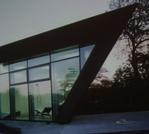
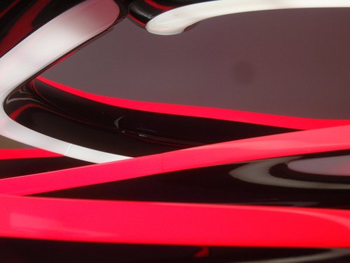
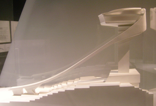
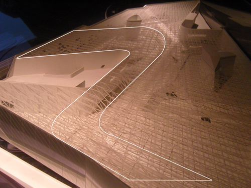
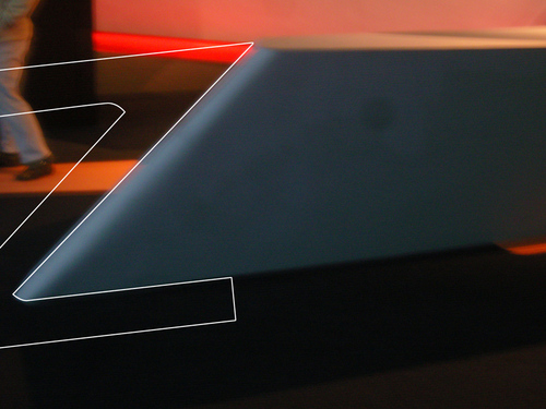
I went to see the Zaha Hadid exhibition at the Design Museum the other day. It's good. It's not just about the buildings, Hadid does some really interesting drawings and paintings. And she's one of those rare people who manage to make the finished product look like the concept sketches. You can see more pics over on Flickr.
My good friend Henrietta Thompson has been writing for the exhibition blog and she's spotted something I think you'll find interesting. Henrietta is a professional writer (for proper publications like Arena, Monocole, Blueprint and the Guardian) so the words are by her and the pics are by me.
- - - - - - - - - - - - - - - - - - - - - - - - - - - - - - - - - - - - - - - - - - - - - - - - - -
Get some Z at the Design Museum
Give us a “Z”! Give us an “A”! Give us an “H”! Give us an “A”! Zaha Hadid is the queen starchitect - the undisputed champion of signature architecture.
Critics and fans alike have long wondered where she finds her inspiration - where do her forms come from? Her architecture rarely fails to astonish, and yet it is always unmistakably her own. It has been attributed to her willingness to experiment with new technologies, her tireless pushing at the boundaries of materials and construction methods. Over and above all that, however, Zaha is an artist. And her conceptual approach begins by taking a long hard look at herself.
From the moment she could write her own name, Zaha has been creating masterpieces. Her trademark geometric Zs are almost certainly the starting point for every project, but it is perhaps only when we see all her buildings, paintings, plans and projects together that we can fully appreciate how she follows through with those perspective warping combinations of As and Hs. And every now and then she will surprise us with a beautiful sinuous D curve and a rare straight vertical I. There’s no doubt about it, this architect puts the “I” in “iconic”.
You can see more pics over on Flickr. This post also appears on the Zaha Hadid Exhibition Blog.
Posted at 09:00 in Exhibition Reviews, Guests, Typography | Permalink | Comments (0) | TrackBack (0)
Sep 16, 2007
The Visual Dictionary

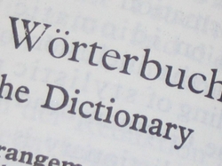
Visual and Dictionary by MINORBUG, used with thanks, usual stuff applies.
This does that brilliant thing of pulling together, building on and bundling up in a nice url all those things you'd been trying or meaning to do. The web is great at that.
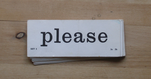
The Visual Dictionary does what it says on the tin. A dictionary of 3000 single words all represent by a photo of that word. Presentations will never be the same again. Is this the new clip art?
Put together by Matthew Knight.

Brilliant by Flicko used with thanks, usual stuff applies.
Posted at 15:59 in New Thinking and Ideas, Seen and heard, Typography | Permalink | Comments (0) | TrackBack (0)
Sep 06, 2007
Sep 02, 2007
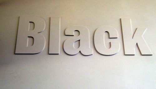
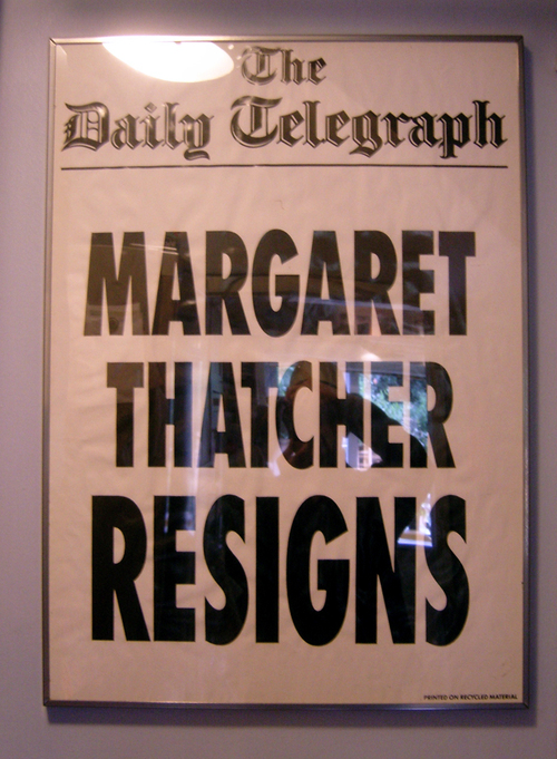
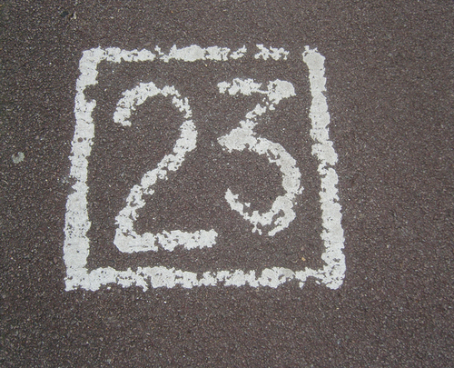
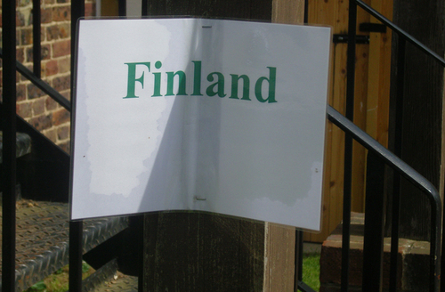
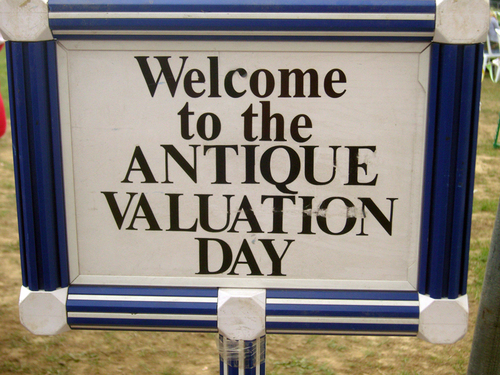
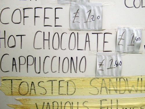
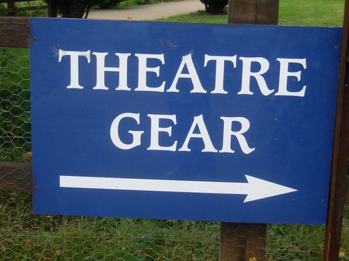
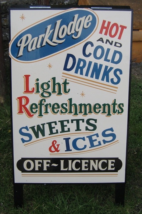
The Signage of Summer
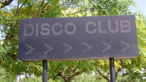
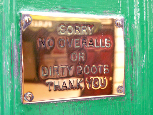
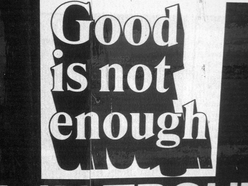
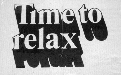
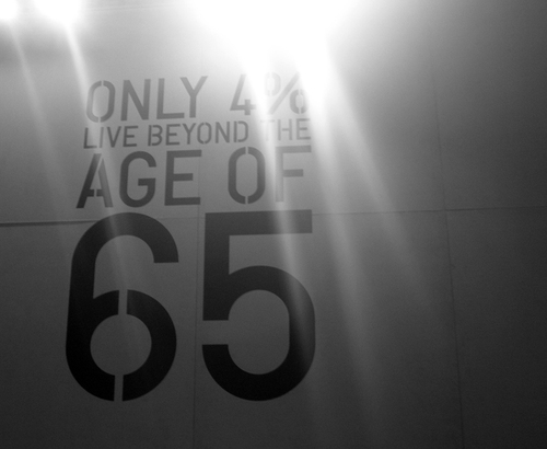
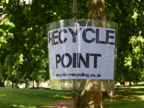
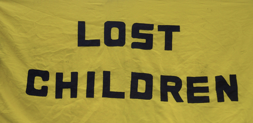
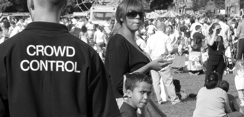
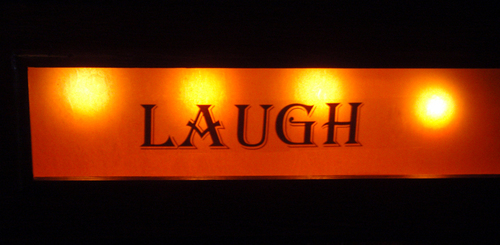
It's been a brilliant summer. Almost every weekend we've been out and about doing something. Being me I couldn't help but snap signage wherever we went. So in the spirit of la rentrée here's the best of the summer signage.
OK, not all of that was signage but the Typography of Summer isn't such a snappy title.
Posted at 22:36 in The Design Disease, Typography | Permalink | Comments (3) | TrackBack (0)
Aug 16, 2007
Batman Onomatopoeias
Posted at 14:56 in Seen and heard, Typography | Permalink | Comments (0) | TrackBack (0)
Jul 26, 2007
Type The Sky
The alphabet made from those photos of looking up at buildings. Brilliant. Why didn't I think of that?
Via infosthetics.
Posted at 12:06 in Seen and heard, Typography | Permalink | Comments (2) | TrackBack (0)
Jun 28, 2007
The importance of grids online
Via AceJet170 I found this brilliant article on Khoi Vinh's blog about the importance of designing online with a grid.
It's a really simple, powerful way of explaining a few differences that print based designers usually struggle with, like;
"in digital media we must make some compromises for the added factor of the way elements behave. Which is to say that, unlike the printed page, the components of a design — photos, illustrations, shapes, flourishes and type — can transform, change state, move, transform etc.".
Not only is it an important article, it's well written and it's easy to understand. Plus, Khoi is the Design Director of the wonderful New York Times online, so he knows a thing or two about grids.
If you're a designer who has designed mainly print all your life and you find websites a little bit, well, hard, then this is the article for you.
I'd like to know what you think about it.
Posted at 21:38 in Graphic Design Industry Stuff, Stuff I'm Reading, Things I've Learnt About Design, Typography | Permalink | Comments (0) | TrackBack (0)
May 15, 2007
May 11, 2007
Fonts and Fells
Let me introduce to you a brand new Flickr set, Fonts and Fells. A splendid time is guaranteed for all.
Posted at 15:35 in Seen and heard, Typography | Permalink | Comments (0) | TrackBack (0)
May 09, 2007
Typographic Advice
I was at Northampton University the other day with April, doing some portfolio surgeries and giving a teeny talk. We've hooked up with Cardiff, Glasgow and Northampton this year as part of the D&AD Clinic thing. A jolly good experience it's been too.
During the portfolio surgeries it was obvious that the thing the students struggled with most was typography. That's fair enough, typography is one of the hardest bits of graphic design. Good typography is rare, very good typography is very rare.
One of the students asked if there were any rules I could tell them to help their typography. Good question.
Whilst there are typographic rules, there aren't really any rules you can tell someone in a ten minute portfolio surgery, so I said; when in doubt keep it simple, remember that readability is the most important thing, obviously no more than seven words per line, stick to a simple typeface that you know and get a decent hierarchy sorted out on paper before you start.
All good advice, but I'm not sure that it was that helpful. So, my beloved listeners, what basic typographic advice would you give a third year graphic design student?
Apr 26, 2007
Helvetica Film?
There must be someone reading this who knows something about when this Helvetica film is coming to London. Is it ever coming? Are there dates?
Should we try and organise it? I can think of a few places that would show it and I'm sure there are lots of people reading this who'd like to see it. Right?
So, anyone know anything?
Posted at 11:24 in Typography | Permalink | Comments (16) | TrackBack (0)
Feb 21, 2007
Ace post, ace brief, ace photos
There are so many good things about this post from Richard. Have a read.
Posted at 07:56 in Stuff I'm Reading, The Design Disease, Typography | Permalink | Comments (0) | TrackBack (0)
Jan 30, 2007
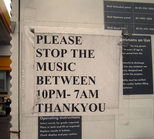
Stop The Music
Posted at 22:00 in Examples of Bad Communication, Seen and heard, Typography | Permalink | Comments (1) | TrackBack (0)
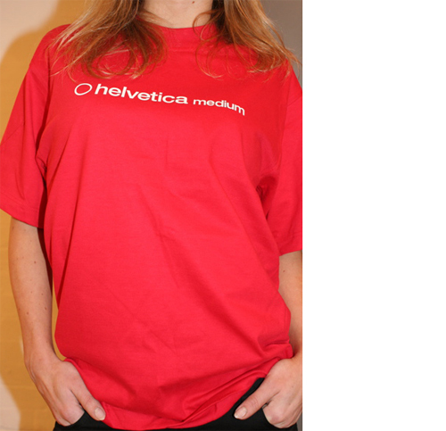
Helvetica and Bodoni tshirts
I've been meaning to do this for a while (about 6 years in fact) and then these comments (and this and this and this) finally awoke me from my slumber.
And so, for your pleasure, Helvetica and Bodoni tshirts now available on eBay. Helvetica here and Bodoni here.
Posted at 14:01 in Typography | Permalink | Comments (12) | TrackBack (0)
Jan 29, 2007
Oooooh this is nice
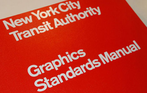
Perfect for a grey Monday. NYC Transit Authority Graphics Standards Manual Flickr Set.
Posted at 13:51 in Typography | Permalink | Comments (5) | TrackBack (0)
Jan 27, 2007
If you only read one thing this weekend
Make sure you read these comments by Bruno Maag. If you like type, you'll find it fascinating.
"Let's get a little bit of history right. Arial was designed in the Monotype drawing offices, for Microsoft, in the late 80s"
"I am also no friend of Helvetica. In fact, I would love to see this typeface banned from use for a while. Just so designers can see that there is typographic pond life beyond."
"I'd happily give up my day job and wash plates if the rest of the world adopted Univers as the font to be used."
Read, learn and enjoy. You don't get this quality of typographic discussion everywhere.
Posted at 08:22 in Quotes, Stuff I'm Reading, Typography | Permalink | Comments (9) | TrackBack (0)
Jan 25, 2007
All those in favour say "aye"
Dearest Tom,
Saying "What's wrong with Arial aesthetically?" is a bit like comparing Greta Garbo to Jodie Marsh.
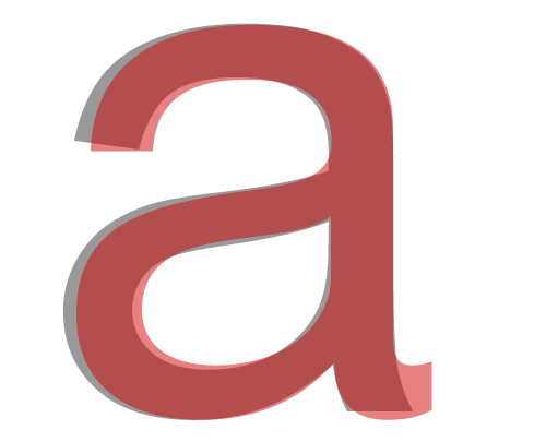
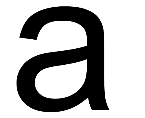
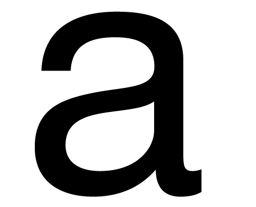
Helvetica can be expensive and if you don't have it installed on your PC then, for you, Arial will probably suffice. But just look at the way the glyph's finish on these a's.
Oooh, isn't that lovely? They didn't make a film about Arial did they?
Although desktop printers don't use the same sort of screen as a Heidelberg they don't print solid colour. Only a screen print can do that. Deskdrop printers still measure in a dpi system but it's a little different. Macus will elaborate.
And lastly, seeing as you've opened Pandora's box, all those in favour of Helvetica say "aye" below.
UPDATE: Bruno provides some historical clarity here. A must read.
Posted at 14:40 in Listeners Questions, Typography | Permalink | Comments (71) | TrackBack (0)
Dec 06, 2006
Alison asks
Alison emails a question:
"i wondered if you have a few moments if you could give me some help on a project im working on. Im looking for inspiration really, i am currently in the process of designing a magazine, and i am about to start the contents page, so i am looking for artists that have designed contents pages in a typographic way, i just want to see ways in which typography can influence a contents page. so if you have come accross any good pieces of work, can you please send me some links"
Can anyone help?
Posted at 08:15 in Listeners Questions, Typography | Permalink | Comments (2) | TrackBack (0)
Dec 01, 2006
"Tracking completely destroys the rhythm, and has a surprisingly disproportionate effect on legibility."
For all you kerning fans, there's been a brilliant discussion going on over on the lovely Ace Jet 170.
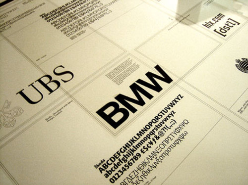
(Picture borrowed from Richard, the photo is of Dalton Maag's stuff, usual bumpf applies.)
Full of interesting useful stuff like, "you have to remember that the tighter you space (minus tracking) the darker the page becomes" and "Tracking completely destroys the rhythm, and has a surprisingly disproportionate effect on legibility."
Bruno Maag (who's a fantastic chap) and a few others explain why you should never track words, lines, paragraphs or God forbid pages.
Read it, you'll learn something.
Posted at 15:02 in Typography | Permalink | Comments (5) | TrackBack (0)
Recent Posts
- Years in the domain, like tears in the rain
- Printing is still too hard
- No innovation until everything works
- "They'll be dancing in the streets of Total Network Solutions this evening"
- It was a pleasure
- Public Digital has won a King’s Award for Enterprise in International Trade
- Kids describing fashion ads
- Art at Mount St Restaurant
- Post match squeeze
- Unbelievably tickets are still available












Recent Comments