Noisy Decent Graphics
A series of blog posts by Ben Terrett about me | archives | atom feed
Jun 02, 2006
Need your eyes tested?
Posted at 08:59 in Seen and heard, Typography | Permalink | Comments (0) | TrackBack (0)
May 16, 2006
Journey through a city in graphics
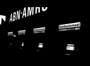
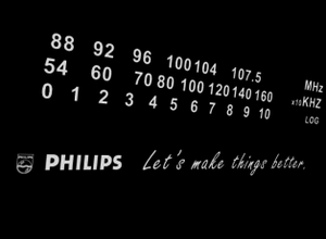
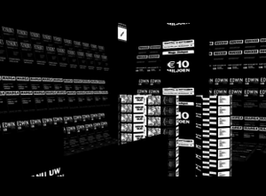
This is stunning. A video of a journey through a city. In graphics.
"Studio Smack is a collective of young artists searching for new esthetics and concepts. Commissioned by the De Beyerd Museum three young graphic designers, former students of AKV/St. Joost, Ton Meijdam, Thom Snels & Béla Zsigmond,made a film about legible signs in town. The typo-animation Kapitaal (Capital)is an impression of the enormous amount of visual stimuli that plague us every day. The amount is so big that its commercial effectiveness has become utterly dubious."
Posted at 07:11 in Graphic Design Reviews , Seen and heard, Typography | Permalink | Comments (2) | TrackBack (0)
Apr 22, 2006
Does this turn you on?
If you're a graphic designer, or if you want to be a graphic designer, or if you want to be a better graphic designer, then this picture should give you a warm feeling inside.
As you know, I passionately believe designers should care most about ideas. But in your armoury you need to have a knowledge and a love of type.
This is from the Design Museum's current exhibition, Designer of the Year. The Guardian is nominated for the prize and on display are whole sheets of different fonts, whole sheets where they've altered the kerning by 0.1 each time, whole sheets where the leading has changed just a fraction.
Sheets of colours with every tint from 100% to 1%. Contrasting colours, complimentary colours, text out of the colours. All the stuff they needed to work through to get the new design to work.
It's fascinating and all that type looks gorgeous. Go and visit.
Posted at 11:36 in Graphic Design Industry Stuff, How To Get A Job In Graphic Design (Kind Of), Typography | Permalink | Comments (0) | TrackBack (0)
Apr 21, 2006
Mind the
gap
Great poster on the Underground.
Good, simple, witty graphics. It communicates. If I was an in house designer at the Underground I'd be banging these little babies out day after day after day.
(Photo nicked from AnnabelB. As usual I'll take it down if you're not happy.)
Posted at 15:18 in Graphic Design Reviews , Typography | Permalink | Comments (1) | TrackBack (0)
Apr 20, 2006
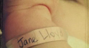
Jane Lloyd - a life through type
Posted at 15:14 in Graphic Design Reviews , Seen and heard, Typography | Permalink | Comments (0) | TrackBack (0)
Apr 01, 2006
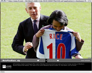
Condie loves Meta
Well, she might do.
I was looking at a picture gallery of Condoleezza Rice's visit to Blackburn on ft.com when I spotted this strange text in the bottom left hand corner.
To my eyes that says Meta Plus Black 16 pt. Must be some kind of programming error, still it's nice to see the Trans Atlantic Alliance promoting decent fonts.
Posted at 10:07 in Seen and heard, Typography | Permalink | Comments (0) | TrackBack (0)
Mar 21, 2006
Street Alphabet
These are beautiful.
A graffiti artist called Eine has painted the whole alphabet across the shutters of East London shops. Dave Gorman (a very funny comedian) has managed to find all 26 letters. The letter forms are gorgeous. The colours are lovely. The textures that the shutters give the letters are wonderful. I love these letters.
Take a look at the letters here via Flickr. Take the slideshow for the best view.
Posted at 09:48 in Graphic Design Reviews , Seen and heard, Typography | Permalink | Comments (0) | TrackBack (0)
Mar 08, 2006
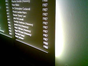
Nice signage at the RSA
Spotted last night, some very nice backlit signage listing the names of all the RDI. This replaces the painted names on brown boards which had been there for hundreds of years. I know the old signage had caused the RDI and the RSA trouble for years and years and I also know that Mike Dempsey and his team had agonised over a replacement.
Good solution, in the end.
Posted at 08:54 in Seen and heard, Typography | Permalink | Comments (0) | TrackBack (0)
Feb 28, 2006
Microsoft makes ammends?
Posted at 10:49 in Complaints Dept., Graphic Design Reviews , Typography | Permalink | Comments (4) | TrackBack (0)
Feb 23, 2006
Arsenal and Liverpool hierarchy
I think this is a really good example of information design and has lessons for all us designers. I’m going to describe why in a bit.
But first I want to set some terms of reference. Firstly, I’m going to presume this was not crated by anyone with any design training at all and secondly I’m not going to eulogise about the intricacies of the design. It’s a pub sign, after all.
I saw this on Tuesday afternoon in a snowy Guildford. Take a look at the hierarchy inherent in this notice. The date and time are in the same place every time and are written in a basic black. The most important information (the teams) are bigger and use colour. The bit which is most likely to attract people in to the pub (the English teams) stands out in red. The one key bit of information that differentiates the two signs (upstairs or downstairs) stands out precisely because all the other elements are in the same place.
Very simple, but effective.
How many pieces of information have you seen, like this, but confused with flying footballs, curly fonts and funky colours. This sign lets me know, quickly, that this pub is showing both games, one upstairs and one downstairs.
This was not produced by a designer, just by someone with an inherent understanding of information (they probably don’t realise they have those skills and like I said, I'm not going to eulogise about the intricacies of the design).
As a designer I think hierarchy is one of the most important things you can master, especially in these times of an emphasis on usability. A good designer can make anything look good work and well with one colour and one font. And a hierarchy will help you achieve this. All the great examples of design, Beck’s Underground Map, Muller Brockman, use hierarchy to great effect.
Posted at 13:47 in Graphic Design Industry Stuff, Graphic Design Reviews , Typography | Permalink | Comments (5) | TrackBack (0)
Bad kerning
Very, very bad kerning from Thompson Holidays. Tut, tut.
Posted at 09:06 in Complaints Dept., Graphic Design Reviews , Typography | Permalink | Comments (0) | TrackBack (0)
Feb 04, 2006
Save the typographer
Please don't do this.
I can only guess the designer aligned the type like this because it matched the logo. But a logo is just that, a logo, not a bloody gridline. This is one of the most absurd pieces of graphic design I've seen in a while. It's hard to read and it looks messy and cheap. All because someone thought it was a clever idea to line the text up with the logo.
Sacrificing legibility for a clever idea is never good idea.
Posted at 07:42 in Complaints Dept., Graphic Design Reviews , Typography | Permalink | Comments (1) | TrackBack (0)
Jan 28, 2006
Interbrand front of house
I walked passed Interbrand yesterday. This is the sign on their glass door. I've tried messing about with the photo to make it more legible, but i stopped because that's kind of my point. It's a complete fucking illegible mess.
There are 5 companies mentioned there; Interbrand, Markforce, Gavin Anderson, Agency.com and Live (I couldn't find a website for Live. You try searching for Live on Google for fuck's sake). I don't want to slag them all off, in fact agency.com are a fantastic agency, but this sign is just bloody terrible.
Guys, you can't read it.
For a branding agency the size (and the fees) of Interbrand they should at least get this bit right. I hadn't even stepped into the building and already I've got the impression you can't design.
Where is the heirachy? How are the companies related? Why do some companies have phone numbers, some have addresses and some have none? Why is Live so fucking big!? This is not good enough, chaps
Nov 15, 2005
Fucking Elle
Very strange this.
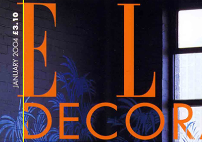
I've been buying Elle Decoration a lot recently. Whilst mindlessly staring at the cover I noticed this abnormality.
Can you see how the edge of the D doesn't line up with the serif edges of the E. Instead it lines up with the edge of the E - disregarding the serifs. We started discussing this in the office and we all thought it was, well, weird. But not just weird, wrong. I've added a yellow line on the photos below so that you can see what I mean.
Then we all started asking whether this was a "right" or "wrong" issue. Don't get me wrong we've all read Erik Spiekermann's Stop Stealing Sheep but I don't think there are rules for this.
Then we started looking at the international editions and we noticed something even stranger. Yes the D's and E's are lined up in the same way as the English edition but whilst all the Elle's are in the same font all the Decorations are different!
I'm very puzzled by all of this. What do you think?
Posted at 23:03 in Complaints Dept., Graphic Design Reviews , Typography | Permalink | Comments (13) | TrackBack (0)
Recent Posts
- Years in the domain, like tears in the rain
- Printing is still too hard
- No innovation until everything works
- "They'll be dancing in the streets of Total Network Solutions this evening"
- It was a pleasure
- Public Digital has won a King’s Award for Enterprise in International Trade
- Kids describing fashion ads
- Art at Mount St Restaurant
- Post match squeeze
- Unbelievably tickets are still available











Recent Comments