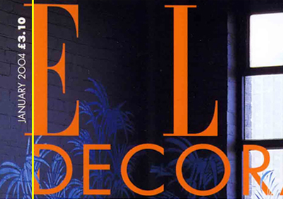
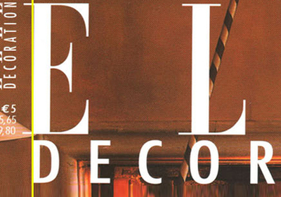
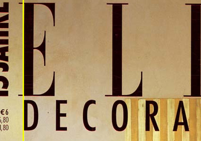
Very strange this.
I've been buying Elle Decoration a lot recently. Whilst mindlessly staring at the cover I noticed this abnormality.
Can you see how the edge of the D doesn't line up with the serif edges of the E. Instead it lines up with the edge of the E - disregarding the serifs. We started discussing this in the office and we all thought it was, well, weird. But not just weird, wrong. I've added a yellow line on the photos below so that you can see what I mean.
Then we all started asking whether this was a "right" or "wrong" issue. Don't get me wrong we've all read Erik Spiekermann's Stop Stealing Sheep but I don't think there are rules for this.
Then we started looking at the international editions and we noticed something even stranger. Yes the D's and E's are lined up in the same way as the English edition but whilst all the Elle's are in the same font all the Decorations are different!
I'm very puzzled by all of this. What do you think?


I´ve been wondering if it is the result of design education in a third world country, but I would probably have done the same the Elle designer did about the alignment. But not with the different fonts! No, not that.
Posted by: Blip | Nov 17, 2005 at 13:02
Excellent example of one of those odd corners of graphic design . . . the alignment here makes perfect sense to me and displays more sensitivity to the letterform than would doggedly committing to the end of the serif.
But this logic falls apart if it's, say, an A or a W. Then the serif dictates the alignment, right?
The multiple fonts for the international editions make no sense . . . sort of like the different packaging for cigarette boxes or soda labels.
Posted by: James Reeves | Nov 19, 2005 at 02:05
Hi James, thanks for popping by. I like the fact you've referred to the "sensitivity" of the letterform. I'll put your comments to the office.
You're right about the A and the W though.
Posted by: Anonymous Graphic Design | Nov 21, 2005 at 20:24
Who cares?
There are no rules in typesetting, only subjective opinions as to what looks best. Your quest for "right" or "wrong" demonstrates your lack of ability as a designer
And why are you expecting good design or consistency from Elle anyway? Dignifying Elle with a design critique suggests your taste level
Congratulations you've demoted your blog by posting this
Posted by: robert | Nov 28, 2005 at 22:05
I agree with Robert although I may not have been quite so harsh, if people had always stuck to a set of typesetting rules then great designers such as Brownjohn may never have been quite so great.
It's not a science, it's an art and as for the international changes in font on 'decoration' that's probably the choice of the editor of that particular edition, whereas the 'Elle' logo is a copyright and the font cannot be changed although it does look like it's been stretched on middle image.
Posted by: Pollock | Nov 29, 2005 at 01:49
Robert - thanks for your comment. There are rules, that's the point. I agree that since David Carson et al most people don't know the rules, but good legible typography needs to follow basic rules. Obviously this is a display issue rather than a legibility issue. But there are rules.
Do you really think I've demoted my blog by posting this?
Pollock - I guess the same applies. And you're right the middle one is stretched. Very strange.
Posted by: Ben | Dec 08, 2005 at 21:00
Okay
Sorry for being harsh in my post. I respect the design debate.
But I stand by the fact that no rules govern whether the "d" should line up with the "e." Show me the "rule" that says it does.
The elle masthead is far from worthy of this ridiculous attention. But, like james, I agree with the decision to line up the characters to the verticals, not to the serif. Its a correct decision.
I'm not saying the designer is right and has followed rules, I'm saying you're wrong to be looking for them. To pollock's point, its an art.
Posted by: Robert | Dec 09, 2005 at 22:18
I think this is more a question of visual weights of the lettering. Think of it like this - you look the magazine from a distance and you see two masses of text; "Elle" and "decoration".
The "Elle" is fairly bigger than the underlining word and the serifs are so thin compared to the actual typeface body weight that the reader doesn't actually see them in the first read. Still, on the second read they lead the eye to exactly right spot where the name begins. Now, if the "decoration" would be aligned with the tip of the serif instead of the body edge, the first read of the words would be just "out of place", even amateurish.
Just my 2c, in my eyes what the Elle AD has done here tells of good design sense if nothing else. I would've probably done it exactly the same way.
Posted by: sami | Feb 01, 2006 at 10:19
About alignment, I would do the same as Elle. There is no rule.
Opticaly, looks better like it is and more align than the other way.
About Elle done in all different way, from Elle Italy, US, UK, Netherlands, China, etc. This is the weeknest of Elle being Franchise, not control by One Design Center and I am sure there is many politics between them. Just an opinion.
Chris
Posted by: Chris Dangtran | Jun 01, 2007 at 08:04
can I see the whole cover? I think it's hard to give a proper analysis, without seeing the whole composition....
Posted by: Lee | Jul 06, 2007 at 15:32
How strange.. just today I was involved in a similar design issue. I thought to myself that logically the way Elle has done it seems to make sense..
however after looking at it for sometime and not being happy I decided it looked better aligning to the serifs.
I guess it is a matter of opinion. It would be interesting to run a poll..
Posted by: JTFX | Sep 03, 2007 at 05:14
i think it aligns better optically as it is.
Posted by: edelyne | Nov 03, 2007 at 18:56
Wow... I wonder how many sales they lost because of this "error"
(I'm being sarcastic by the way)
Posted by: Richard | Nov 19, 2010 at 13:12