
I've just scanned down my blog and noticed that it reads, in big clear letters, "Please visit. But not really."
I don't mean that of course, you are welcome any time.
I've just scanned down my blog and noticed that it reads, in big clear letters, "Please visit. But not really."
I don't mean that of course, you are welcome any time.

Jeff is looking for a "designer or studio that is fluent in Arabic and English design". Can anyone help?
Email him (not me) over here. Thanks
I've always wanted to go here, and so have loads of other people. But I (we) never quite get round to it. So how d'you fancy a group visit?

I was thinking Wednesday 25th June at 10am. Who's up for that? We'll all just meet outside, have a look around and then maybe go for a coffee or sommits afterwards? If you're interested drop your name in the comments.
Already the suggestions for Unofficial Official Interesting 2008 Branded Item ideas are flooding in.
You could, for example, get your Moleskine engraved with the logo. They even do the spine. And they look fucking amazing.

Here's one that Nicky created which I found via Cookie.
You could also rework the logo like Alistair has just done. Great stuff.

A little late, but... here's the logotype for Interesting 2008. It's like last year's, but with an 8 instead of a 7.
![]()
This year there are no goodie bags, no sending your t-shirts in. None of that. This year we want you to generate interesting stuff. Use, abuse, favourite, sticker, stencil, blog, video that logo. We're not doing anything, so if you want any Interesting 2008 branded items (and you do want them because they will go nicely with your Interesting 2007 branded items and because they will be worth loads in years to come) you'll have to create them. Yourself.
The logo above is a jpeg, big enough for most of your needs. By clicking here you'll get an eps file that you can use for more serious schemes. And it's on Flickr too.

There's a whole world of things online that will help you create stuff, real things. Pop over to moo.com and get some Interesting 2008 cards, or even stickers. Pop over to Spreadshirt and create your very own Interesting 2008 t-shirt.

Head on down to Coudal Partners and buy some Interesting 2008 buttons.

It's easy. Don't let me down. As an added incentive the best Unofficial Official Interesting 2008 Branded Item will win a prize. A small prize. Like a pint or something, but a prize nonetheless. So get cracking.

Oh dear. I thought we'd stopped all that.
Absolutely bloody gorgeous isn't it. Many more here.


The first photograph is the new print ad for Lucozade. The second photograph is the gorgeous photography for the V&A's China Design Now exhibition, created by North. The China Design Now stuff was created around August last year (I know, we pitched for the website in September) and the Lucozade stuff went up a few weeks ago.
Shameless, isn't it?
Thanks to Alex and Tom and everyone else who 'sent this in'.

The Richard Rogers exhibition at the Design Museum is very good. You should go. It's full of those lovely models that architects make.

Those models must make for brilliant "pitch theatre".

But it's also got great typography. Those great big signs are gorgeous. Really lovely.

But you should go because, in a bit of a shock for the Design Museum, the other exhibitions are worth seeing too. There's some very cool, interesting and playful stuff from Industrial Facility and there are some colourful photographs from Tim Walker. And of course they let you take lots of pictures.

Wednesday saw the release of the first 'real' James Bond book in years. The first as in the first official book, written in the style of Ian Flemming. Officially sanctioned by the International Committee of Flemmings. Trust me, it's exciting news.
I bought a copy. And it occurred to me that it's the first time for a while that I've opted for the thing as opposed to the digital version. You know, audio book, dvd, iTunes etc. So let's take a look at the graphic design of said object.

First up the cover, or more accurately the dust jacket. I don't like it at all. The type is OK. I like the full cap DEVIL MAY CARE. I can't (quickly at any rate) work out what font it is. It's Gill Sans esque, but it's not Gill. The foil embossing works well and it's a decent tight little unit.
The woman / flower graphic is an OK idea, very Bond, but it's badly executed. The two different styles, one for the woman and one for the flower, clash horribly. It's not a seamless segueway. The shapes are nice but they don't seem to work together.
The dust jacket itself is glossy and shiny and doesn't really feel special. Nothing like those little special editions Penguin were doing a few years ago. I don't feel like I'm being rewarded for buying the actual thing. In fact, I binned the cover straight away, much to the chagrin* of my colleagues. I always bin the dust jackets. These days they look shit and they just get in the way. They're cumbersome and besides, the books look so much better without. Don't ya think?

Much better. There's that nice little 007 Penguin logo. I like that. Do you?

There are end papers too, which is a nice change. They're OK.

But, you know what, everything is OK and OK just isn't good enough. Especially when I've gone and bought the actual thing. You'd think that designing the cover for the first official Bond book in years was a dream brief for many a young designer, wouldn't you? And it's for Penguin too! Not good enough.
There are some special editions kicking around and they look pretty decent. This is probably the best one.

That's more like it. I know they can't make special editions for everyone, but they could have copied some of the graphic style.
What do you think?
* Devil May Care joke.

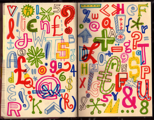
This a picture of my Rodchenko notes, my meeting notes are all a bit longer but a bit more confidential.
In my continual quest to become uber organised, I have recently ditched Moleskine's in favour of note taking on my Jesus Phone.
This has several advantages.
1. Less stuff to carry around.
2. When it's done, it's done. No typing up the notes.
3. You can email the meeting notes to the client as you leave the building. When they arrive back at their desk, it's in their inbox. Trust me, this impresses clients.
The only problem is that I have to start every meeting with "Sorry, I'm not txting, I'm taking notes" which makes me sound like a wally.

My coins arrived the other day. Lovely aren't they?
Great graphic design if you ask me. It's engaging, it's fun, it will entertain your Grandad as much as your 5 year old nephew, as the designer says, "It's easy to imagine the coins pushed around a school classroom table or fumbled around with on a bar - being pieced together as a jigsaw and just having fun with them." It's practical, it's relevant and it's appropriate. It's different, it's very now and yet it won't date. It's brilliant. Literally.

I've only met one person who doesn't like them so far.
The designer, Matt Dent is one of the speakers at Interesting 2008, that'll be good.

I've just played answerphone tennis with someone I've never met before who works for one of our clients.
They left a message and asked if it was OK if they brought some "stuff" with them to the office for a presentation. I left a message and said yes, but we don't have any PC's, so bear that in mind.
We eventually spoke and after a few pleasantries the conversation went like this:
Them "Do you have somewhere I can print stuff out?"
Me "Err, yes, we have a printer."
"OK, do you have something I could plug a USB stick into?"
"Err, yeah, we do, yeah."
"OK. Do you have PowerPoint?"
"Umm, yes."
"Oh, it's just that your message sounded like you didn't have any computers there?"
"Ahhh I see. When I said we didn't have any PC's I meant that we only have Macs..."
Classic miscommunication. Although if they seriously thought we didn't have any computers I'd be a bit worried.
For the record we do have a PC for testing etc but we keep it quiet...

Remember Craig? He did that hand drawn letter thing last year. And he works at The Chase and they're good.

He's just sent me a copy of his latest project, 12 in 12. Actually he sent it a few weeks ago, but I've just got round to blogging about it. It's a nice big (A3 ish) booklet he put together for a talk he gave at Falmouth. It's basically 12 things he's learnt in the 12 months he's been in the industry. It's funny and useful and well written. If I'm honest it gets a bit waffley in places, but I'd love to have gotten this if I was a student.

Click on this picture to make it bigger and you'll see he's lumped us in with great companies such as Johnson Banks, The Chase, The Partners, Williams Murray Hamm, LOVE, Carter Wong and NB: Studios. All great people to be associated with.

He also talks about how being a designer is different to other jobs and he very kindly links to The Design Disease post.
You can read more about the project here and if you're nice Craig will probably send you a copy.

A bit of fun for a Friday. If you've ever wondered where creatives come from, find out in this little video.
I tend not to write about other blogs and I try not to just link to stuff I've found on the web. I like to be a little more in depth for you, my beloved listeners. I also tend to think that you lot read all the same blogs as me. That's probably wrong, but probably broadly right.
Anyhoo. Here's some new blogs I've found. I hope I'm illuminating you a little bit with these.
Martha Stewart's Blog
I'm not a Martha Stewart fan at all. But she's got a blog and that (in my opinion) is exactly the sort of thing Martha Stewart should be doing. I've being reading it for about 5 months, and you know what? It's brilliant. It's updated regularly, it's well written, it has good pictures, it's honest, it's interesting and it's refreshing. You get the feeling she writes a lot of it, she probably doesn't, but t feels like she does.
Here's some photos from a helicopter trip she took over her farm.

Feels better than all those fake cutaways of Surallen's Canary Wharf empire, doesn't it?
Here she is out and about at the White House Correspondents Dinner. No pictures of her with the President, but lots of genuine 'night out' photos.

It's good. Subscribe and be surprised.
Mark Porter
Mark Porter is probably a genius. I say probably because I don't want to sound like an over excited football commentator. He's Creative Director at The Guardian and he won a D&AD Black Pencil for that redesign. I'm the only person I know who's not a huge fan of the redesign, but it's massively popular and to win a Black Pencil is a huge achievement. Even more so for a newspaper redesign.
He only started blogging two months ago and as you'd expect he writes about graphic design and editorial design. Here's a review of the FT Magazine's redesign and here he is talking about the Mirror's ongoing redesign. Interesting and valuable stuff from someone at the top of their game.
Jan Chipchase
Jan is Principal Researcher, User Research at the Nokia Research Center. He blogs about the future, which sounds awful but he actually spends his day researching the future, so it's a fascinating glimpse at weird and wonderful things all around the world. Like the Golden Week in Japan. Jan is also an 'on the road' project management expert. Find out why, on the road, inanimate objects have names. Laptops = Names beginning with L. Dispatches from the frontline, you should take a look.
David Jones
David is IT Director for AEG Europe (owners of The O2 ) in London. He blogs about the effective use of IT at home and at work. Here's a good post about the (frankly horrific) possibility of using your mobile on the tube. Here's another good post about how the BBC manages it's different web design relaunches. Good stuff.
id8
I'll declare an interest from the outset here - I'm on the Board of Advisors for id8 and we designed their business cards last year.
Based in Chicago and San Francisco they've just started a blog and it's
going to be exciting. If you're interested in usability, interaction
design, start ups or the emerging technology iRise then pop over there
and subscribe.


Recent Comments