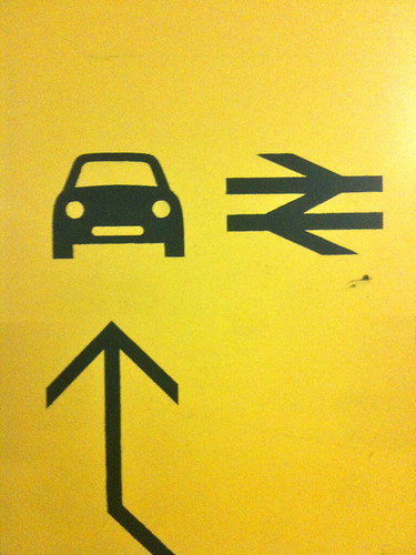
I like these. You don't very often see a British Rail sign painted onto a wall like that. It looks nice. Much better than some hideous vinyl / plastic combo.
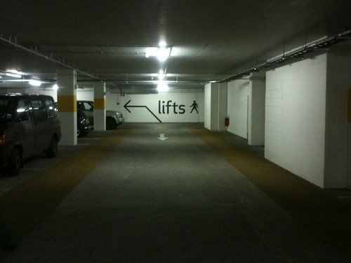
And this is nice too. Somehow the way the arrow comes up from the floor seems to add to the instruction. It makes the sign appear more worthy.
Seen at the new Southgate shopping centre in Bath.
Russell has been banging on about objects and behaviours for years now. In fact it's all he ever talks about. This is a good example. And he's right, it's just that it's a bit hard to get your head round.

But now Adam Lassy has made a video that neatly sums up exactly the future Russell has been talking about. And it's as amazing and terrifying as he predicts. IMAGINE! A table that "expects feedback" fucking hell... Watch the video.
Ikea Robotics - Animals from adam lassy on Vimeo.
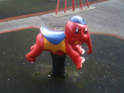
Most days I cycle round the Elephant and Castle and my route takes me through a housing estate where they have this delightful little elephant in the kids playground.
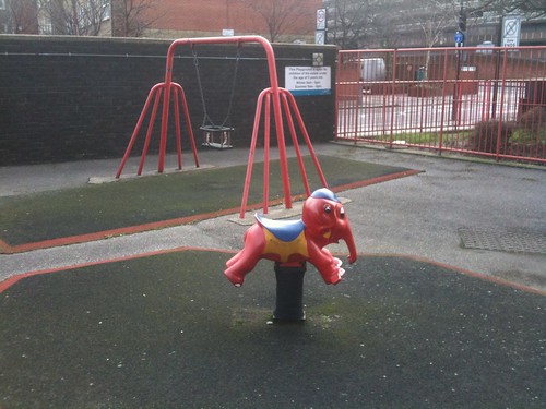
I say delightful, because this little elephant is a smaller version of the bigger famous elephant and castle sign.
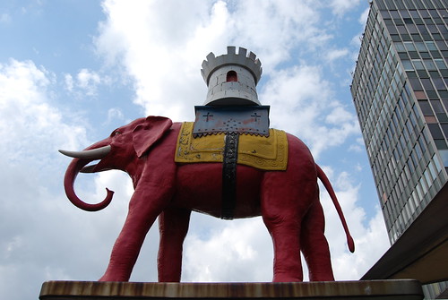
Seen in Lambeth. Lovely idea. Made by Cyclehoop.

I am very excited to announce four new partners in the Really Interesting Group.
Alex, Phil, James and Gary are all brilliant. Here's the blurb.
I get asked what website designs I like, all the time. Way too often in fact. It's not a nice question. What's a website these days? Most of the websites I like look shit, but are brilliant. So I always struggle and fire back a grumpy answer. You know.
Despite that, PEOPLE STILL ASK ME.
The last time I was asked, I couldn't refuse to answer. I had to reply. So I thought I'd stick them up here. Some website designs that I like right now. Websites DESIGNS not necessarily websites. These are not the best websites in the world. They are not the most beautiful examples of UI design known to mankind. I just like them, a bit, right now.

Skype is nice. Happy, optimistic. Glossy but not vomit inducing. It looks like fun. And it makes a lot of options look simple.

It's the same with Things. It looks simple. That mix of glossy 3D and hand drawn stuff is nice.

This is a screen grab of Clearleft's site. Pretty much everything they do is good. The standard is very high.

They designed this site for St Paul's School. It's not that striking at first, but if you have a look around it does a very nice job of a corporate / brochureware site. The menus are nice and simple, the photographs are handled well. As you might expect, David has a very good write up of the design process.
 And then there's this design studio website. A little bit different. Stands out in a crowded world. Simple, elegant. Nice.
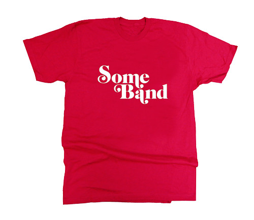
Russell and I dreamt up this tshirt a few years ago. We should have made it. We didn't. We are stupid. Add it to the list of things we should have done.

This is an interesting way of looking at the recent Brisbane floods from ANC News. There are Before pictures and as you roll your mouse over the picture you can see the After. Interesting and shocking.
On a similar note, you should also read Dan Hill's incredible account of being in Brisbane at the time of the flood. Amazing.
Great photo, highlighting many design issues. Taken by ![]() By chriswoebken
By chriswoebken
Makes a change, doesn't it?

Google are currently running these ads for Chrome on the London Underground. The graphics design is pretty grim to be honest. You can see what the idea is, keep it clean and white like the Google homepage (and indeed brand look and feel) but it looks pretty dull on a big poster.

That's bad enough. But there's worse. They've tried to put 'jokes and ideas' into the typography. They're awful. Clunky. Really unelegant. And worse than that, they just don't work. They don't capture the feeling they're describing.

Ever felt like that, above, when booking seats online. No. Didn't think so.

This one just about works. When you read that, it sort of does feel a bit like what happens when you're waiting for pictures to load on a slow connection. It's OK. It's simpler than the others. Cleverer and simpler and better.
But still, grim all round really.

Russell wrote a thing about 'music for shuffle'.
" I really want to see... Music made for the shuffle - pieces designed to appear randomly but still hang together. More than a bunch of songs. And long too, filling up a shuffle, hours worth of it."
And then MIB went and made it.
That's how we roll in the BRIG.
Domino Dancing, all day all day.

Remember Lebowski? He was Paul's mate. He used to work at Yakult in IT and then he left to go and be a scuba diving instructor in Thailand. Anyway, for years his dream was to start a viral sensation called the Answer Dancer.
He's actually gone and done it. Help make his dreams come true by asking the Answer Dancer a question.

Rapha, who I am a big fan of, launched an app a while back. Visually it's gorgeous, some lovely design details. Really beautiful. I particularly love this bit which allows you to set the app to only display images in black and white. I love that.

Which reminds me, there have been a few apps recently that I've liked. They all seem to make a virtue of feeling small.

Instagram, has it's critics. Rightly so as those effects are basically Photoshop filters and we all know how that ended. But I like it. It gives me a nice feed of interesting images from a few people, I follow 30 people. That feels nice. More friendly. (Don't get me wrong it will NEVER replace my beloved Flickr.)

Then there's Words With Friends which is basically Scrabble. At any one time I may have 8 or so games going on. Words With Friends has a really nice message function that lets you talk to people while playing a game. I said Happy Christmas to more people via that that any social network. It just felt a bit weird, a bit too much, a bit odd, saying Happy New Year etc on Twitter. Maybe.

And there's Path. I actually think Path is rubbish. It's a mega stripped back photo sharing app, you can only follow 50 people at one time. It's so stripped back it's frustrating to use. But still, another small feed of stuff. I like the idea of smallness even though I don't like the app. And they've made it deliberately small. It can't get big.
This is all a huge contrast to the Facebook behemoth. That smart listeners will now be suggesting I reduce the number of 'friends' I have on Facebook. And actually Facebook does a decent job of allowing you to have different groups for different things. But it just feels a bit too difficult to start using Facebook that way. I don't think we can put the Genie back into the bottle.
Small feels good.

And then there's this which isn't an app, but is a wonderful thing made Jason Kottke called Stellar. You see what you’re friends have favourited on Twitter and Flickr and Vimeo and the like. That’s actually really inspiring, it's invite only at the moment and I'm not sure about plans for a bigger launch. Again it feels like another small thing. This has the added effect of a sort of nearness halo. For example I often see things that friends have favourited by other people I know, but don't necessarily follow. This leads me over there and brings them nearer to me.
Stellar highlights things I might like from my near networks. I like it a lot.
Actually, I've always liked small.
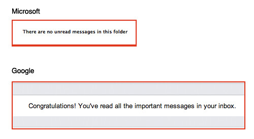
I love both of these messages dearly. But the Google one is so much better.
Still, as Iain says, email is just Tetris.
Awesome ![]() By Laser Bread
By Laser Bread
We all went to the O2 on Sunday.
It's mental inside. Full of garish.
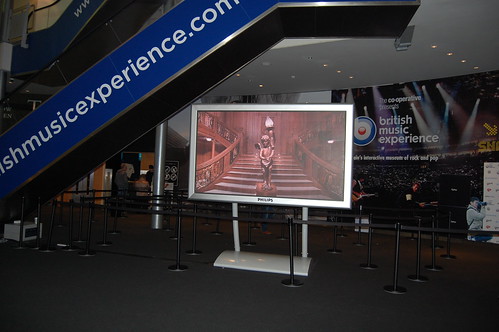
There are lots of screens.
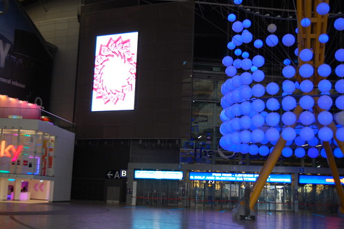
There seems to be no reason or structure to how they are placed or sized.
The only uniformity is that no-one seems to know what to do with them. The best one, the only one that worked, I didn't manage to get a picture of. It was for Coca Cola and was just a nice animation based on the bottle which was conveniently the same shape as this screen. Nothing too clever just considered. (Something here about Moira Cullen being appointed Design Director all those years ago.)
It's funny really that no-one has worked out how to do something good on these screens. It's not like screens are an unfamiliar medium to agencies, to brands.
Just for the record the best so far, imho, is this. Basically a moving poster. I think that's a good place to start. For now.
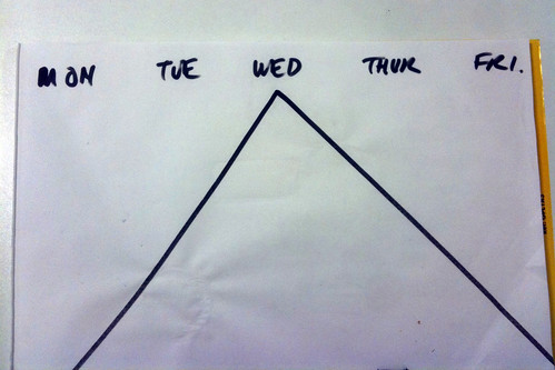
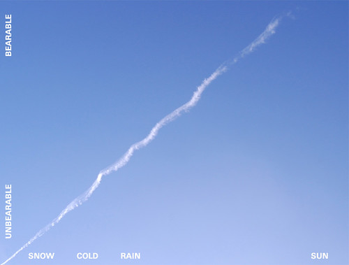
This is how I see the week. Every week. From 12pm Wednesday it's all free wheel.
Recent Comments