I get asked what website designs I like, all the time. Way too often in fact. It's not a nice question. What's a website these days? Most of the websites I like look shit, but are brilliant. So I always struggle and fire back a grumpy answer. You know.
Despite that, PEOPLE STILL ASK ME.
The last time I was asked, I couldn't refuse to answer. I had to reply. So I thought I'd stick them up here. Some website designs that I like right now. Websites DESIGNS not necessarily websites. These are not the best websites in the world. They are not the most beautiful examples of UI design known to mankind. I just like them, a bit, right now.
Skype is nice. Happy, optimistic. Glossy but not vomit inducing. It looks like fun. And it makes a lot of options look simple.
It's the same with Things. It looks simple. That mix of glossy 3D and hand drawn stuff is nice.
This is a screen grab of Clearleft's site. Pretty much everything they do is good. The standard is very high.
They designed this site for St Paul's School. It's not that striking at first, but if you have a look around it does a very nice job of a corporate / brochureware site. The menus are nice and simple, the photographs are handled well. As you might expect, David has a very good write up of the design process.
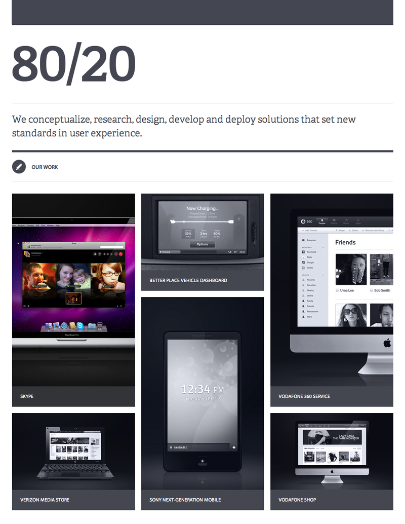
 And then there's this design studio website. A little bit different. Stands out in a crowded world. Simple, elegant. Nice.


Nice selection Ben.
A slightly off topic thought: The use of Apple products in ads and portfolios.
I find it a bit annoying, disproportionally representative perhaps? I mean skype is every bit as functional on a grey ThinkPad circa 2005, right?
It's annoyed me since BA did this a few years back. I love Apple products, but I can't help but be distracted by the big fruity logo. For me, the Verzion Media store, shown on the 80/20 site, displayed on a 'generic' machine stands out. But I find myself ogling over the iMac, rather than looking at the work they've done on the online Vodafone shop.
It's a bit like those ads for Carports in the back of the Observer magazine, ever noticed there's always a brand new Merc underneath the crummy poly-alu construction?
What d'ya think?
Posted by: JameoGreig | Jan 24, 2011 at 15:25
Sorry, this: http://bit.ly/dOCWK3
Posted by: JameoGreig | Jan 24, 2011 at 15:26