Of all the silly things agencies do this is one of the silliest and the best
For w+k London's 20th anniversary they had a massive cake made of all their best ads. Utter nonsense. Brilliant.


Of all the silly things agencies do this is one of the silliest and the best
For w+k London's 20th anniversary they had a massive cake made of all their best ads. Utter nonsense. Brilliant.

Richard Turley and friends have launched a newspaper in New York. It looks great, you should buy a copy.
But the best bit, the bit that's the most fun and the most clever is this. Genius.


63. Jon Marshall co-founder of MAP joined Pentagram
Always a frisson on the forums when Pentagram appoint a new partner. I’m excited by this one, Marshall is exactly who Pentagram should be appointing. The mix of classic product design with a good understanding of technology and designing for different types of connected interaction suits their heritage and future perfectly. Kano and BleepBleeps is exactly what Pentagram should have been doing.
I’m a huge fan of Map Project Studio (founded with Edward Barber and Jay Osgerby) and this must be a big loss for them.
What Jon Marshall joining Pentagram may mean for him, and the studio
64. Martin Sorrell resigned from WPP
After 33 years in charge of WPP Sorrell resigned, technically retired, probably before he was pushed. And that’s not the only similarity with Arsène Wenger.
It’s big moment in advertising and design as well, with many more questions than answers and a lot more to come from this story.
What happens to the consolidation of agencies now? Do the cost savings clients want come from breaking WPP up? What happens to SuperAgency? (see para 45)
WPP bought 43 small agencies last year alone. Lots of founder / entrepreneurs got rich in a tax efficient manner. Writing in the FT John Gapper describes this as essentially tax arbitrage which “paid for a lot of houses, boats and divorces”. But he acknowledges that the model “contributes innovation to the whole.”
There is a ringing endorsement from Justin Cooke who sold to WPP six years ago,
“Sir Martin practically invented the earn-out, turning WPP into a deal machine continuously injecting innovation and fresh thinking into the network as well as giving creative entrepreneurs the ability to realise value from their blood, sweat and tears and, more importantly creating a vibrant eco-system that has ensured that the UK remains at the heart of the creative economy.”
What happens when this merry go round comes to a halt? The FT is betting hard on a big break up with several articles this week. Worth noting that the idea seems to come from analysts with a desire to get in the press rather than anything concrete.
But one analyst says “Just as WPP was constructed so it can be deconstructed, think of WPP as a bank …it’s a financial engineering exercise.”
Is WPP the ad industries Carillion? The finances are nowhere near as bad but are we about to find out how much a financial construct it is versus a creative company?
Wenger and Sorrell show the costs and prizes of leadership longevity
Advertising’s acquisition carousel is slowing
WPP - breaking up is not so hard to do
Last point on this. Sorrell has no non-compete agreement with WPP. (That's the sound of people choking on their earn out deals up and down the land.)
65. Foster + Partners launch integrated services system
In collaboration with other design firms Foster and Partners released Node, a system to incorporate all the lighting, security, fire prevention and air conditioning services an office needs elegantly. It looks good and flexible. I’m no architect but this looks smart. I had a conversation this week where we wondered why designers are so reluctant to embrace systems. Every big successful design project involves many complex systems. I remarked that Foster + Partners were especially good at this.
Node brings building services integration into the 21st century
66. Reckons on Apple and its cash flow
Scott Galloway (mentioned in para 27) writes that Apple should launch the world’s largest tuition-free university. Everyone has an idea of what Apple should do with all its cash. Maybe they’ll buy WPP.
Apple should open a university that's free for everyone
67. Brilliant 3D printed optical illusion

So much of modern communication is like this. Badly written, poorly designed, unclear, confusing, multi-layered ideas that look like phishing.
Here's the rational behind using Arnie, “He’s like a fitness instructor for decision making, he is only a head because he wants people to use theirs, he keeps things ticking because, without him, we put things off, and his job is to drive people to the FCA to make an informed decision.”
Found via an FOI request by Money Marketing.

Here’s a picture of the Apple Store in Bluewater, a shopping mall in Kent. It could be any Apple Store anywhere. Notice that it has nothing in the windows.
No marketing collateral, no promotional offers, no posters, no displays, no product, nothing. As far as I’m aware this only changes at Christmas when they have a simple Christmas product display.
There are over 300 shops in Bluewater and the windows of every other store are littered with marketing and special offers. Admittedly some of the more luxury stores have less stuff in the windows, but they all have something. You can barely see inside some of them.
Apple have the highest sales per sq ft of any retailer. 30% higher than the number two.
Highest sales. Nothing in the windows.
Those sales figures aren’t just down to the windows obviously. That’s down to a mix of product, pricing, atl marketing and other stuff.
But still, you’d think one of the others would have tried the nothing in the windows strategy.
 I have absolutely no idea what caused this spike or where these visitors came from, but welcome newcomers!

55. Not one mention of London's Ark
But this is still good, 13 stunning buildings that look like boats

56. Citymapper made a bus but the bus isn’t the important bit, obvs
Citymapper started a bus route age ago. And that's probably a silly idea, but read this blog post about how they did it and marvel at what a small tech company can do. They built a fully functioning end to end transport system. Albeit small and with very carefully controlled conditions. But they built a prototype and tested their riskiest assumptions on real users.
"We built the entire technology stack for a bus, starting in our own office. We built a driver app, a smart display, tracking software, scheduling systems, control systems, even strange flashing headsigns.
We have been able to run our buses smoothly. We made software updates, even during live operations. We provided accurate realtime data in our app, as well as supporting open data.
All at a fraction of the cost of what traditional bus systems do.”
The agility needed to do this is the huge advantage Citymapper has. Forget the bus, it’s not about the bus. It’s about the agility.
If you are a legacy organisation this is the problem, over time you’ve lost agility. And now all you have left is, what? Connections, relationships? Customer loyalty? Brand? I think we’re starting to find out those things don’t count for much.
What happens when an app company runs a bus
57. Threads👇
I might start a new section just on Threads. Here’s three good ones from the last few weeks.
Why FMCG companies are struggling to find an alternative to the competitor acquisition model. Or really why FMCG companies need to find an alternative to the Marketing Led business model. Thread👇
Maps. Loads of lovely maps. Thread 👇
A rare of example of the internet still being brilliant. 6 Music asks what’s the strongest run of three songs in a row on an album? Thread 👇here, easier to read summary here.
58. A negative New Yorker article on Heatherwick’s new project The Vessel, in Hudson Yards. The article features artwork by Christoph Niemann who I love but it’s a 10MB page, that took 59 seconds to load which I didn’t love.
There’s a lot more negative press for Heatherwick these days. For my money there is still more in the positive column than the negative column.
Thomas Heatherwick, Architecture’s Showman
59. Street signs counting the amount of cyclists going past
Would love to see more of this. Harmless (?) data used in simple ways with low risk (so what if everyone ignores it) but potentially high reward (better public health). Better than putting ads on every screen.
Street signs counting the amount of cyclists going past
60. Brand = margin, therefore Bezos is going after brands. As I’ve mentioned before we are starting to discover the true value of “brand”.
Death, for brands, has a name... Alexa.

Sketch from this Autocar article, not clear who drew it
61. And here’s the perfect example, the Dyson car.
Dyson should be good at this. Already good at batteries, good at engineering, good at innovation, good at supply chain. But who wants a car from a hoover company? Would you buy a Hoover car? Would you buy a hoover from Vauxhall? Does anyone care anymore?
Remember LoveMarks? (Remember Kevin Roberts?) We’re about to find out the true value of "brand" and it’s going to be brutal.
Dyson bets on electric cars to shake up industry


62. Brilliantly
I discovered recently that the Pet Shop Boys have published their own magazine, Literally, since 1989 and last year announced it would become an annual publication. Literally becomes Annually. So good.

I went to the Design Museum’s Hope to Nope exhibition at the weekend. It was good, I enjoyed it, Russell you should go and then you can look at the screens and the Ferrari exhibition.
More about the screens later.
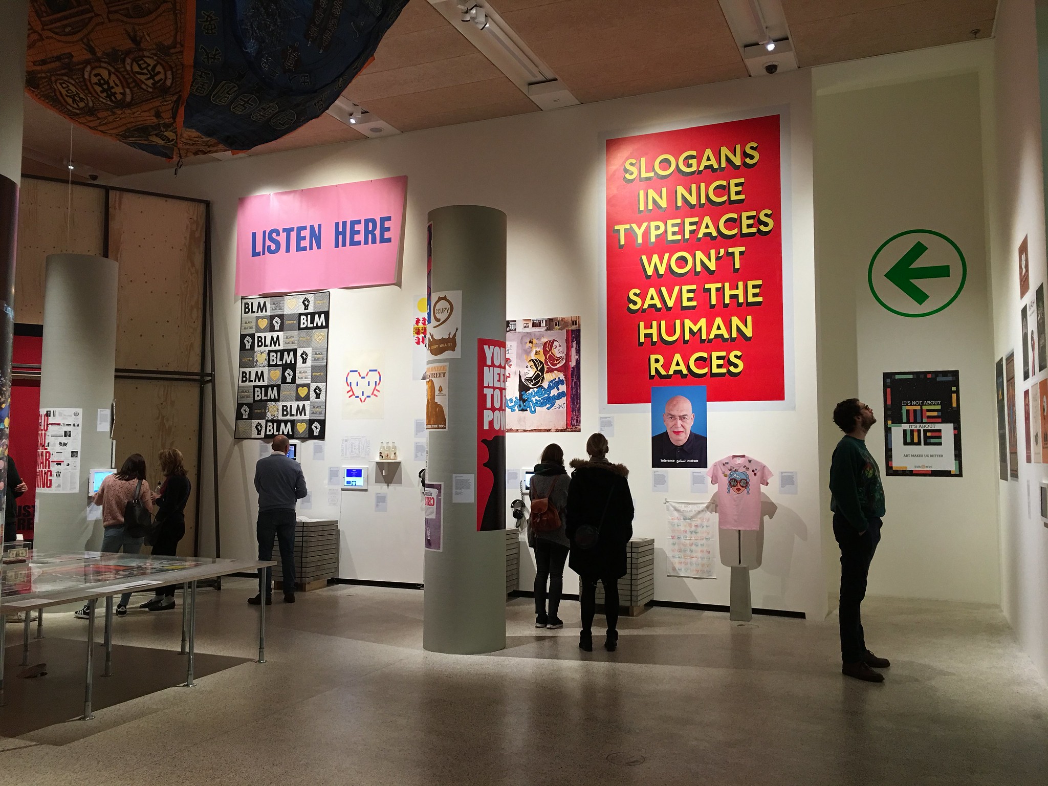
Hope to Nope only covers 2008 to 2018. This is smart. It makes the exhibition simpler and more focused. It’s a raw exhibition, it feels immediate and that suits the subject matter. Upfront it states that the world has been a more unstable place since the banking crisis.
I’m sure someone will tell that they’ve missed a certain movement in a certain country – but it seemed a good selection to me. From obvious things where design would normally play a part like Trump to less obvious ones like Catalonia, Turkey and Grenfell.

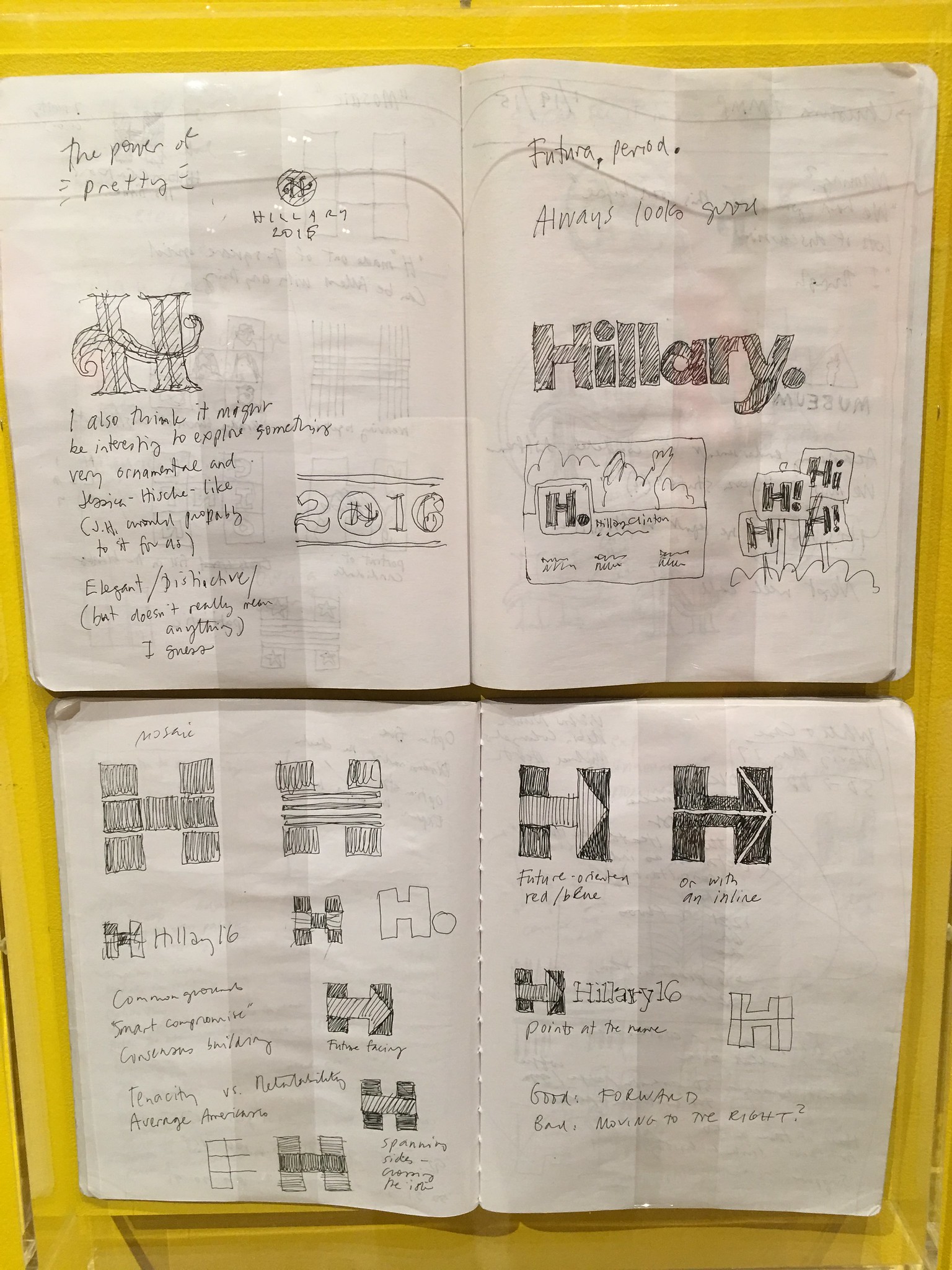
There’s a nice moment where they show the Hillary logo by Michael Bierut and the Remain campaign by North and acknowledge that while they are successful graphic designs the established nature of the design (and designers) has contributed to the ultimate failure of the campaign. That’s an awareness that design exhibitions often lack.
Here’s the thing that really surprised me. It was an exhibition that featured screens and the museum didn’t mess it up. They all worked, no A4 notices. It even added to the exhibits.
The Ferrari exhibition is decent too. A few more pics here and some Ferrari ones here.
Walked by Project 84 the yesterday day. A campaign by male suicide prevention charity CALM with sculptures by Mark Jenkins, there are 84 sculptures of young men on the roof of the ITV building on the South Bank to highlight the 84 men that commit suicide each week.
It's a haunting piece of work. I'd read about before I saw it but I was still shocked when I saw it for real. The figures look like real people, dangerously close to the edge and your brain convinces you they are moving slightly. The quiet grey bank holiday added to the eerie atmosphere.
Putting it on the ITV building means it's got good coverage on the channel which seems a good use of ITV. I've donated to Calm, you can do so too here.
* * * * John Maeda Design In Tech Special * * * *

The fourth Design In Tech report by John Maeda is out. Looks like a Pet Shop Boys album which is no bad thing.
As usual it’s good. Interesting and detailed. Last year I asked for it to be published in html rather than as a PDF. John has obviously listened ;) and there is an html version. Maeda is pretty humble about it, which is nice. FWIW it worked fine in Chrome on my laptop.

One advantage of html is that you can link to specific sections. So here goes.
Maeda's The Key Takeaways
The recognition of design’s value grows. Especially as the big gains in tech become smaller.
The design thinking + business school romance continues. Easy to see this dominating Exec education for a while.
The big management consultancies continue to make acquisitions and hires. I wonder to what extent this is hurting WPP and the like.
There’s an interesting bit about the changing design software. As an old man I’ve been struck by this recently. I’m the only one using Adobe. Hard to see how they still have a business model when everyone uses Sketch or Pixlr or stuff from this huge list.
Voice, AI, algos.
China, china, china. (I need to get to China this year.)
Ben's Other things worth noting
There’s lots about Inclusive Design which is good, but it reads like the design industry is just discovering it. I don’t think that’s true and I think the coverage in this report has been driven too much by the Microsoft Inclusive Design Guidelines which are excellent, but not new news.

Maeda talks about there now being three kinds of design. Classical Design, Design Thinking and Computational Design. I’m not sure this is right, the third one feels unfinished. But the other two are good and I like this approach. This will develop and is worth keeping an eye on.
He goes in pretty hard against the "Classical Designers". Hey, we all have links that need clicking.

Be afraid Marketing. Alibaba Luban, a piece of "design AI", produced 400 million banners during the 2017 singles day, resulting in a 100% increase in conversion rate.
There's more here, "About 10 types of robots were used by Alibaba for different applications for this year's festival. One of them, named Luban, is an AI designer who created up to 410 million product posters for the Singles' Day, according to the Alibaba statement. Another customer service robot named Ali Xiaomi answered more than 90 percent of the questions asked by consumers on the shopping festival day."
Brian Chesky on culture is interesting. “Why is culture so important to a business? Here is a simple way to frame it. The stronger the culture, the less corporate process a company needs. When the culture is strong, you can trust everyone to do the right thing.” Reminded me of Russell's and Giles's recent blogs on GDS.
The bit about designers needing to learn the skills of product management gives you a good list of skills relevant to any designer in tech. You could argue that product managers have learned those skills from design... but whatever.
Nice to see Durrell’s Line Us get a mention.
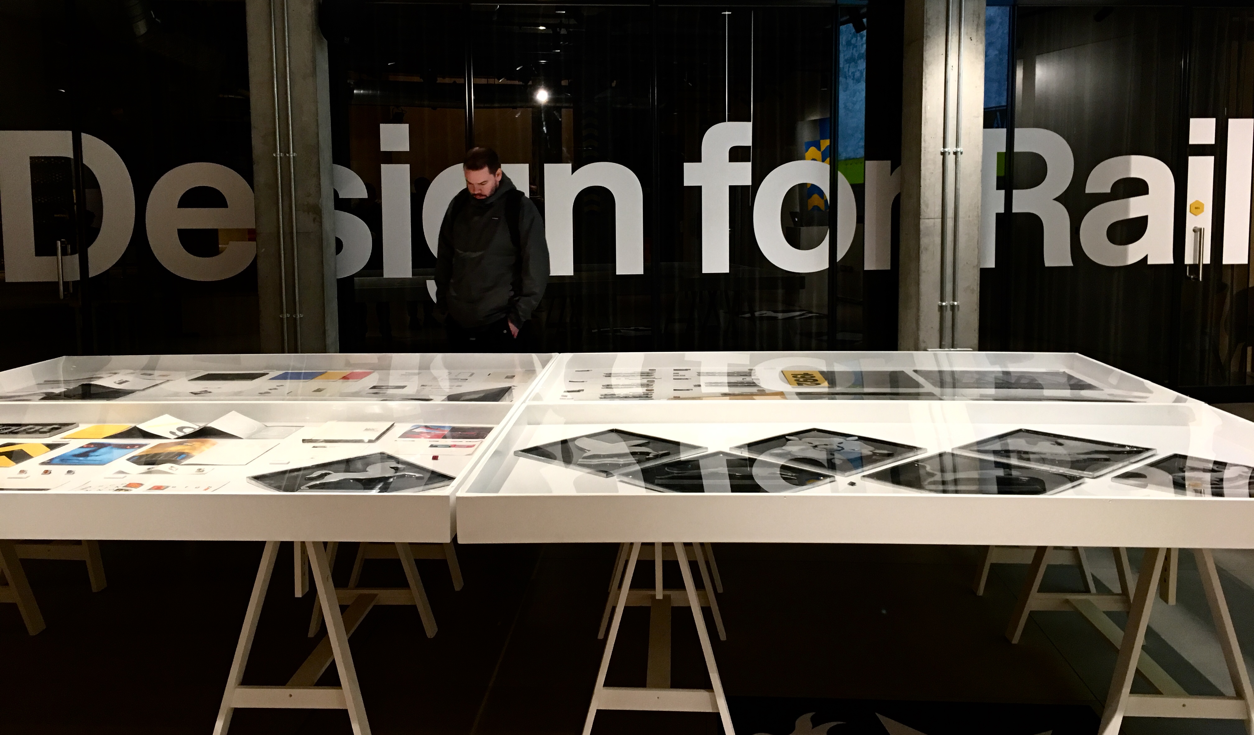
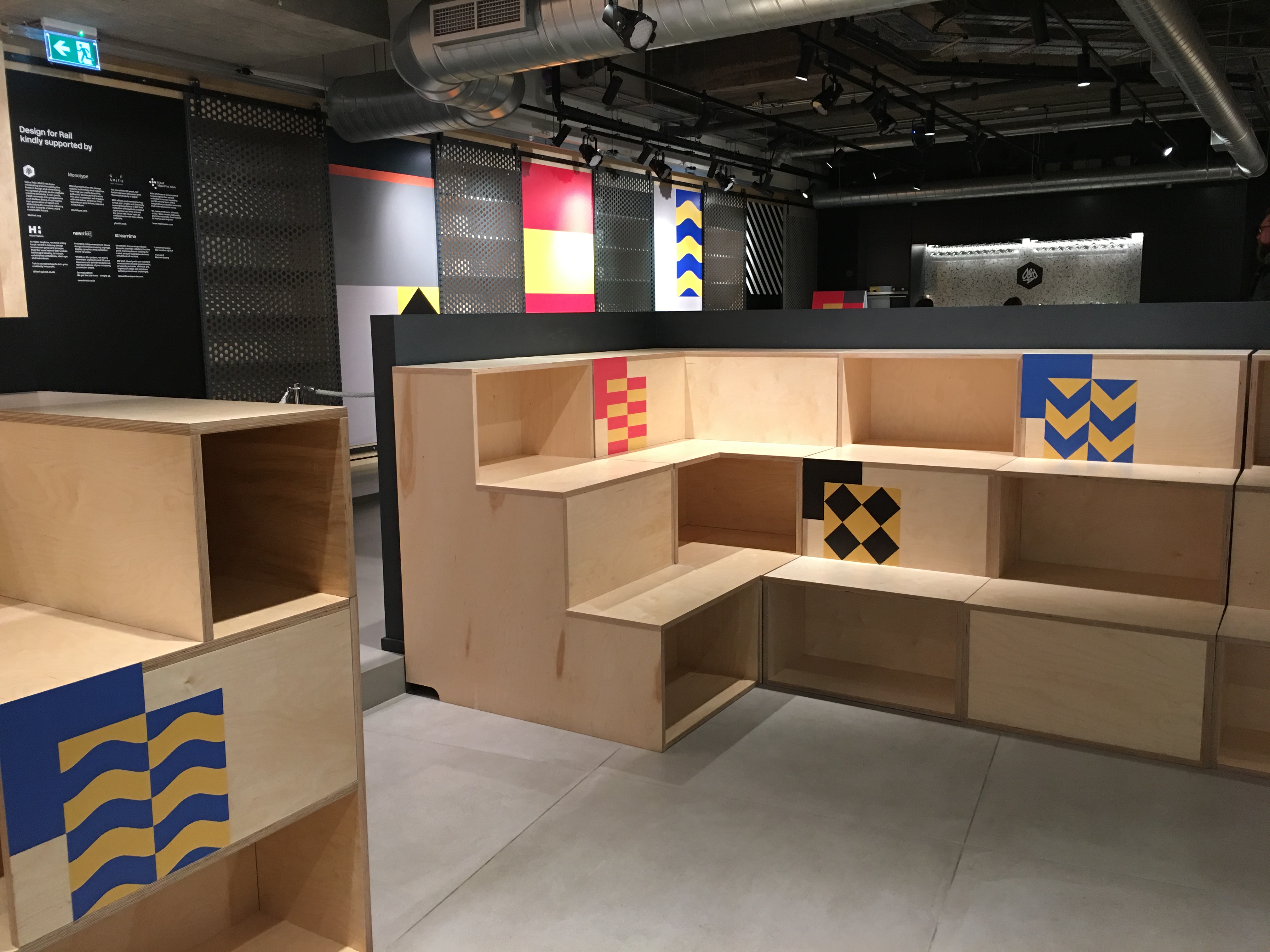
Way, way back in 2007 when no-one cared whether you said blog or blog post they were just happy you were blogging, I wrote about the British Railways Board Environment Identity Scheme which I was a bit obsessed with since a teacher at college showed it to me.
Funny how things worked then, when I was in college, before blogging and mainstream publishing on the web. A teacher would grab a book from a shelf, show you something, and it would stick half remembered in your mind forever.
Anyway an email I received about that blog up there from the son of a designer who worked on the project led to this article in It's Nice That which maybe led to this exhibition by SEA Design at the D&AD a few weeks ago. And so I finally got to see that half remembered graphic design work in the full technicolour glory of a small dark exhibition. Design for Rail.
I think that's probably enough now. We can all move on.
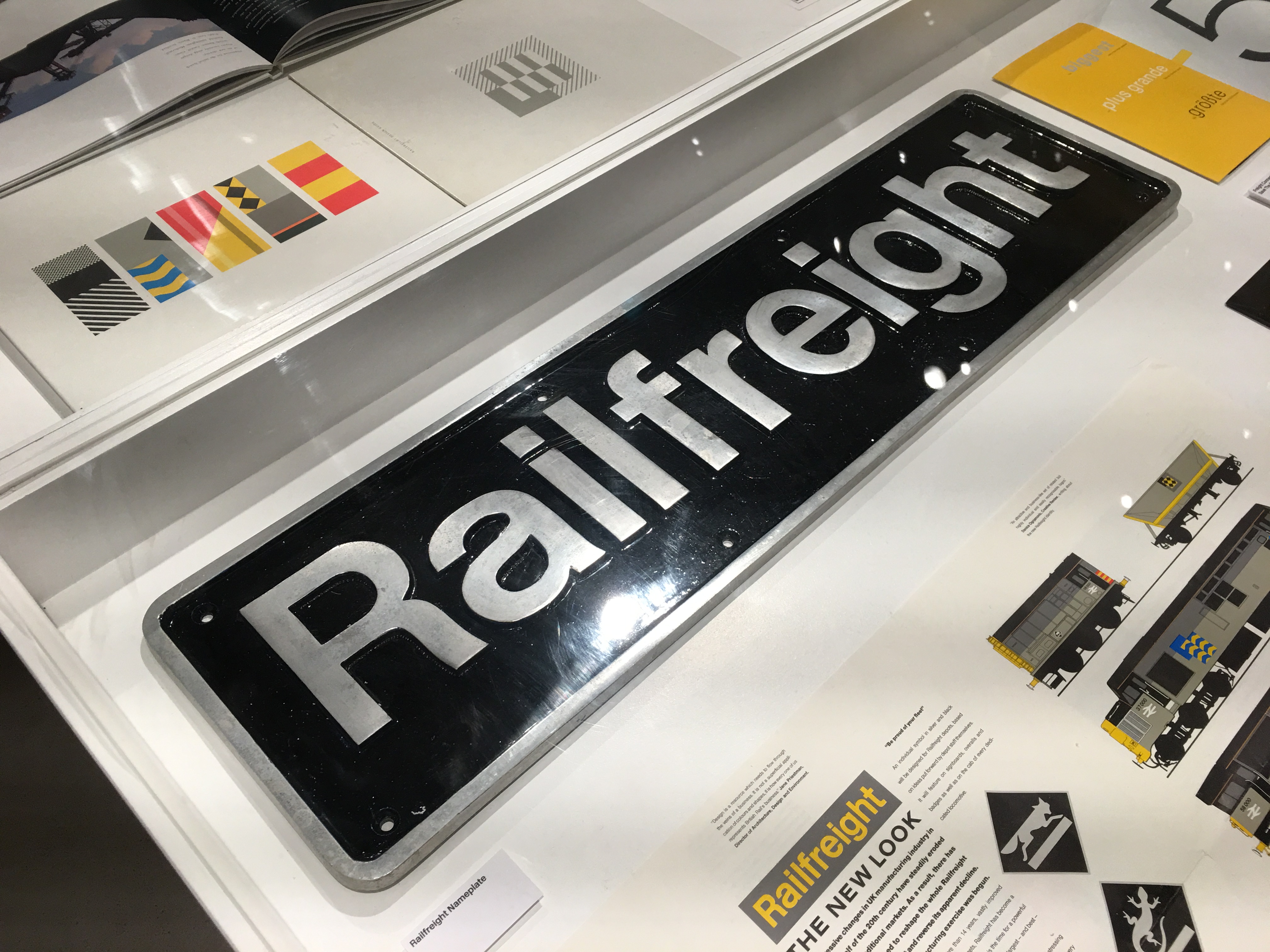
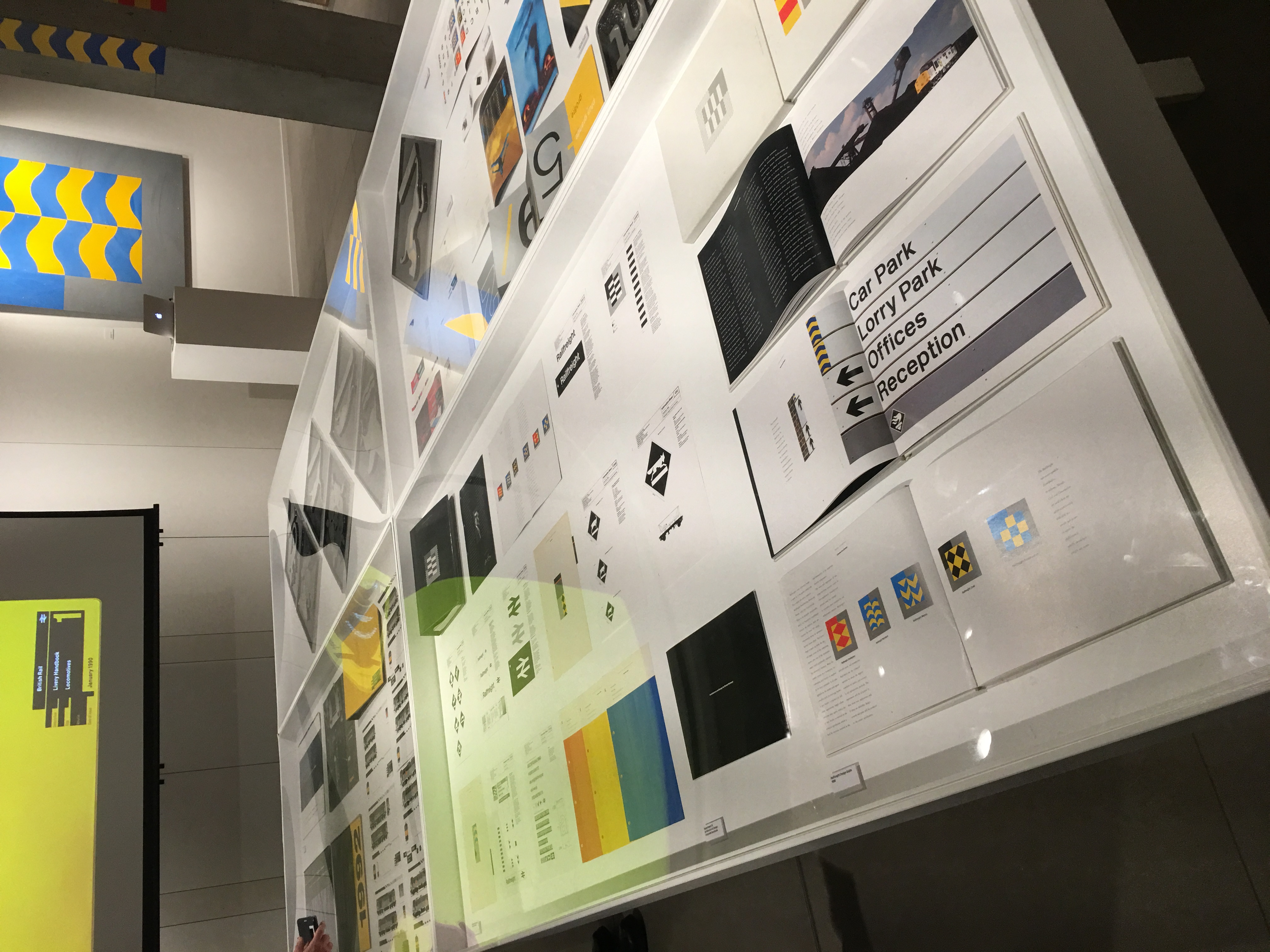
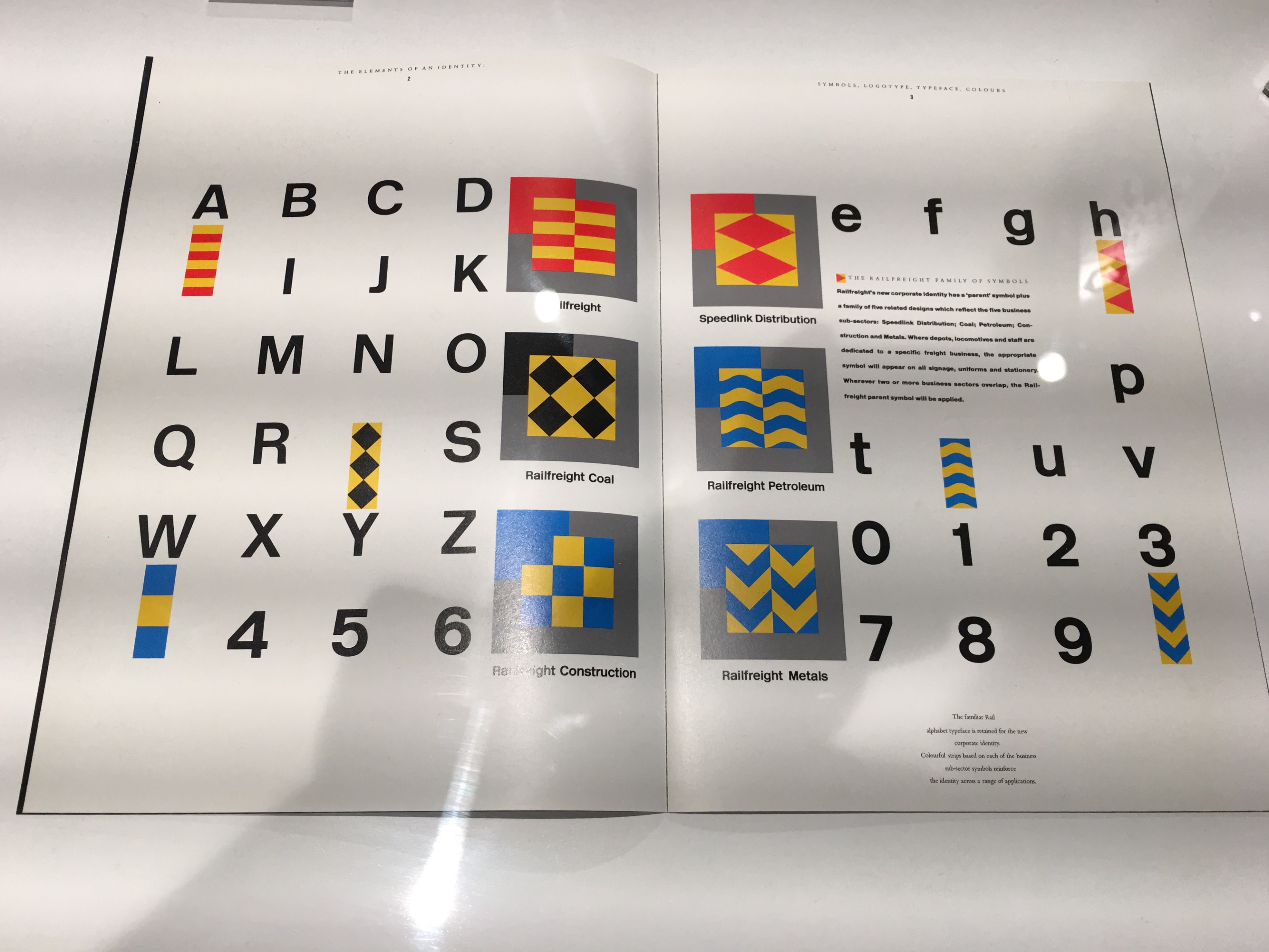
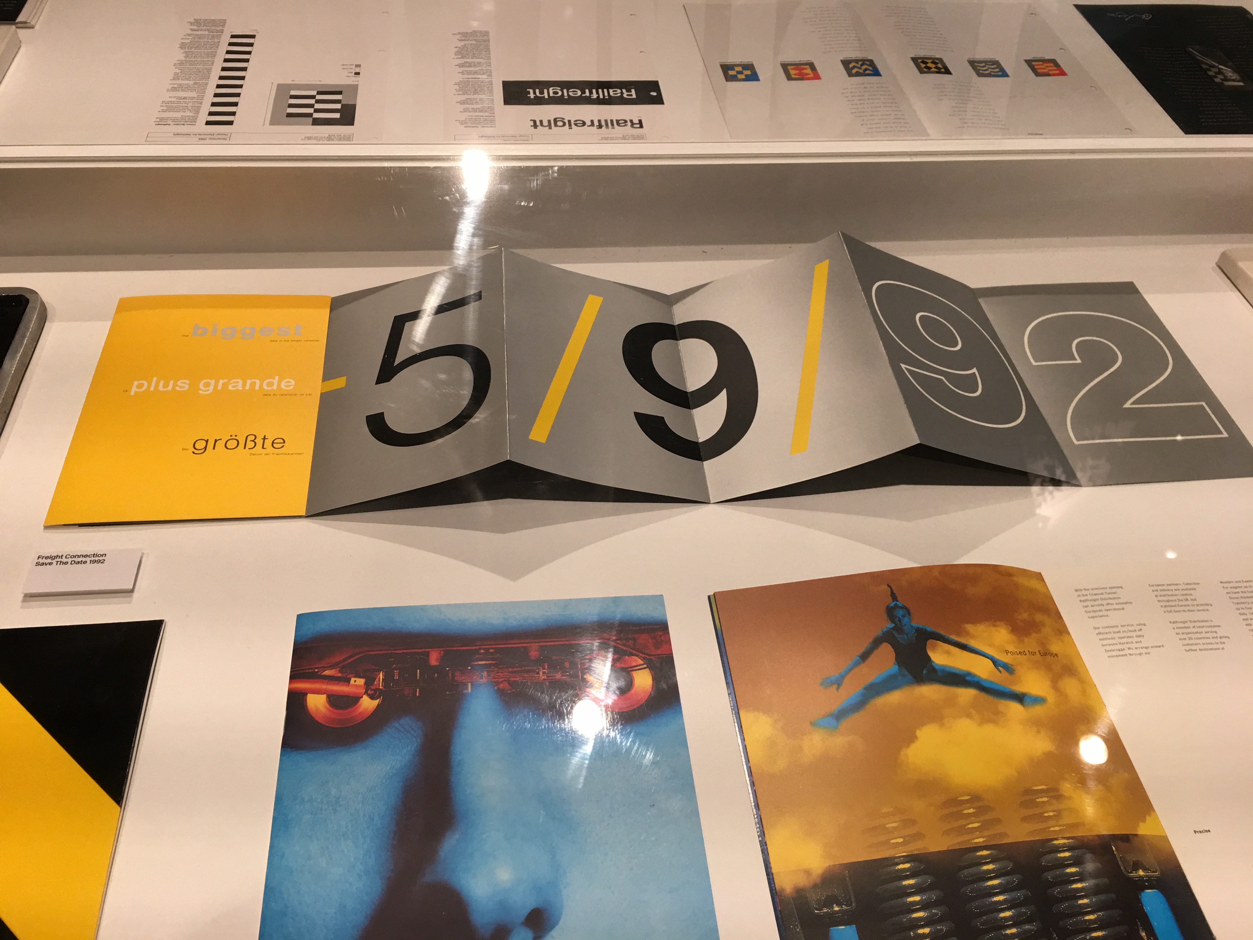
But a few quick thoughts.
1. It's lovely. This more than anything else feels like pure real graphic design to me. It isn't obviously, and I'm showing everything about my design background and education in saying that. I bet there are many others like me. I'm hyper aware of how dated that reaction is, the work isn't necessarily dated, but my reaction to it is. Like going into a screaming fit when you hear Paul McCartney has landed at Terminal 5. Reaction nostalgia.
2. There's a bit of evidence to say the railways never really liked it. That it worked better as pure graphic design. Would love to know more about that.
3. The exhibition was good, the D&AD should do more stuff like that.
I enjoyed that.
Whenever there is lots of reporting around an intangible news event I get frustrated at the terrible graphics.
The Credit Crunch a few years ago was a good example of this.
Brexit is an almost perfect example of the phenomenon. Huge news event, in the news everyday but nothing tangible to take pictures or film of. You get lots of what Russell describes as, People Stood in Front of a Building Where Some News Happened a While Ago.
You also get loads of terrible, clichéd, meaningless graphics.


 Lots of 3D graphics. Jigsaws because that's the default for two ideas in one image. (At least the bigger jigsaw works better than the two single pieces which doesn't really make any sense). Road signs because that's the default option for report covers, whatever the subject.

At least Banksy has made a decent one, on a wall in Dover.
And now I've had a go. The exit door motif had been in my head for ages and I had assumed someone else would have made one like it, but I can't find one anywhere. So I put this together.
I have no need for it, so feel free to use it. Please credit me, but otherwise go for it. Full version on Flickr.
Maybe it's as clichéd as the others. I'll let you decide.
On the 15th January Carillion filed for compulsory liquidation. A construction company that provided services such as school meals, hospital maintenance, and defence accommodation. They employed 43,000 people.
Carillion’s strapline was “making tomorrow a better place”.

Their logo was a text book example of the corporate blobs so loved in the 90s. (Like Consignia.) I think it’s a watercolour painting of the Princess Diana memorial and a 6ft misshapen starfish.
At the end of January Capita’s shares dropped 45% on news of a profit warning. Capita, among other services, runs the London congestion charge, collects BBC licence fees and handles admin services for the National Health Service. They employ 73,000 people.
Their strapline appears to be “unlocking value through talent and technology”.
Their logo is the word CAPITA written in the sort of typeface you get when you choose the free BUSINESS theme.
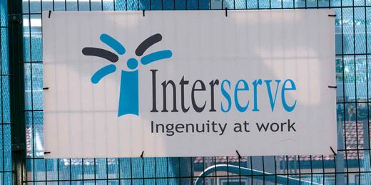
Last week the FT reported that Interserve presented a rescue plan to banks in an attempt to secure fresh funding. Among other outsourcing services Interserve cleans the London Underground and manages the Ministry of Defence’s estate in the UK. They employ 80,000 people.
Their strapline is “Ingenuity at work”.

Their logo is a child’s drawing of a broken fire hydrant.
Brand experts always talk about finding the brand's essence. A "brand truth".
These logos, these straplines, these names are opaque, confused pieces of communication. Vapid. Devoid of meaning.
The branding people did a good job.

50. Dave Addey who writes the blog Typeset In The Future is writing a book. I’m assuming you will all like that.
51. I can’t believe I hadn’t heard of the Phoebus Cartel before. A cartel of Osram, General Electric, Philips and others engaged in large scale planned obsolescence of lightbulbs. Reducing the life of lightbulbs by 60%. More profits obvs.
What eventually stopped the cartel? A war and a co-op.
Read about the Phoebus cartel here.
52. Vallie was bonkers Silicon Valley style tech start-up nonsense in London. On demand valet parking. In London.
You can see the pitch. Location aware app, parking in London at a premium. Drive to (what exactly? fancy restaurant? meeting?) valet picks up car and returns it when you’re ready. Plenty of rich people in London with valet-able cars.
I first heard of this when EV owners started asking Vallie to take their cars and put them on charge while they went about their business. (I kinda thought that was an interesting side business. Park and ride for EV charging.)
Ran for two years and closed at the end of last year. Nash, one of the founders, wrote a decent post-mortem. Worth a read as you rarely get to hear what failed in start-ups.
tl;dr the incentives to avoid driving in London are very successful.
Vallie — A post-mortem on on-demand parking in London
53. The headline of this article is “Fan-made football kits that are arguably better than the real thing”. Not arguably - definitely. Proper New Aesthetic. Zazzle meets Premier League - made for each other.

I’ve wanted them to do this with sponsors logos for ever.

Fan-made football kits that are arguably better than the real thing
54. Thoughtful post from Ben Evans on what he calls the impending collapse in TV, retail and advertising.
“There’s a famous Jeff Bezos quote that ‘your margin is my opportunity’ - right now Amazon is building a billion dollar ad business in its own search results, but I suspect he also looks at the $500bn that’s spent every year on advertising and the further $500bn that’s spent on marketing and sees money that should be going to lower prices and same-day or 1-hour delivery. P&G spent 11% of revenue on advertising last year and plenty more on marketing. What will that look like in 10 years, where will it be spending it and how will people be buying?”
TV, retail, advertising and cascading collapses
I bought this radio at least 10 years ago, maybe 12. The Roberts EcoLogic3.
It sounds good, it has buttons that are well laid out and are pleasing to use. It’s white and goes with the rest of the kitchen. It worked perfectly.
A while ago the kids took it outside and left it outside. For several weeks. It never sounded the same. It struggled to keep reception. Stations would drift in and out. When you walked past it, it stopped working.
It’s a Roberts, so I wondered if they did repairs.
They do.
Go on their website. Fill in a very simple form. Choose a delivery date. Print off a label.
The next day FedEx arrived to collect it.
About a week later it was returned. Fixed and working perfectly again. All for £44.21 including collection and delivery.
I think that’s pretty good. Screws not glues.

44. Modern Matter have laid out the latest issue of their magazine on a billboard. Fun and I bet sales go up.
Modern Matter Billboard (via MagCulture)
45. WPP merged together five of its design consultancies; Brand Union, Lambie-Nairn, The Partners, Addison and Vbat. Being brand experts they’ve named the new company Superunion. Other WPP design firms remain separate; Design Bridge, AKQA and Fitch.
 This is an interesting development. It looks like nothing has changed apart from some senior management musical chairs. No redundancies, no relocations. WPP and other holding companies have traditionally stayed away from this sort of merger preferring to keep the individual “hot shop” brands. In fact there was a lucrative career to be made inventing small hot shop brands and flogging them to Sir Martin.
Is this a change of direction? Will we see the same happen to ad agencies? There must be savings to be made at a time when margins are low and the sector is under huge pressure. More of this to come? Will it make a difference to clients? To the quality of work? Is one huge ad agency on the horizon?
Brand Union, Lambie-Nairn and The Partners become Superunion in huge WPP merger
Oh and Michael Wolff isn't happy about the new logo.
"I rarely make comments on the work of colleagues in design. I only do so when I’m angered to see work that I consider trivialising and shameful.
Whatever sense this merger may make to WPP and its clients, this logotype is a disappointing, mediocre and demeaning one.
If it’s an indication of the creativity and intelligence that a merger on this scale is promising, it represents a bleak outlook. Logotypes and names of this banality do a serious disservice to the world of design."
46. Nintendo launched Nintendo Labo and it looks brilliant.

Labo is a series of cardboard cut-outs that work with the Nintendo Switch and Joy-Con controllers to create "Toy-Cons" that can interact with game software and vice versa. Apparently Nintendo designed them as a way to teach the principles of engineering and physics to kids.
It is completely different to other games add-ons and perfectly mimics how kids play. Reminds me of the sort of thinking that led to the 5 second minigames in Yoshio Sakamoto's Warioware Smooth Moves.

Nintendo is so good at this and it’s a shame the world doesn’t get more of this type of thinking in areas other than games.
47. Shell have applied for a minicab licence in London. We're about to find out, quite dramatically, the true value of "brands".
I expect to see a lot more of this type of "brand extension" as Big Legacy Cos work out where the value is in their business. As new businesses emerge and grow, will legacy businesses find that all they have left is their brand? That's supposed to be worth billions. Or is the real value in Big Legacy Cos the actual physical assets, rendering the brand worthless without a decent business model.
Could you stretch a fuel or power brand to a taxi or mobility company? Could British Airways do that? The black cabs have an incredibly well known and well established "brand". Uber was an unknown start up with a weird name.
This is going to get interesting and disprove a lot of Thought Leadership pretty quickly. There will be blood on the walls.
Shell subsidiary applies for minicab licence in London
48. Someone please do a podcast of people like this.

Tweet from M Plummer Fernandez
49. Philippe Starck, remember him? He made sculptures that hated lemons and now makes perfumes.
In an interview with the FT he said “Two hundred years BC, Eratosthenes measured the circumference of the earth with only a 2 per cent error, using a camel, a well and a 30cm wooden stock. That’s design.”
That’s not design, that’s maths.
Don't bother reading this typically ridiculous interview with him. Instead of read this Q&A with Richard Turley. Far more interesting.


Recent Comments