
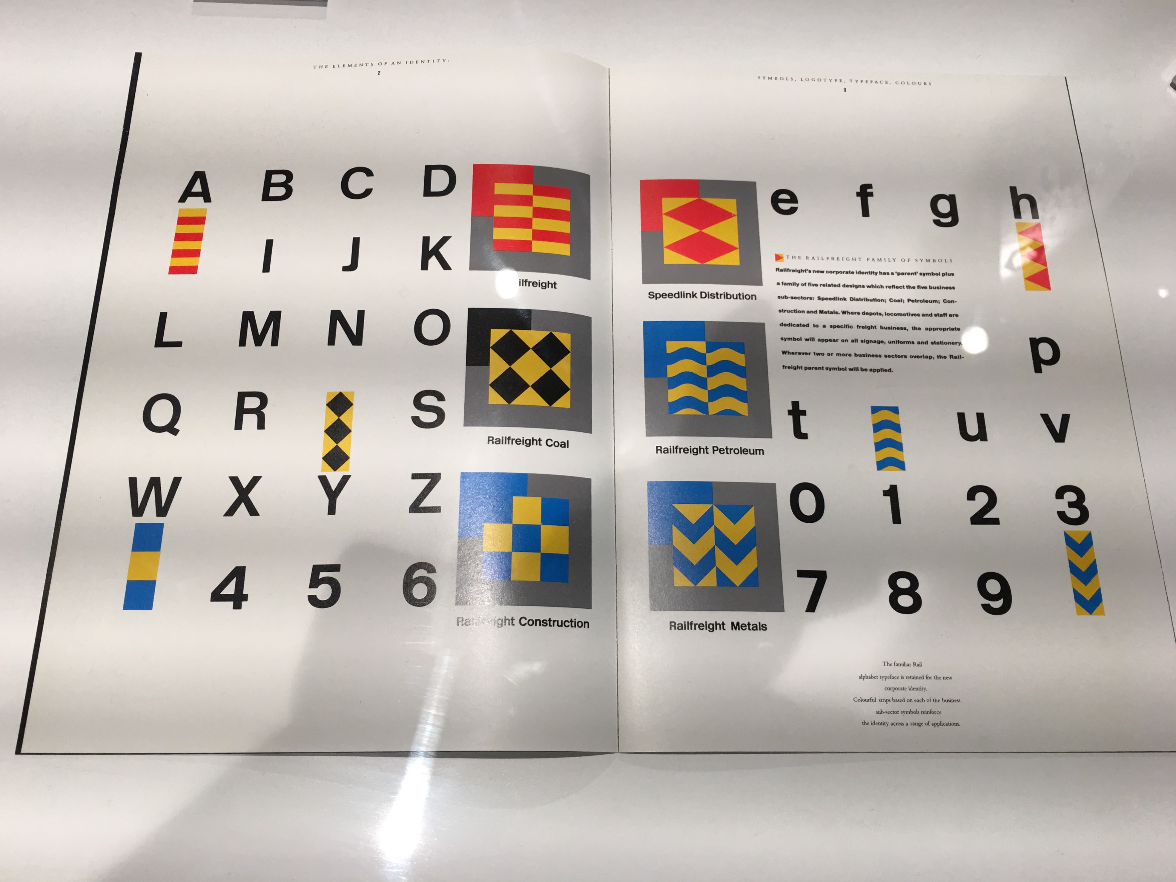
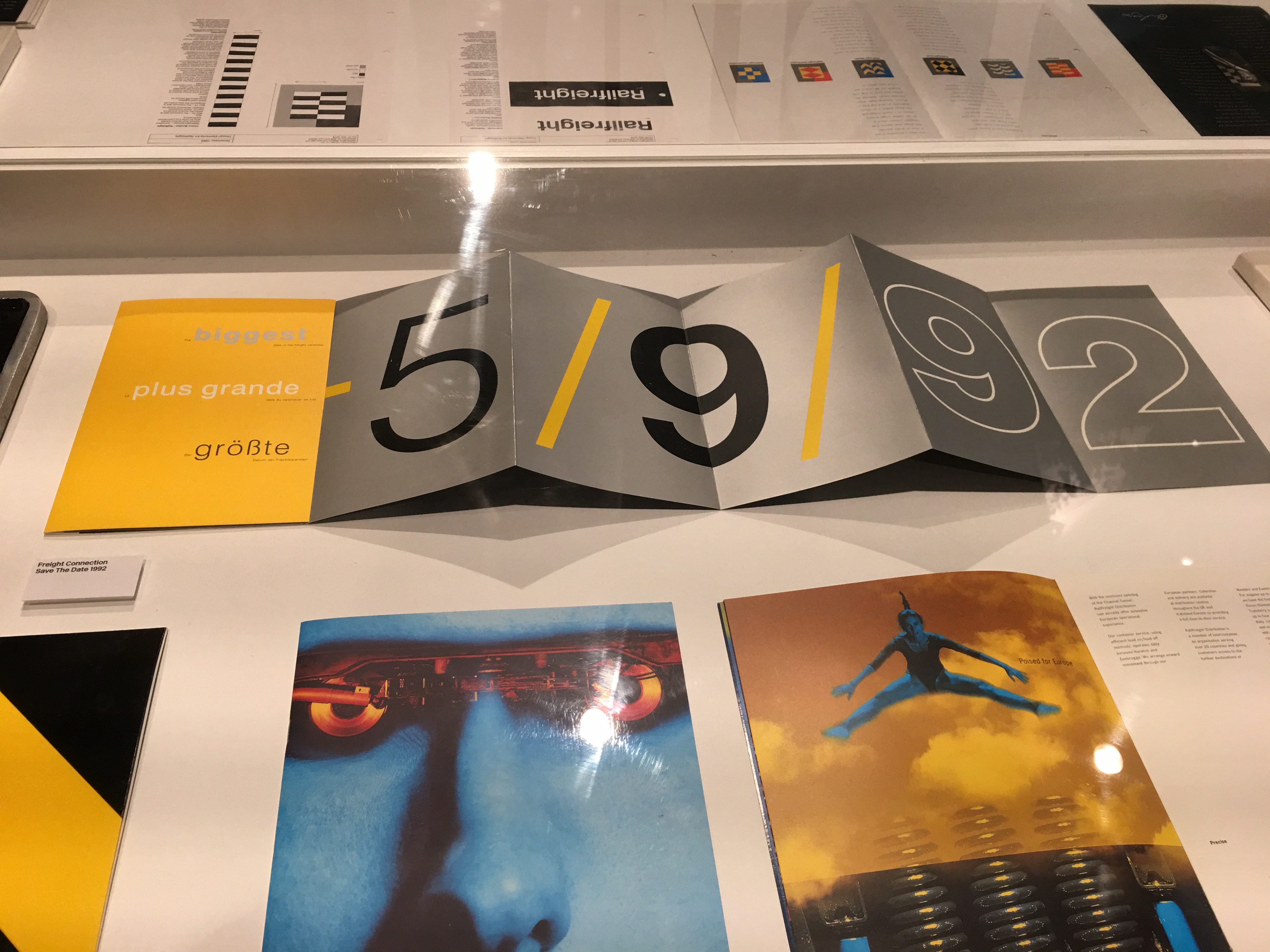
Way, way back in 2007 when no-one cared whether you said blog or blog post they were just happy you were blogging, I wrote about the British Railways Board Environment Identity Scheme which I was a bit obsessed with since a teacher at college showed it to me.
Funny how things worked then, when I was in college, before blogging and mainstream publishing on the web. A teacher would grab a book from a shelf, show you something, and it would stick half remembered in your mind forever.
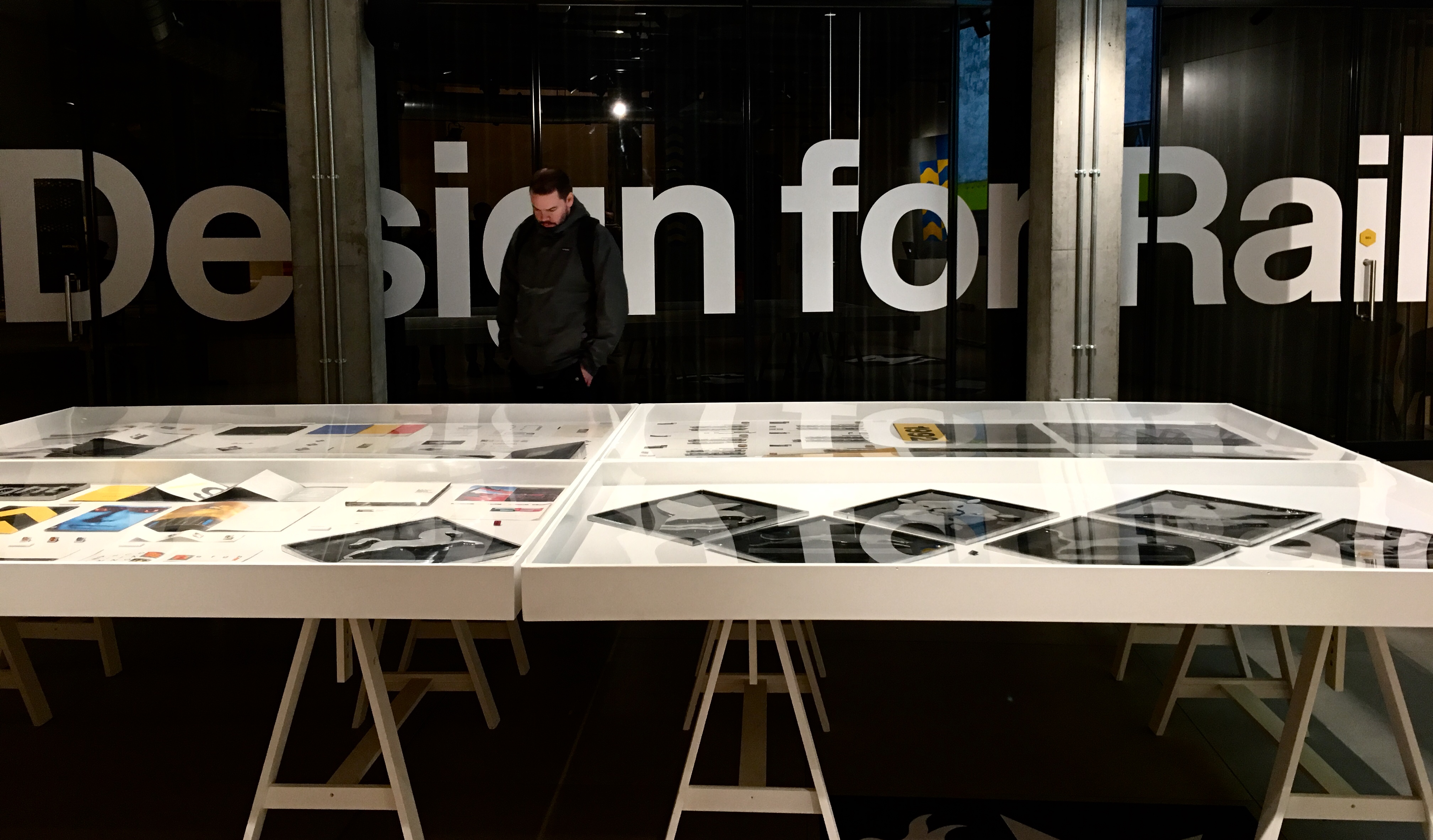
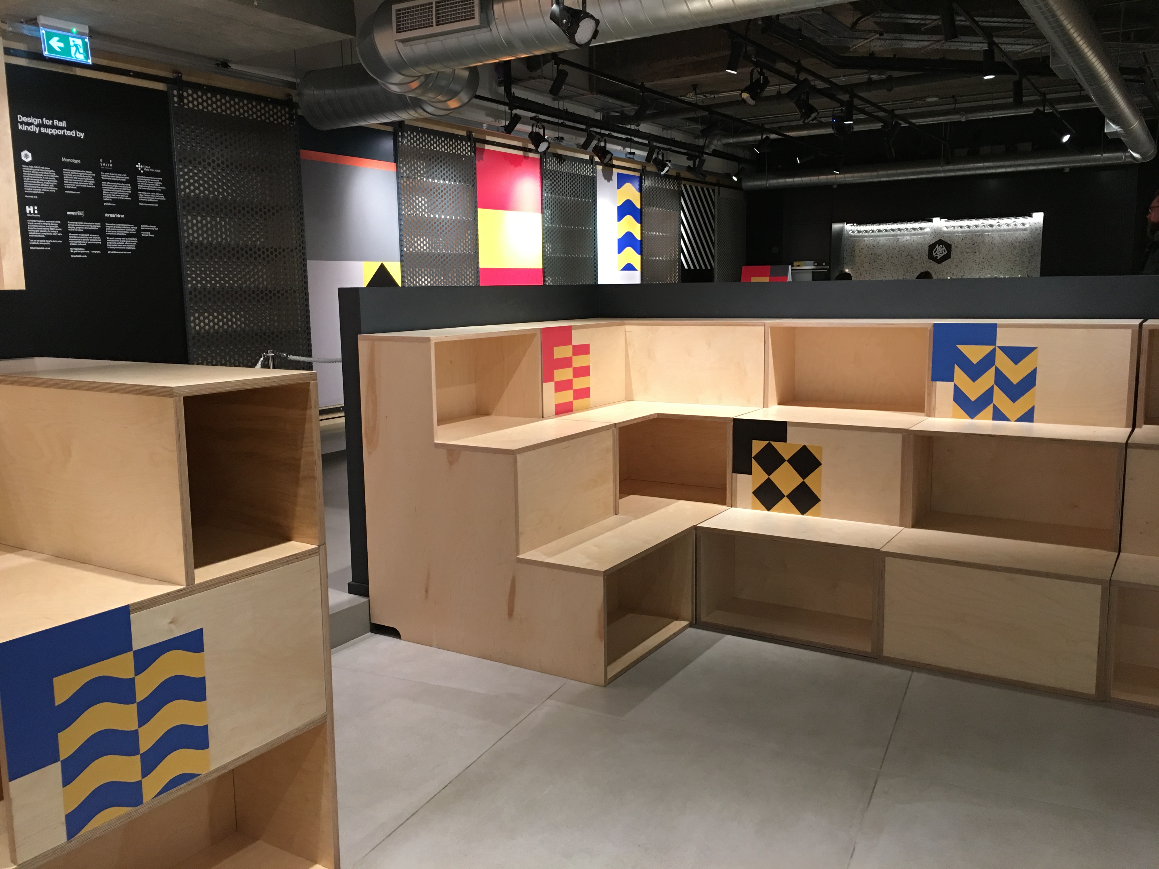
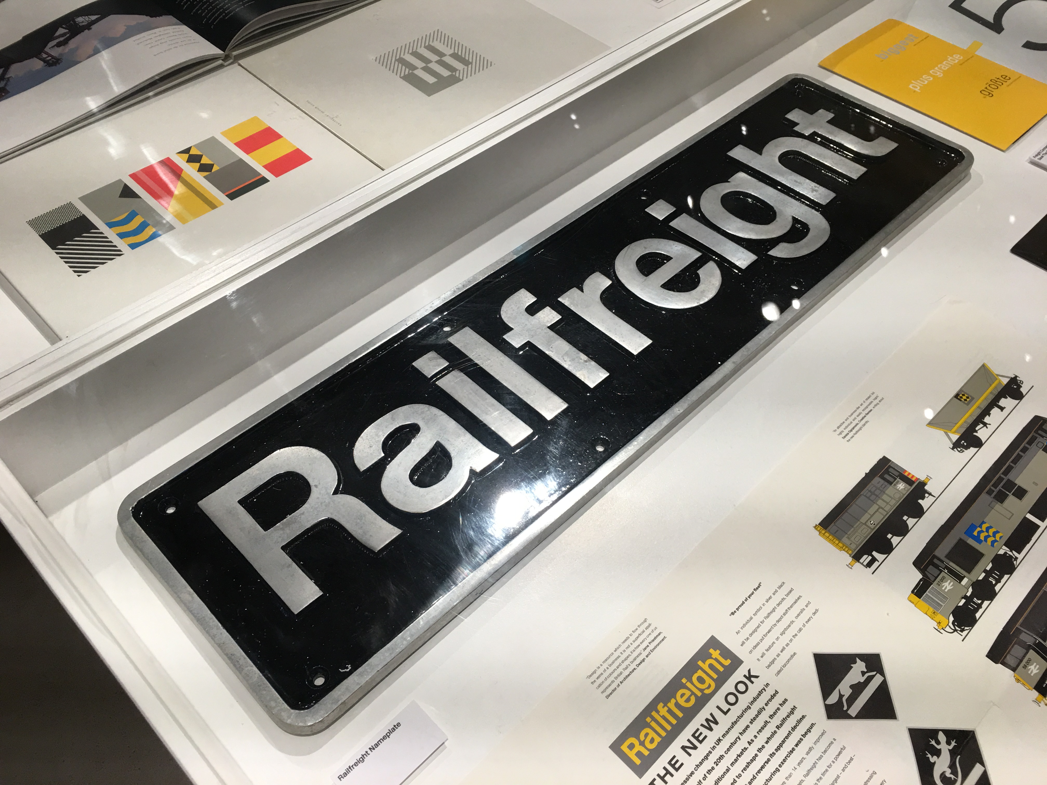
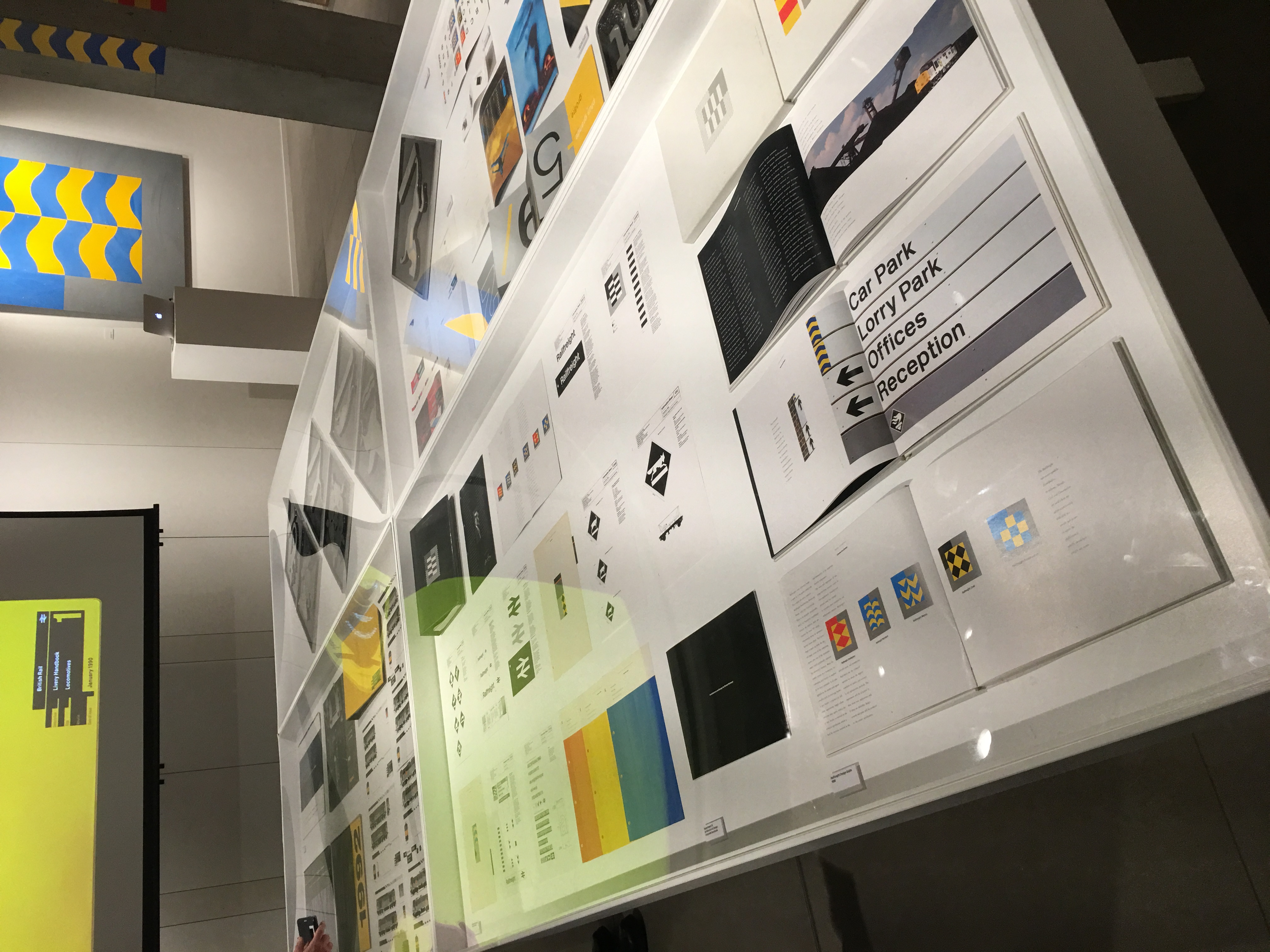
Anyway an email I received about that blog up there from the son of a designer who worked on the project led to this article in It's Nice That which maybe led to this exhibition by SEA Design at the D&AD a few weeks ago. And so I finally got to see that half remembered graphic design work in the full technicolour glory of a small dark exhibition. Design for Rail.
I think that's probably enough now. We can all move on.
But a few quick thoughts.
1. It's lovely. This more than anything else feels like pure real graphic design to me. It isn't obviously, and I'm showing everything about my design background and education in saying that. I bet there are many others like me. I'm hyper aware of how dated that reaction is, the work isn't necessarily dated, but my reaction to it is. Like going into a screaming fit when you hear Paul McCartney has landed at Terminal 5. Reaction nostalgia.
2. There's a bit of evidence to say the railways never really liked it. That it worked better as pure graphic design. Would love to know more about that.
3. The exhibition was good, the D&AD should do more stuff like that.
I enjoyed that.

Ben,
on related railway and graphic design, in case you and your readers are not aware of this, I think the book was produced as result of a kickstarter campaign.
https://britishrailmanual.com/
Posted by: Harold | Mar 16, 2018 at 15:34