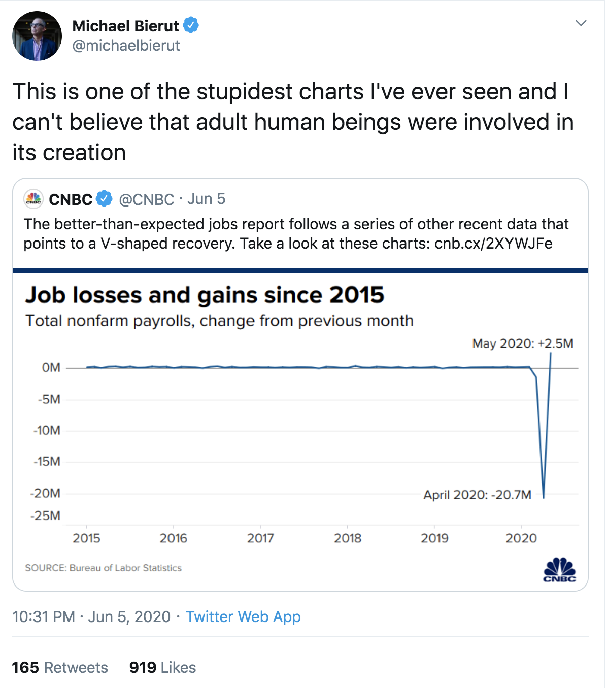
After this one the other day, here's another bad chart. Or as Michael puts it, "This is one of the stupidest charts I've ever seen and I can't believe that adult human beings were involved in its creation". His tweet here.

We've been here before, in November 2008 during the "credit crunch". In fact I wrote A LOT of blog posts about it at the time. I even did a whole series of guest posts with advice for designers to help them get through a recession. Included posts from an accountant and an agency CEO.
Yeah, I know. Different times.
Anyway the best thing to read is probably this blog post by Phil - Graphs that lie.
Recent Comments