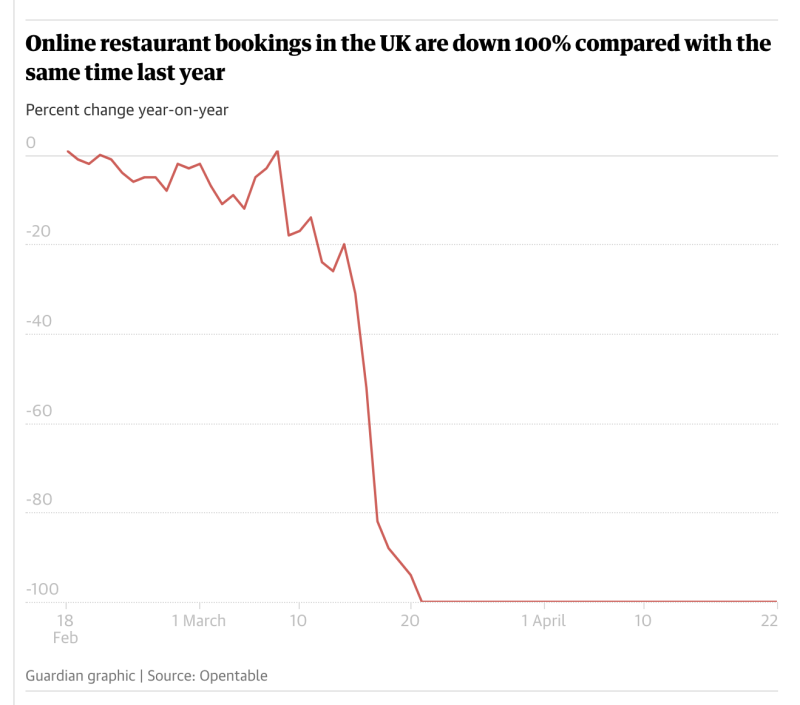
There are lots of charts like this at the moment. I really don't understand the point of the chart. 
I mean, yeah, obviously. And yeah, good. Well not good, but appropriate and so good. It's exactly what you'd expect to see, isn't it?
I guess the stark lines are very attractive to editors and, yes, to graphic designers.
Anyway. Not helpful, sorry.

Comments