Art direction. We spoke about that along time ago. Nearly 7 years ago - remember?
I keep seeing these two posters around town, one is an example of bad art direction, one is an example of good art direction.
First, the bad.
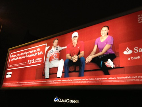
You would think these ads would be a gift for any agency. They feature three hugely recognised sports stars. Rory McIlroy is probably the most famous golfer on the planet, after Tiger Woods. Jess Ennis is stilll basking in the glow her amazing Olympic performance. (And Jenson, bless.)
But who on earth decided to put Rory in a red polo shirt? On a red background! I'm guesisng the red background is a standard brand thing for Santander, in which case someone has to ask Rory to wear or different shirt. Or, more likely, provide him with a different shirt on shoot day.
And Jess! Star of the Olympics! Inspiration to a nation! Who put her in that purple? Which is redish and doesn't really stand out from the red. Both of them just blend into the background.
From a distance its really hard to notice them.
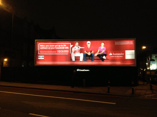
It's lazy art direction. Bad.
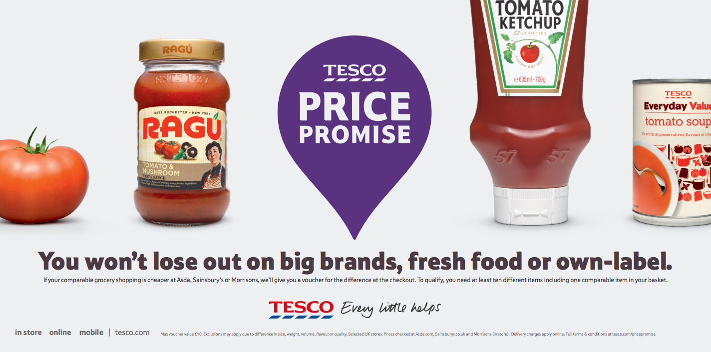
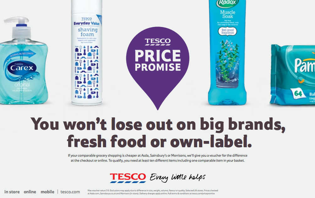
Now here's the good. Disclaimer, this is done by my old agency.
These ads don't feature any glamorous celebrities. They're pretty straight retail ads. The feature groceries. Groceries. Yet the art direction is exquisite. Crafted. Considered. Clever.


There's a whole series of them and the way they're based on the colour spectrum is beautiful. It makes my design disease heart leap for joy. Such a simple idea. The use of the slightly off white colour is well thought out. The lighting and the typography creates the feel of the checkout in an elegant way.

But they're cleverer than that. All the ads feature something big brand, something fresh food and something own label, which is the point of the ad. Not just beautiful - smart and communicating a message. Brilliant.

Good luck ,Great post,love you!Thanks for the info it had cleared out too many things in my mind. Your recommendations are really good.
Posted by: Skin Whitening Forever | Mar 27, 2013 at 09:17
Serious question Ben. Does the fact that I had not and probably would not look close enough to register the points you praised in your penultimate paragraph render the art direction moot. Would good enough art direction have sufficed as far as punters are concerned?
Posted by: john dodds | Mar 27, 2013 at 10:29
Agreed. The Santander ad looks a bit of a mess, but the Tesco stuff is both functionally great and well crafted too.
Posted by: Rob | Mar 27, 2013 at 14:00
Excellent post, great insights, thank you, I had not consciously noticed the lighting and typography.
Posted by: Harold | Jun 04, 2013 at 09:26