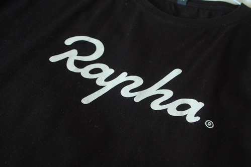
I love the Rapha logo. Amazing craft in the hand drawn type. The curves and proportions are gorgeous. Luscious and rich and yet simple. Beautiful.
The other week we visited Lance Armstrong's shop Mellow Johnny's in Texas. I bought this tshirt.
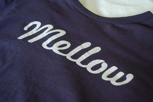
It's not the Mellow Johnny's logo, it's just a graphic on a tshirt. Similar to the Rapha one, isn't it.
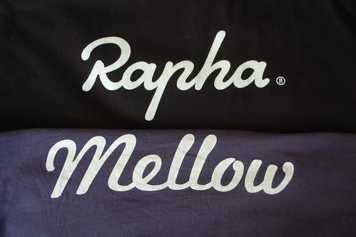
An homage, maybe? I'm not complaining. They're both good brands and they both look great. I'd like more stuff like this.

I quite agree, though Rapha looks relaxed and easy going while mellow is more disorganised, dontcha think? Look at the ascender on the rapha h, and the more blobby ascender on the mellow l.
Posted by: A Facebook User | Apr 17, 2012 at 18:15
Rapha's is way nicer I think and definitely looks to be completely handdrawn/bespoke.
The Mellow one looks like it's been typed using an existing script font. If it is, I wonder what face it is?
Posted by: Futurefabric | Apr 18, 2012 at 11:10
My Rapha logo is better than the Mellow logo.
Posted by: Gtypefoundry | Aug 05, 2012 at 23:04