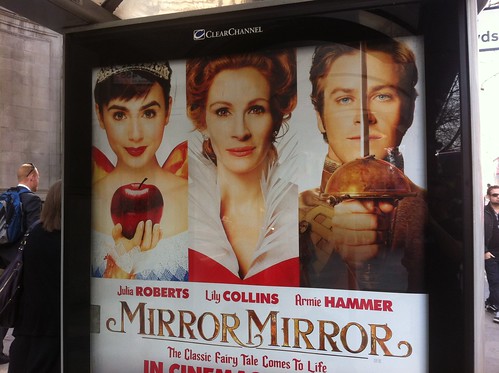
1. It's well known that in Hollywood studios and agents fight over who gets top billing on a film. Essentially whose name is at the top of the bill. Or these days whose name comes first in the opening credits. It also translates back to the film poster, the equivalent of the 'bill'. So you'll always see the biggest stars name first on the poster. But visually, the picture of the biggest star may not appear first. In fact the biggest star may appear in the centre because that's where, visually, the most important thing often goes.
So you often get the scenario depicted above where Julia Roberts' name is not underneath the picture of Julia Roberts. In fact you could be forgiven for thinking that Julia Roberts is the young dark haired lady on the far left and that the older red haired lady in the middle is called Lily Collins.
Look out for this. You see it all the time on movie posters. Often you see a male name under a picture of a female. Because the two decisions, who gets top billing and which picture goes where on the poster, are taken in isolation. Politics getting in the way of the punter understaning the communication.
- - - - - - - - - - - - - - - - - - - - - - - - - - - - - -
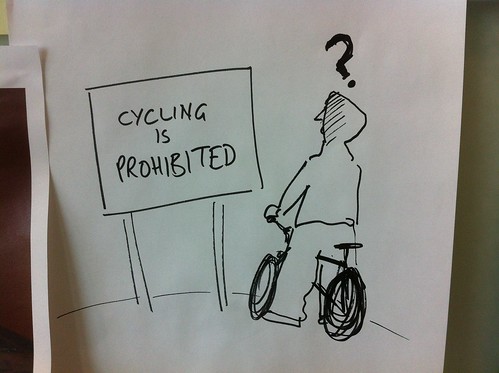
2. This really annoys me. When people use language that makes sense to the creator of the piece of communication but makes little or no sense to the intended recipient of the communication.
Like in this example. How many of the kids in hoodies riding through the park on low slung BMXs do you think know what prohibited means?
OK, they may know what it means if they stop and think about it. But is it commonly understood language aimed at them that they can understand instantly?
- - - - - - - - - - - - - - - - - - - - - - - - - - - - - -

3. Too many logos. I'm not against logos. But I bet what's happened here is that everyone of the these agencies has contributed to the cost of this ad and so everyone of them wants their logo on the ad.
Why? So they can prove to their boss that something has been done.
But the end result is meaningless for the reader, the user, the punter. The man on the street needs to know that this is an official piece of communication and not something by Coca Cola or Persil, so it needs a logo and probably the 'highest authority'. I'd guess at that being TfL or Dept for Transport. If it were me I'd go with Tfl. And that's it.
As we say at GDS you shouldn't need to have to understand how government works to be able to find something out. That same rules applies here. The punter doesn't care about the Highways Agency or the National whatever.
- - - - - - - - - - - - - - - - - - - - - - - - - - - - - -
You see these three things all the time and they annoy me.

Logos don’t annoy me as much as awkward copy. The ORN poster is worse than the cycling one in this regard – vague and in the passive voice. Should we be worried that some roads (though we’d have to check the website to see which ones) might be upset? Unusually twisty? Upside down?
It’d be nicer if it said ‘If you see this sign on a road, it means it’s going to be totally buggered during the Olympics’ and had a picture of a sign with a skull and crossbones or something appropriate. But then TfL would need to spend money sticking up signs on roads, I suppose.
Posted by: Peter Parkes | Mar 26, 2012 at 11:42
When you need a whole 'Fag Warning' bar for the logo's that make no difference to the end audience whatsoever you know something went wrong...
Posted by: Rob | Mar 26, 2012 at 13:13
#1 Annoys me too, and has for years. The worst example of this, in my opinion, is the poster/DVD cover for "Nothing to Lose" with Tim Robbins and Martin Lawrence. Here, the names of the actors are actually placed ON TOP of wrong man. Here is the image:
http://www.impawards.com/1997/posters/nothing_to_lose.jpg
I can't believe no one thought to change the layout, or to stage the photo accordingly. Or at least flip the photo at the very least. ... However, I'm laughing imagining that someone is going through life saying "I really like Martin Lawrence. He's a great actor"
Posted by: Scottperezfox | Mar 26, 2012 at 15:32
Clearly they don't care about the accuracy of the messages (sigh). The games billboard is an important message and it's not big enough or clear enough to read from a car on the other side of the road, let alone obvious enough that it's an official message.
Even worse, an awfully unimaginative film poster design for something that's visually quite a creative story! My pet hate with those usually, is the fact they ruin a good poster design with '5 star reviews' all over them. Not objective so what's the bloody point? You'll never see honest reviews on them or a 1 star quote, so they're effectively useless. If I remember correctly, the 2:10 to Yuma poster was really nice but plastered with reviews across the top moving your focus away from a really good image. (end of rant)
Posted by: Minxlj | Mar 28, 2012 at 09:50
'adverse camber'
Posted by: I4_1 | Apr 02, 2012 at 22:16