Saw this last night. I hate to be negative, but I think there are lessons here.
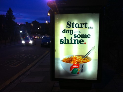
The typography on this ad is awful. It's a simple line, just six words, that have been made harder to read by the design.
Your eye has some real work to do getting from "the" and then back to "day" all the way on the other side of the 6 sheet. Reading makes you feel a bit sick as your head has to do so much movement from left to right and left to right and…
It looks like they're trying to hide (or lose) the word "the" which would be OK if you could read the line without it, but you can't really.
There's absolutely no hierarchy to the information. I'm pretty sure each of the six words are a different size which makes it really hard for brain to work out which words are important. If I was walking past quickly, what's the take out - start shine?
Why underline start?
This kind of typography is hard to get right, but this an example of how not to do it.
Legibility is key in any form of communication. If you can't read the line then that's game over.
(All that and we haven't even started on the puntastic line.)

Oh, 'some shine' haha. I didn't get that for ages. Perhaps it was the awful typography indeed.
Posted by: Adam Wilson | Aug 25, 2011 at 08:58
I am also very against the recent Special K ads due to their questionable font combinations. The wispy script with that stumpy slab-ish thing really bothers me.
Eg: http://adsinmyway.blogspot.com/2011/01/flaunt-those-jeans.html
Posted by: Euphiophone | Aug 25, 2011 at 10:04
It is
surprisingly
bad
typography from
such a big
brand.
Posted by: FamousRob | Aug 25, 2011 at 11:21
@Euphiophone Haunt your jeans??
Posted by: FamousRob | Aug 25, 2011 at 11:22
I'm with you on this, no reason for the odd alignment and hierarchy that I can see.
Start (the) day (with) some shine
Some (the) designers (with) should stop
Shit (the) day (with) suspect suicide
tut
Posted by: AAMpCreative | Aug 25, 2011 at 13:59
you should try to find this designer and ask him what he was thinking. Why did he underline the word "start"? And why put the rooster on the bowl? And where's the milk? Are we supposed to eat dry cereal and have a good day? When you have to do that, It's probably because you're piss-poor and you're probably gonna jump down a bridge that same day. Kellogg's basically promotes suicide on their ads! Have a good day...
Posted by: Sebastien Paquet | Aug 25, 2011 at 15:53
Is this genuine?
Posted by: Pmurraydesign | Aug 29, 2011 at 12:46
Part of good typography is knowing where to split a line.
Incidentally, did you know that the colours of the Kellogg's cornflake pack derive from the Welsh flag? "Ceillog" (excuse the spelling) is Welsh for hen, and sounds like "Kellogg", hence the image of a hen.
It strikes me as a "the boss did it" design. I had to put up with that a lot in my first job. There's a certain brand of tap that I should have done the logo for, but my boss did and it's awful. Trouble is, it's a very, very popular make and I see it every bloody where.
Posted by: Jbaldwin | Aug 31, 2011 at 13:07
It's Leo Burnett I think (they do Europe & North America). Somewhere, Leo's pencil cracked in two.
Posted by: Wankyplannerblog.wordpress.com | Sep 06, 2011 at 09:43