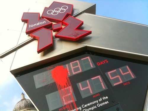
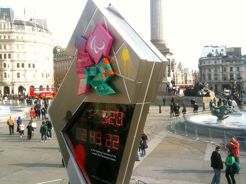
I popped down to Tralagar Square today to take a look at the Olympic Clock.
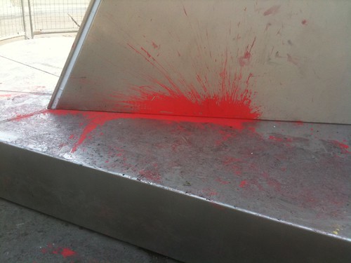
It's been vandalised, presumably during the march on Saturday. Unless it's all the people from the comments thread on the Creative Review blog who really hate the logo.
I'm pretty strongly against vandalism. It's what stops me from liking graffiti as much as other graphic designers (NB I'm not saying graffiti is necessarily vandalism , that's a whole other blog post for another time). But in a weird way these paint splashes make the clock look better. They almost look part of the branding.
Good colour choices. Makes it feeling exciting. Adds movement.
The clock itself is actually pretty dull. The steel seems old and tired. The shape ought to be exciting but it doesn;t come across that way. It doesn't really fit in Trafalgar Square. It feels small, both physically and conceptually.
But that's the problem with this damn logo isn't it - all the executions are weak. I love that logo I really do, but it' so hard when all the supporting stuff seems to lack the energy and boldness of the original concept.

And the typography. Jesus Christ the typography.


Recent Comments