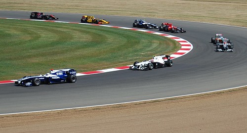
I was at the British Grand Prix on Sunday. As ever I was keeping my eye out for some interesting graphics design.

This font only seemed to be used on the tickets and car park stickers, but I thought it was quite interesting. I'm assuming it was hand drawn, mainly because I can't be bothered to look for it online. It's obviously been designed to resemble a motor racing track. I think it does that well. Not line crosses another, you can 'race' your finger round each 'track'.
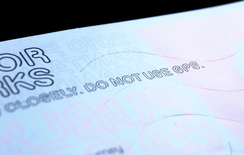
Sure, it's a teeny bit cheesy, but it's a decent idea and it's a very had thing to pull off. It's cute and it's simple enough to read. AND READABILITY is important. It's also a nice change from the speeding lines typography and forties pastiche you normally get at motorsport events.
It's not perfect. It's not brilliant. But I like it.

I'm not enough of a designer to spot the imperfections. I think it's brilliant. Love the fact the designer put that twist in the I, which could have been a straightforward rounded rectangle.
Posted by: Mike Reed | Jul 13, 2010 at 11:40
Quite interesting. It's surprisingly legible and still accomplishes the feel that it's going for.
Posted by: Lee Benson | Sep 03, 2010 at 06:50