By Phil Gyford.
« I never really understand what Bureau l’Imprimante is up to | Main | I have... »
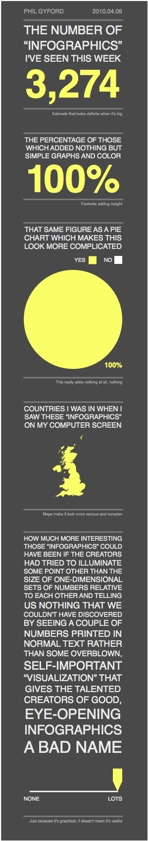
By Phil Gyford.
As a final step before posting your comment, enter the letters and numbers you see in the image below. This prevents automated programs from posting comments.
Having trouble reading this image? View an alternate.
Your Information
(Name is required. Email address will not be displayed with the comment.)

The wind is turning.
Posted by: Loïc | Apr 10, 2010 at 10:36
Best infographic I've seen yet. So informative too! :p
Posted by: Matt | Apr 10, 2010 at 16:16
This is good stuff.
Posted by: Account Deleted | Apr 10, 2010 at 19:56
Haha, I love this. 'estimate that looks definite when big' - so true. I'm expecting a lot of crap infographics to pop up before the election... politics love infographics.
Posted by: Rachel | Apr 11, 2010 at 10:55
Great image Phil.
Spot on.
It's a point we try to impress on our graphic design students at the school of creative arts in Bristol.
They've just completed a project called complex simplicity that asked them to address an issue of importance using infographics. We got some great results that I'd be happy to share with you if of interest.
As a shameless bit of self promotion I attempt to use a form of infographics along with simple illustration to help me deal with the daily challenges encountered as a parent of two highly strung, over-excited ankle biters.
Have a look:
http://dadographic.blogspot.com/
Posted by: Gabriel | Apr 13, 2010 at 12:42
Wow--thank you for saying/showing my feelings exactly! Wonderful :)
Posted by: Scott Nelson | Apr 13, 2010 at 17:02