« Busy x 3 | Main | Chicken Graphics »
As a final step before posting your comment, enter the letters and numbers you see in the image below. This prevents automated programs from posting comments.
Having trouble reading this image? View an alternate.
Your Information
(Name is required. Email address will not be displayed with the comment.)

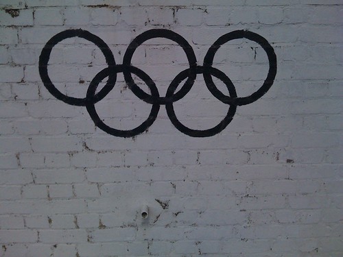
Depends what you mean by 'work'.
Posted by: Paul H. Colman | Apr 06, 2009 at 10:08
We all know what it is, we all recognise it. Does this mean it then works?
Posted by: Quality Sausage | Apr 06, 2009 at 10:16
i think because its such a well recognised logo it does but if it was something more complicated like the 2012 olympics logo it wouldnt.. Al All
Posted by: Jacob Hinson | Apr 06, 2009 at 10:51
I think it works in black and white for the same reasons Jacob said above. It is a symbol we all recognize and it triggers de colors in our mind right away as point of reference.
But I would say if it was the early days of this logo in this version as original then it wouldn't work the same way as the color version we know. The different colors suggest different countries intimately united. The monochrome version doesn't really suggest the idea of different elements together as one. However this is what you get when you photocopy or fax the color version anyway!!
Posted by: Stan Diers | Apr 06, 2009 at 11:06
mmm At first I thought yes but then it makes me think of the Audi Logo.
Posted by: Andy Coff | Apr 06, 2009 at 11:24
I guess it’s taking its cue from national flags, which only ever appear full-colour. (At least, you don’t see many mono French tricolors.) Interesting that flags get by without black-and-white versions. Quite interesting, anyway.
Posted by: Nick Asbury | Apr 06, 2009 at 11:25
Another point is the coloured logo conveys a joining in a positive way whereas this one almost looks like chains and conveys a completely different message.
Posted by: Andy Coff | Apr 06, 2009 at 11:27
I don't think it does at all. Yes it's still recognisable but surely a logo is about more than that? In black and white it fails to present it's message of hope and unity, and I feel it actually looks quite sinister.
Posted by: Dave Potter | Apr 06, 2009 at 11:31
You hardly ever see it in black and white but surely most people must still recognise it, so I say yes it works. The Rings represent the continents, I don't think the colours not being there takes anything away from the logo, it's form is still iconic and established.
Posted by: Steve Leard | Apr 06, 2009 at 11:56
Yeah. You can still tell it's an Audi.
Posted by: Simon | Apr 06, 2009 at 13:07
yes
Posted by: graham peake | Apr 06, 2009 at 13:26
Yes.
Posted by: Simon | Apr 06, 2009 at 13:44
what paul said.
Posted by: lauren | Apr 06, 2009 at 14:30
I prefer it to the full colour version.
Posted by: alexparrott | Apr 06, 2009 at 14:34
I don't think perception is altered by it being in mono at all. It may limit its application yes, but still delivers.
Posted by: Blair Thomson | Apr 06, 2009 at 14:47
Does it work as well as the color version? Nope. But as a screenprinter I have done this logo as it's included it the Special Olympics designs we have done for many years. Or for events that raise money for such Olympics. I would have to say yes it works.
As for the presentation that you put it in. ( seemingly printed on a stark brick wall) it conveys a different message than say if it were in black and white with no other imagery around it.
Posted by: Don Kelly | Apr 06, 2009 at 14:53
I'd say it still works just as well as a colour version. At the end of the day, it is still 5 rings connecting together - and you can clearly see it.
Just because we no longer have different colours to show that doesn't mean that they are all the same. Do you class a subscripted 2 different to a normal 2, because it is the same colour - No, because they are on different levels.
We can see that they are rings and that they are probably linked. Therefore unity.
Just because the colours lost doesn't mean the message is. And as we can still see this, it works. You now maybe have to look a bit harder for it, but i've seen other logos which are harder to see.
Posted by: Ashley Dean | Apr 06, 2009 at 15:48
It's clearly the Goth Olympiad logo and therefore works fine.
Posted by: John | Apr 06, 2009 at 17:58
Are you saying that before colour telly, logos didn't work?
Posted by: John | Apr 06, 2009 at 17:59
It's so strongly associated with the colour version that it might just as well be the colour version. I'm not sure it's even possible to judge it independently as a black and white logo anymore - it's like a representation of a representation.
So yes, it works - in exactly the same way that b+w versions of iconic logos like Nike and Apple do.
Posted by: Marcus | Apr 07, 2009 at 00:06
Imagine that we are pre-presentation and I had designed the colour version to everyone's liking, and then we were all standing round this black and white version...
It would have to have some cuts to illustrate the linkage. So would I then have to back track, applying the same shapes to the colour version? Would that look better?
I would choose to have a slightly different marque for the black and white version; one that was still recognisably the logo, but that was optimised to work in mono.
Posted by: Steve | Apr 07, 2009 at 02:50
I think it is about structure. Our mind simplifies structure and stores it. It applies what we see in everyday life too. We can differentiate between cup, glass or bowl.
I look at logos in black as silhouettes. We can identify people or things in silhouettes. We can do that because we store structures and gestures.
For this to work, the mind should have had sufficient exposure to the symbol to store the structure. At least, once.
Posted by: Sanjay Basavaraju | Apr 07, 2009 at 11:17
Yes.
Posted by: Guy | Apr 07, 2009 at 13:08
yes
Posted by: beeker | Apr 07, 2009 at 18:18
I prefer it in Black and White. Interconnecting rings in different colours to me somehow makes a statement that we're getting along for one event but aren't all the same. Maybe that has to do with modern issues of race and the current riff between East and West. Probably an unfair comment though as I'm applying an old logo to the modern climate.
I respectfully disagree with Jacob's comment though. The 2012 logo was specifically designed to work with any colour scheme, hence Lloyds TSB using a green version.
Posted by: Pete | Apr 08, 2009 at 12:49
but i think you misunderstood my point pete - what it meant was that the 2012 logo is far too complicated to be made into a straight black and white silhouette, whereas this logo is still seen as the olympics regardless of the fact it is b&w
Posted by: Jacob Hinson | Apr 08, 2009 at 16:14
I think you misjudged my comment, what i meant was that the 2012 logo would not work as a silhouette unlike the olympics logo as it is far too complicated
Posted by: Jacob Hinson | Apr 08, 2009 at 18:27
Why couldn't the 2012 logo work in 1 colour?
Posted by: Simon | Apr 08, 2009 at 20:02
This needs drips. And something witty spraypainted below it.
And yes, this actually looks very nice in black.
Posted by: Randy | Apr 08, 2009 at 21:19
There's something fascistic about it in B&W to me, although I don't think I can articulate why.
Posted by: Valarie | Apr 08, 2009 at 22:03
So, does your "about" silhouette wurk? Hmmm?
Posted by: SadQuestion | Apr 12, 2009 at 06:54
Does that logo work sprayed onto a wall? More to the point - WHY is it sprayed on a wall? I like it.
Posted by: Mat | Apr 12, 2009 at 15:19
black and white reminds me of the rip-off's made by human rights organisations last year. so rather no. but maybe it works on something else than this wall. though, the different colours stand for the continents and therefore underline the idea... then there s audi
Posted by: sincere | Apr 20, 2009 at 16:27