I saw Quantum of Solace the other day. Reviews can be found elsewhere, so let's concentrate on the typography.
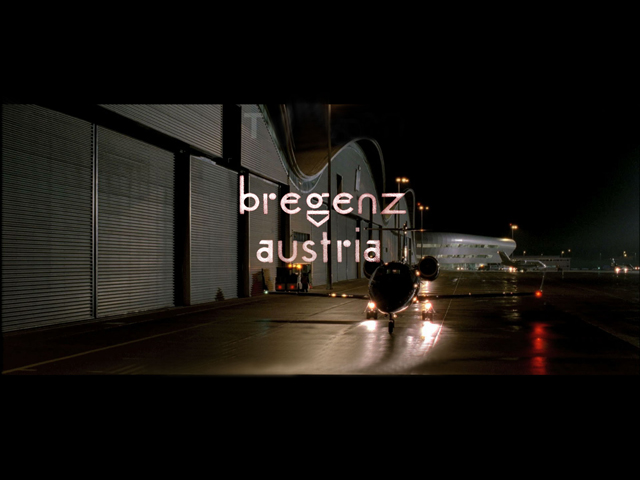
As the film moves from location to location these, quite intricate, titles appear informing you where the action is set. Sometimes they're simple text on screen as above. And sometimes they've part of the scene as below where a car drives over the word London.
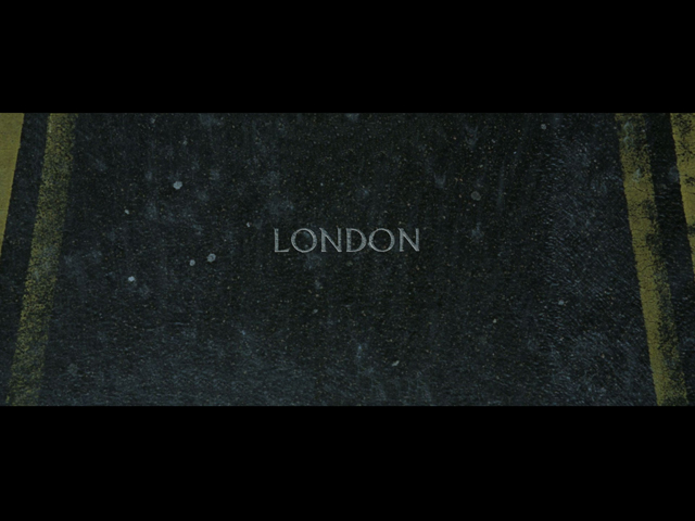
During the film, without giving it too much thought, I liked them. They're well done, clunky in places, but they look like they've been considered.
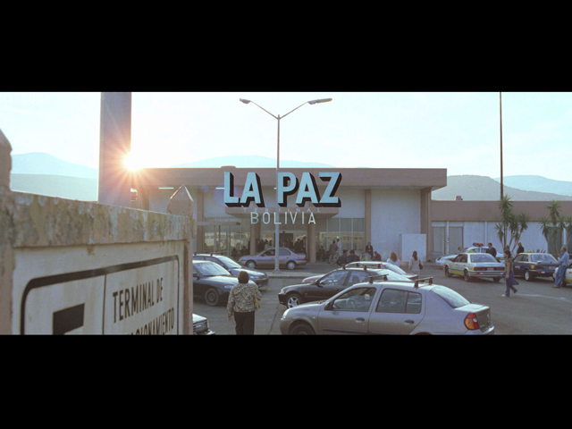
I wanted to find out more so I googled. Turns out most people hate them. Here's a good example, "don’t even get me started on the distractingly tacky typography that accompanies every location change" and "wtf was up with some of those fonts?” Time, effort and research, thats what!". This made me question my first thoughts. Maybe they are cheesy and hackneyed? Maybe I shouldn't like them?
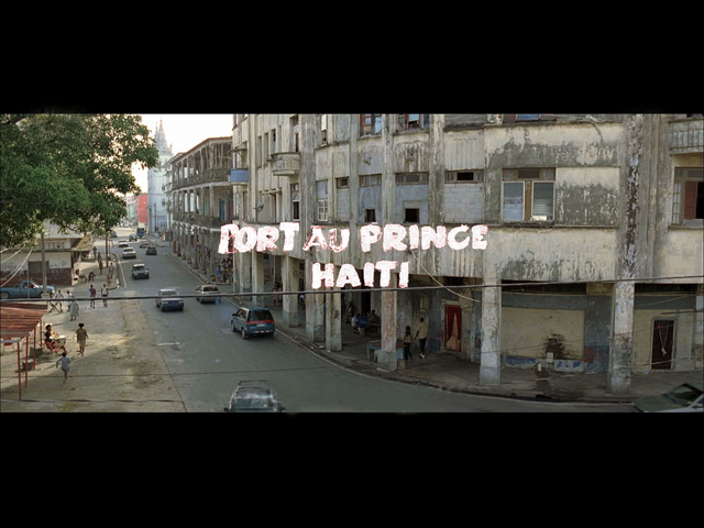
More googling explained that they were created by Tomato (which is where these grabs come from, thanks guys). I'm ashamed to admit that when I found out they were done by Tomato I was reassured. They must be OK if Tomato did them.
This, of course, is utter bollocks and I took myself outside and gave myself a good talking too.
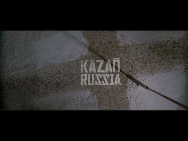
It doesn't matter (at all) who did them. And I'm not even a Tomato fan. At the very least, I suppose you could say that Tomato are more likely to have researched the fonts at some length. But still, it's irrelevant really.
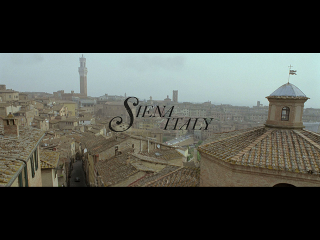
So I'm sticking with my gut reaction. My first instinct.
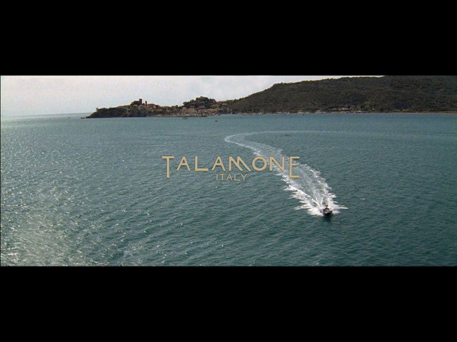
I like them. I enjoyed them during the movie. They're not perfect, but they're fun. I like them. Do you?

very similar to oceans12 isn't it? I can't bother to rewatch o12 to prove my point now but i did have a feeling that o12 kicked off a trend to better typography in films when i saw 007.
Posted by: Obi | Dec 16, 2008 at 08:06
I liked them too. I just thought it was interesting... Why would they need to be the same, it's not like you'd get confused what film you were watching...
Posted by: Jon Heslop | Dec 16, 2008 at 09:00
Thanks for reminding me of this - the QOS location typography was as utterly banal, over-designed, and bereft of even the merest hint of original thought as the film itself.
Posted by: bob | Dec 16, 2008 at 09:12
I haven't seem the film... he certainly gets around doesn't he.
I agree, great typography, especially La Paz and London. Hard to carry off without it becoming too stereotypical.
Posted by: one way photo / Mark | Dec 16, 2008 at 09:15
I liked them. They were distinctive enough to draw my attention to them but not so obvious as to distract me from the movie. Admittedly, I may just like the typefaces themselves. (But seriously, the real star of the show? That Microsoft Surface table. Crazy, possibly unusable interface design? Yes. Cool as hell? ABSOLUTELY!)
Posted by: austin | Dec 16, 2008 at 09:23
Liked them too, they were by far the best thing in the movie. Even if that's not saying much.
Posted by: Blip | Dec 16, 2008 at 09:37
@one way photo - judging by the screen grabs, I thought the font choices were all stereotypes. Call it 'stereotypography', if you want to give it a name.
For example, Italy gets more elegant typefaces, as befits those stylish Italians; Haiti gets -- surprise, surprise -- a graffiti-inspired brush font, which, in effect, tells the viewer (in case they don't already know) that 'this place is edgy, maybe even a bit dangerous; and Russia has what is probably the most predictable font of all.
None of this is any criticism of the Bond franchise. Bond is, in some ways, in a genre full of stereotypes. The viewer gets exactly what they expect. That's why it's so successful. Still uses stereotyped fonts, though.
Posted by: Chris | Dec 16, 2008 at 09:45
I loved them in the cinema, and still do seeing the stills.
They're representative of the locales themselves without being excessively stereotypical. I particularly like the London type, set against a road with distinctive UK yellow road lines. And the Russian one too. It would have been nice to see them all set against a "local" texture style backdrop.
People always get annoyed by change, and good design always has critics.
Posted by: Ben Bodien | Dec 16, 2008 at 09:52
Always a bit wary of pastiche, but this felt like pretty well executed pastiche. I suppose it makes a change from the faux-teletype scene labels used in every bond film since the 90s...
Posted by: George Morgan | Dec 16, 2008 at 09:53
I liked them. Anyway, I thought the *whole point* of Bond was that it was slightly tongue in cheek?
Posted by: gemma | Dec 16, 2008 at 10:21
best execution of this kind of thing?
Teachers. Channel 4.
Posted by: dan heaver | Dec 16, 2008 at 10:54
I'm going to go with my gut instinct too and say that I like them. People are so quick to criticise things that are different. I liked them because they added a creative depth to the film, and puts the film in a different league to other action films.
Posted by: Victoria | Dec 16, 2008 at 10:55
Liked them - but they are becoming a bit hackneyed as a device, they've been seen a lot on TV lately in US imports like Heroes and Fringe.
I also find them a bit distracting when they're not just overlayed captions, ie the London one where a car drives over it and it disappears under the car (if my memory serves me). This tends to take me out of the film as such, is a bit jarring at times.
Posted by: Duncan Swain | Dec 16, 2008 at 10:58
They get my vote too. "Not perfect, but fun" sums up both the typography and the film...
...and life in general.
Posted by: Richard | Dec 16, 2008 at 11:36
I'm glad you brought these up Ben.
I don't think they are necessary.
I thought that they didn't suit the more sombre tone of the film.
If Baz Luhrmann did this film, they would have better complemented his (likely) visually diverse style. They are rather odd stylistic bumps in a (given-rather-joyless) 2008 Bond experience.
Verdict - OK in themselves but ill fitting in the context that is surely the main reason for their being.
Posted by: Max Gadney | Dec 16, 2008 at 12:00
As someone who hasn't seen any Bond film except Moonraker, I think the La Paz one is far and away the best. Sets the mood without drawing attention to itself.
Posted by: Simon | Dec 16, 2008 at 12:35
I still haven't seen the film, but before I read that Tomato did them I liked them. Now I like them a little less because my gut instinct is to dislike Tomato work (just a little) to keep my jealousy in-check.
Posted by: Steve Price | Dec 16, 2008 at 15:19
They seem to be okay in the film, and I feel the reasoning here is because you don't have to view them all together; which, by the way, makes me want to vomit. I agree with Ben that they did not bother me in the movie except for the treatment they used on "Port Au Prince", I remember that sticking out in my mind when I was watching it.
Posted by: Richard | Dec 16, 2008 at 20:00
Thanks for this list. I must say consistent would have been better. I mean, I get why multiples were used, but a nice uniform look would have created a more unique universe in QoS.
Posted by: Dan | Dec 16, 2008 at 20:34
I liked them, generally. The location type itself was a tad on the hackneyed side, and a little inconsistent, but the opening credits were out-and-out fantastic.
More thought-out than most movie type, I'd say.
Posted by: Ragdoll | Dec 16, 2008 at 21:20
I really like them as well. I remember watching the movie and thinking to myself ... "Ooh, those look neat, not ridiculously cheesy, but fun and they fit nicely."
A few seconds later ... "Am I crazy? Is it wrong to like those titles?"
But in the end I realized that I do in fact like them.
Posted by: moeed | Dec 16, 2008 at 22:52
The Austrian typo looks like the original futura. And +1 for Dan Heaver's Teachers vote. Who designed those credits?
Posted by: Andrew | Dec 17, 2008 at 10:09
I loved them. It was one of the things that made my enjoyment of the film really; I just loved how they made each typeface 'fit' the place. Like the military-soviet style stencil one for Russia. And the swishy one for Siena. Lol, swishy. That's a technical term.
I was going to blog about this myself when I saw the film. Completely forgot. You've done a better job than me anyway.
Posted by: RacheL | Dec 17, 2008 at 18:45
Yep, they're good - I think the reason they get a bit annoying is there's so many scene changes in the film?!
Posted by: Ben Hanbury | Dec 18, 2008 at 11:17
I liked them too, I liked that somebody had thought it important to pay attention to the type. I agree with Austin though, that whooshy-table-thingy with the mind-blowing interface looked awesome!
Posted by: M | Dec 19, 2008 at 12:00
Not see the film yet, need to keep an eye out on sky, the type looks more fun than most bond films.
Posted by: boots | Jan 14, 2009 at 11:49