Right then, recession week over, angry head on. Three logos I hate and one that's not good, but it's better than what went before.
First up, Channel Five.
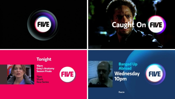
I really can't stand this. Channel Five (or Five as I suppose it's now called) have a history of terrible branding and this is no better. And it's certainly no better than what went before. So why bother changing it?
To be fair it's better when it's animated on screen, which is it's main usage, but overall it's dull and lifeless. It has no punch, no point, no edge. It feels flat and very ordinary.
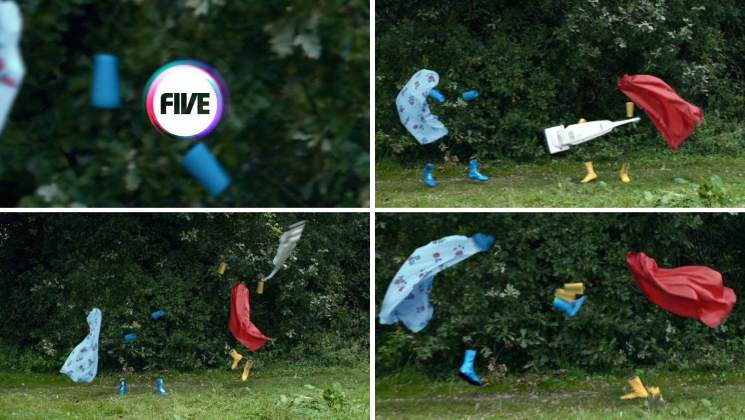 Five branding by DixonBaxi all images taken from their website. Usual rules apply.
Museum of London.
If you'd have told me about this over the phone, I'd have said that I loved the idea. I think the idea of having three logos that come together to form one is clever and solves one of the biggest problems the organisation faces, getting people to link all three museums. This bit “The colour palettes of Museum of London Docklands and Museum of London Archaeology’s new logos, feed into the layers of the main brand mark, creating a family of three destinations, united in a single mission: to inspire a passion for London.” is good. Very good.
Brave idea, good thinking - it's just a stylistic mess.
It's looks too now, too of the moment. It looks like it wants to play with all the other swirly rubbish logos around at the moment. And that's not a good thing.
It's like the confidence of the idea didn't come through in the execution which is a tragedy. Coley Porter Bell are one of the big names of graphic design; this is an opportunity missed.
Creative Review have more on this.
Barclaycard.
Fucking hell. Where do we start with this? Awful. Meaningless. Irrelevant. Confusing. Ugly. What's the point? And why is that bloody Y floating in mid air?
Logo by the Brand Union, another big name. Again Creative Review have more on this. Check out the comments.
Currys.digital
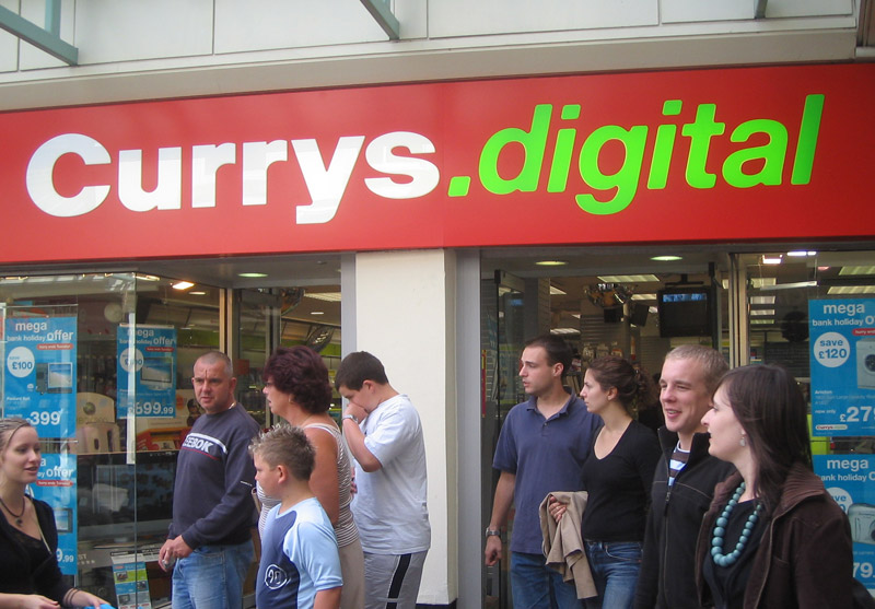
Now here's an odd one. We've talked about Currys before and their awful renaming, rebranding exercise. But let's recap quickly. Dixons and Currys rebranded all their high street stores as Currys.digital. it looked like this.
Pretty bad, huh? So imagine my surprise when I saw this the other day.
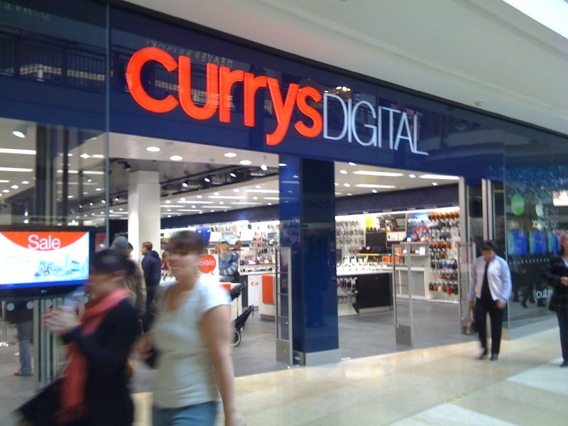
Not fantastic, but it's a lot better. A great improvement. But what's going on? I haven't seen this anywhere else. It turns out that Dalziel & Pow are trialling a new store format. It's being trialled in 25 stores up and down (and presumably across) the land.
This bit sounds interesting, "What you'd see as a customer would be grid layout of the store as opposed to the old herring bone, so when you walk in you will immediately have clear line of sight right to the other end of the store, we have much better clarity with the signage and the look of the stores."
I haven't seen anything in the design press, so we'll see how all this develops. As I said, not fantastic, but a lot better.
So, what do you think? Like any of those logos?
I have the courage of my convictions and so I've linked to all of the companies responsible. If any of them would like to comment on here, that would be great. I'm also aware that big branding exercises like these are fraught with difficulties and obviously there are individuals out there toiling away for hours on these projects. Please don't take it personally.





The new five logo also caught my eye, not for any good reason, but because it looks like the living logo: http://www.taylorherring.com/images/living_logo150.jpg
Branding suicide?
Regarding Currys, the less lime green on red we see the better.
Posted by: Tom H | Nov 16, 2008 at 23:32
I really like the Museum of London logo. I think it is fitting for a museum to have a "now" logo since they are in the business of expressing the essence of different time periods.
As for Currys, I like the way it is integrated with the architecture of the store. It reminds me of the old TechTV graphics in a good way.
Barclaycard. Oi! This had so much promise. Unfortunately, it suffers from AT&T deathstar envy.
Five. Ugh! Reminds me of those crappy independent magazines from the 90's that were all about style and layout and had no content whatsoever.
Posted by: Chris | Nov 16, 2008 at 23:38
The Museum of London logo looks like it would be good friends with the new Art Gallery of Ontario logo (http://torontoist.com/2008/05/ago_new_logo.php). Lots of colours! Overlapping!
Posted by: Dory | Nov 17, 2008 at 01:55
I didn't mind the outgoing Five logo, agree with the collective comments on the new one - my main dislike about the Five branding is their naming of spinoff channel, Five Life which has been rebranded as 'Fiver'. It wasn't great before. It sure ain't great now...
It's got to be a matter of time until Barclaycard call Rowan Atkinson back, dump the new brand and re-establish itself. It's so anonymous, which can't be good for a credit card business in a crowded market in harsh times.
Posted by: Simon | Nov 17, 2008 at 06:56
Haha, I’m glad to see that even U.K. can be the victim of grayscaled/multicoloured logos.
Like this typically french ’00s one: http://www.infos-du-net.com/image/Logo-SNCF,0101-4574--2-3-1-jpg-.html
Maybe we should create a european union against this threat?
Posted by: Loïc | Nov 17, 2008 at 07:50
Nail. On. The. F******. Head.
Posted by: peaky | Nov 17, 2008 at 10:31
Five - as someone that doesn't even flick to the channel, ever, I am still somewhat confused by Five. Be one thing, or another, but choose and then stick to it. Channel Four is a great example of this.
Museum of London - There have been a few logo's like this already. Brasil for one. I know that everything has been done before and it is harder to create something unique. Having said that I do like it on face value, but as a visual creation of splendor, I just know that it looks very similar to something else, which for me detracts the value of the branding.
Barclaycard - Talking of unique... it is too AT&T for me. For that reason I am loathed to love it, but I do like the advert on TV only because the idea of going down a water slide that spans an entire city is the kind of thing I would buy if I were Mark Zuckerberg.
CurrysDIGITAL - I'm not a fan of lowercase then uppercase with the same X height.
Posted by: Steve Price | Nov 17, 2008 at 13:00
Barclaycard - Looks like someone just found the 3D capabilities of CS4.
"Hey! Thats cool! Lets do something with it, but what? Hmmm... Oh hey how 'bout we put it on a logo. Awesome. Another satisfied client, Oh almost forgot, lets levitate that 'y' for good measure. Done."
Posted by: Richard | Nov 17, 2008 at 15:21
Speaking of bad logos. I'm not sure how anyone else has felt, but I didn't much care for any of the new automobile manufacture logo re-designs they talked about in DW. But, then again I don't particularly fancy 3D logos seeing as they are kind of limited.
http://www.designweek.co.uk/Articles/140512/How+automobile+logos+define+a+brand+.html
Posted by: Richard | Nov 17, 2008 at 15:26
The creatives on the Barclaycard pitch must love their Sony Ericsson devices -shockingly familiar, ghastly icon!. Never leave home without one!
Posted by: Blair Thomson | Nov 17, 2008 at 16:54
The problem with the Currys.digital branding starts with the stupid name. Do the bigger Currys stores only sell analogue equipment?
I did like the Museum Of London logo when I first saw it, but I see what you mean about it being a bit too "now". It'll be interesting to see how well this one dates over the next few years.
The Five one isn't as bad as Fiver, which is based incorporates an Amstrad-style flashing cursor for some reason.
As for Barclaycard.: sheesh.
Posted by: Daniel | Nov 17, 2008 at 17:06
Blair Thomson: spot on! I hate how S Ericsson use it instead of a heart sign, perhaps Barclays will do the same:
I [Barclays logo] Short-selling.
Watch this space.
An excellent post may i say.
Posted by: poohugh | Nov 17, 2008 at 17:28
It makes a change not to see a WO logo featured in a logo rant.
I know its been a year now , but is there anything worse than their WACOM logo.
At least you get the impression that the 'FIVE' logo was considered firstly in 2D B/W before being subjected to a CS blitz...not that I like it much.
The Currys logo is so bad it can only be judged in terms of the brand decisions that have been made with regards to its high street presence. Can't help thinking they are going to regret dropping the familar Dixons red stylings. The new one feels like one of those electrical trade-in/cash places.
Posted by: Tim | Nov 17, 2008 at 20:09
not being a design person foremost, I ask the question, is there any proof that levitating a'y' or any other mid word letter will make good impact? Were they just wondering if 'y' was a vowel as in that song from the eighties, or is it more crass and we are made to think "but 'y'?"
Posted by: caroline | Nov 17, 2008 at 20:22
Maybe I've been staring at my computer screen way to long... but I don't see a Y floating in mid air? I'm confused on that one
Posted by: Deron | Nov 17, 2008 at 21:10
Couldn't agree more. I think they are all hideous. Hopefully they will be hit where it hurts them most; on the bottom line. These brands look so shite now (Currys won't end up rolling out that idea - it's too god) that surely they will only repel people.
The five one is so obtrusive on the TV now, which it didn't use to be - again evidence that none of these identities have actually been re-designed, just re-decorated.
Deron: drawn an imaginary line along the base of the word and you will see that the 'y' isn't on the baseline with the rest of the letters. Do you work for barclaycard?
Posted by: Tom | Nov 17, 2008 at 22:53
Actually, the Five logo got me instantly thinking about the rebranded Fiat logo: http://www.carpages.co.uk/fiat/fiat-logo-26-10-06.asp
As a general comment, i'm deeply annoyed by the trendy gradients/ 2.0 /f-ing shadow hi tech logos invasion. You want a good logo? print it out, go to a xerox machine, reduce it by 95%, photocopy it on a recycled low quality paper: still readable? Yes? That's a start.
Posted by: bob | Nov 18, 2008 at 01:00
Good post Ben, although I quite like the Museum of London. And with Five, well, at least they took the time to reference the Roman numeral with the V, although they would've thought of that 50 years ago, too.
By the way, if you're on a logo-slagging kick, I've been hoping you'll have a pop at the logo for the new Westfield mall. Maybe you can find something redeeming in it; it just reminds me of the 70s-era malls I grew up around in backwoods Canada.
Posted by: Alex | Nov 18, 2008 at 08:49
Of a bad bunch the museum is my favorite, I'd love to see it 'grow' in some kind of animation, it looks like a gooey blob. The wording on top breaks it for me.
Barclycard really should have tried harder, it's a logo to satisfy the suits, hits plenty of contemporary spots but ends up bland as.
Currys is simply awful in both forms, perhaps the stores as a whole are nicer?
FIVE I think struggles (Don't know when I last watched it) with more than logo troubles, I think however a TV brand needs to be see in action, best example in my opinion? 2012 logo that is simply naff on it's own, but I loved it alongside the (fit inducing) London 2012 video with thos retro swooshes and flashes bouncing around the place.
Posted by: KieranH | Nov 18, 2008 at 13:45
"Maybe I've been staring at my computer screen way to long... but I don't see a Y floating in mid air? I'm confused on that one"
The "y" is off the baseline, the bottom of the character should be aligned with the bottom of the "B" "a" "c" and "d" characters.
Posted by: dik | Nov 24, 2008 at 09:41
I think the Museum of London logo is similar to the Brasil logo, do you agree? They aren't the exact same but they are similar I think. Is this a current fad of overlapping colours and random shapes that I had no idea about?
http://www.international-confex.com/g/2008/ExhibLogos/Brasil_logo_223.jpg
Posted by: Victoria | Nov 24, 2008 at 14:10
I think that the Museum logo missed the retro-revival about 4 years ago when retro was making it's comeback. Oh you hip young designers.
Posted by: Richard | Nov 24, 2008 at 23:17
I have to say I like the Five redesign but dislike some of the colour choices they have made. Barclaycard on the other hand is one that I most certainly love. Finally Currys have done something that looks OK instead of that rancid green
Posted by: rmaspero | Dec 02, 2008 at 14:13
Five
Not a bad mark but generic and very corporate. Television brands should be warm, energetic and welcoming. This identity won't be missed.
Museum of London
Agreed. Visually problematic. The approach has been exhausted.
Barclaycard
A lot to appreciate in 2D and 3D. This is a skillfull symbol. Barclaycard is a global brand. I have some minor issues with the type but it's a creative globe.
Curry's Digital
Low cost and cheap are worlds apart. Cheap implies poor quality. Curry's looks cheap.
A.
Posted by: Andrew Sabatier | Dec 03, 2008 at 10:20
It's really nice to see someone brave enough to say what a lot of us are thinking. Loved your rant!
Posted by: Marnie B | Dec 03, 2008 at 23:51
Aw, I was really hoping some of the companies would have replied. Especially Museum of London, as I'd be intrigued to know what their staff think as opposed to the 'corporate line'.
For instance, where I work - part learned society, part membership organisation, part London institution - has hideous branding and design. Truly rubbish, and I'd wager most of the staff agree. But not the management.
Posted by: Adrian | Dec 09, 2008 at 22:32
Great post, there have been some awful rebrand's completed recently. I particularly agree with the Five, Fiver etc logo's (why do they change branding every year?)
From the Curry's one (which still looks awful by the way)
"What you'd see as a customer would be grid layout... ...when you walk in you will immediately have clear line of sight right to the other end of the store"
So like any apple store then?
Posted by: Chip | Dec 12, 2008 at 16:00
I do like the Museum of London logo. I think its main strength lies in the fact that its not your typical museum logo. You make a good point about it being of the here and now. It will possibly date very easily though we could be wrong. We will just have to wait and see. It definitely stands out from the crowd.
Posted by: www.chewdesign.co.uk | Apr 04, 2009 at 23:22