Not written by me, written by you as part of the Summer Of Design Books series. You can write and post a review too, go here and follow the simple instructions.
- - - - - - - - - - - - - - - - - - - - - - - - - - - - - - - - - - - - - - - - - - - - - - - - -
Typography
Friedrich Friedl
Nicolaus Ott
bernard Stein
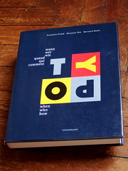
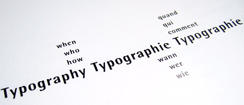
It's some kind of an international book, because it is written in eglish, french & german, but strangely (as I could see online) it's not the UK version who owns the best cover design. I don't know what's happening with her majesty's secret services, but anyway, here's how this book works: 3 parts when / who / how
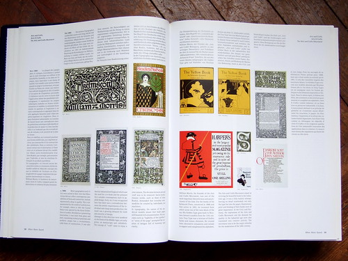
So you start reading the chronology and travel through times, from this DR/David Carson era we all know, to the more exotic Mesopotamia/Sumer era.
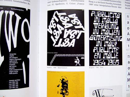
It's a good way to put you in the mood, it's not too long, like 60 pages (with a lot of small pictures, and three languages in the same page, remember?) and you'll meet Fluxus, Constructivism, Baroque, Rome, and many more. Each style has its own spread, so you can just pick up the information you need in in an easy way.
Now you know - or you remember, depending on your age - what's this all about, and you can come into what's the real matter of this book: the Who section.
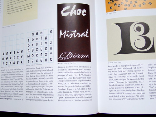
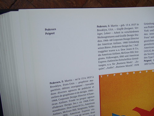
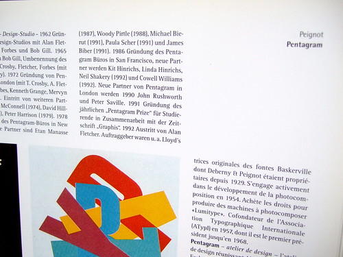
It's a big dictionnary about the people and the institutions relevant to type. You can't remember where Armin Hofmann was studying when he was 19? In Zürich of course (p.285). How many prizes did Hern Lubalin won? Don't look no further, it's "over 500” (p.355). And what has the Stiftung Bauhaus Dessau to do with the original Bauhaus? I'll let you read by yourself, it's on page 495.
And there's even a font index at the end!
And now that you're filled with all this science, it's time to put your hands in action, or at least to tell the workers what they'll have to do for you.
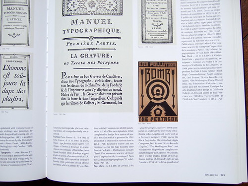
And they shall not try to cheat you, because the last part (When) is all about tools. The chisel won't have any secrets to you, nor the hand-ax. And if you ever wonder how a pen or a computer could be useful in this job, you'll find out in this short section.
More seriously, you'll notice that the laguages are always set in the same place of the spread (french on right and left, german on top, english at the bottom) with the pictures in the middle. I would say this is a very helpful use of the page space.
So, as you may have understood, this a book filled with various informations, but it's really easy to find its way to anything you're looking for. Is it so common? I'm not quite sure.
I recommend this book, a very useful tool (and not only to beginners) always next to my hand, with The Story of Graphic Design in France, but that's a story for another time.
Thanks for reading my crap english.
Typography, when whow, how
Friedrich Friedl
Nicolaus Ott
bernard Stein
Köneman 1998, Köln
isbn 3 89508 473 5

Excellent book. I picked up a copy of this book years ago at some booksale. It hasen't left my desk since.
Recommended reading!
Posted by: Dirk Sabbe | Jul 08, 2008 at 22:02
I have this big old book too and agree it's great as a reference guide – but I couldn't help thinking (back in the day, heading off to Uni with a ruck sack full of books) that I really begrudged having to carry the German and French translations around with me.
Posted by: alexparrott | Jul 10, 2008 at 13:22