Also known as: proof that a Christmas card doesn't have to be shit, clichéd, tacky, over thought or over engineered. Many more here.
Noisy Decent Graphics
A series of blog posts by Ben Terrett about me | archives | atom feed
« September 2007 | Main | November 2007 »
Oct 31, 2007
Disney Christmas 1947
Posted at 13:55 in Beauty Week | Permalink | Comments (0) | TrackBack (0)
Website Craft

The lovely thing above constructed by Cookie.
One thing is I hate about web designs is that generally, they all look like web designs. In the same way I was disappointed all Matthew Williamson's inspiration appears to come from fashion, it often seems as though all web designers inspiration comes from web designs.
Poke are one company that tend to avoid this and their latest site Get On Board is a shining example of beautiful craft that happens to be on a website. Sure it's a brilliant idea and a great cause, but the craft that's gone into little things like buttons is lovely. And it's managed to look nice and good and hand made without looking twee and shit and like it was done by Swampy.
Just look at the picture / illustration / graphic above. Gorgeous isn't it? And that's what this week is all about.
Posted at 08:40 in Beauty Week | Permalink | Comments (1) | TrackBack (0)
Oct 30, 2007
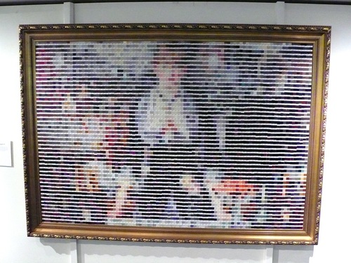
Pantone Manet
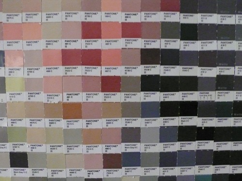
Mike of Surrey is a frequent contributor to The Design Disease Flickr pool (a constant source of inspiration for me, err The Pool not Mike) and he alerts us to this cool picture in the reception of The Partners. A Manet made entirely of Pantones.
Looks great, doesn't it?
Posted at 10:39 in Beauty Week, The Design Disease | Permalink | Comments (1) | TrackBack (0)
Oct 29, 2007
Beauty Week: Autumn has all the best colours
Posted at 13:01 in Beauty Week, Seen and heard, The Design Disease | Permalink | Comments (2) | TrackBack (0)
Thank You Henrietta and introducing Beauty Week
That was pretty good, wasn't it?
I'd like to say a really big thank you to Henrietta, you guys seem to agree that she did a grand job.
Personally it was weird and exciting to log on every day and see someone else writing on here. As an experiment I think it worked well. It gave you all a rest from me and it added a slightly different flavour to the blog. Hits went up (not sure if that was a good thing or a bad thing) and I noticed a few different faces around the place.
I really liked the 7 Rules of Showcasing Architecture in Print post, I'm in love with the Magnum book (more on that soon) and I'm really glad she saved me the trouble of posting about the Matthew Williamson exhibition. (There are a few more pictures of that on Flickr and the picture above is also from the show, well worth a visit.) The death of Barcelona street art post has been linked to all over the place. Let me know in the comments what you thought.
And now back to normal.
Well not quite. Speaking in the broadest sense possible most designers fall into two camps; Form or Function. Hopefully you've already noticed, but I'm very firmly in the Function camp. It's quite not as simple as that of course, as Michael Bierut is often pointing out.
There's a lot of Function on this blog and (maybe) not enough Form. So welcome to Beauty Week. A whole week of stuff that, well, stuff that just looks beautiful. No big theory, no grand ideas, just great looking stuff.
But before that, last night was the final episode of the amazing, Shakespearian, Sopranos. It was stunning. And that's as good a reason as any to direct you to Michael Bierut's Everything I Know About Design I Learned from The Sopranos.
Posted at 07:00 in Beauty Week, Guests | Permalink | Comments (0) | TrackBack (0)
Oct 26, 2007
The Making of Magnum Magnum
Magnum Magnum comes out in November. Published by Thames & Hudson it is – as noted in the blurb – a book of unparalleled scale and ambition. It is a category killer, which is to say that this is the photography book of 2007.
Don’t call it a coffee table book – it’s bigger than that in every way. Showcasing no less than six works from each of every Magnum member there ever was, the resulting 400 or so photographs and accompanying texts make up a product of epic (390 x 320mm, 568 pages) proportions. It weighs 6.5kg and comes in a special carrycase with a handle. It is absolutely jaw-droppingly gorgeous.
Andrew Sanigar is commissioning editor at Thames & Hudson, and Magnum Magnum was all his idea. I know for a fact he’s been pretty busy with this over the last year or so, and I thought it would be interesting to ask him what is involved in putting a book like this together.
(Also, seeing as this is likely to be my last post before the return of NDG’s resident editor Ben I’m taking the opportunity to make it really really long…)
Henrietta Thompson for NDG: Why does the world need another book of Magnum photography?
Andrew Sanigar: This year is the 60th anniversary of the founding of Magnum by Henri Cartier-Bresson, Robert Capa, David 'Chim' Seymour and George Rodger – the book celebrates the great photography created by Magnum during that time. The book is also the first and only time all the Magnum members, associate members (and the Estates of those who died while still Magnum members) have featured in one book – previous 'group' books don't have all of them. There is no group exhibition to celebrate the anniversary and Magnum very much see the book, particularly because of its size, scale and quality, as an exhibition you can keep at home.
HT: What makes it different from all the rest?
AS: Apart from featuring the full complement of photographers, as mentioned above, the six photographs by each photographer have been selected by another Magnum photographer and each set of six photographs is accompanied with a short commentary, written by the selecting photographer, about six photographs shown and the photographer who created them. It is a book with the voices of and insights from all the current members, so it is quite unlike any other photography book which might have one, two, possibly three author's voices and picture selections combined in the book. As a result, the book provides an exceptional insight into what makes a great photograph in the eyes and minds of photographers who are members of the world's greatest photographic collective. The idea of being reviewed/criticised/judged by one's peers is at the heart of the book and is what makes joining Magnum such a demanding exercise. Such high standards are what has largely driven the exceptional quality of Magnum photography, in both aesthetic and journalistic senses, over the last 60 years. It's very different from the rest in every sense.
HT: Is it difficult to produce a book of this size?
AS: Yes, it is not only physically difficult to print and bind, but relied on using the very, very best material to repro from – original prints supplied by the photographers and estates. It is also the largest and heaviest (and I think, most expensive book) Thames & Hudson has ever published.
HT: Who designed it, and why did he get the job?
AS: The designer was Martin Andersen, a freelance designer in partnership with his sister, Line, as AndersenM Studio. Martin has worked with us a number of times before, most notably on Magnum Ireland and Cartier. Martin has an exceptional sensitivity to photography books, a proven ability to make them look and feel amazing and has the best eyes and mind, in photo editing terms, of any book designer I know. We all worked closely with Brigitte Lardinois, who was the editor for the book, paired the photographers up, co-ordinated all the photographers in terms of their sending their selections and texts and Johanna Neurath, the Design Director.
HT: What challenges are involved with designing a photography book on this scale?
AS: Martin faced several challenges when making the design: a) How to make a coherent sequence/picture edit when only supplied with six photographs by a selecting photographer; b) how to achieve the same when a photographer selected more than six (sometimes we got eight, sometimes ten); and c) how to make sure the rhythm, pace and emphasis (which is crucial in getting photography books to work in the right way) was sufficiently varied (but without looking really whacky) when different people selected different photographers and each selecting photographer had their own criteria (i.e we didn't advise the photographers up front) when making their selections.
In 'normal' photography books, the designer either works with an author (or a single photographer) and therefore 'co-curates' the selection, or sometimes is presented with a larger edit, which the designer can edit down from when creating the layout, deciding on juxtapositions, rhythm, pace, etc. To have the work of 69 individuals, all in sequence, each of whom has been selected by 55 individuals (the balance is either estates or those too unwell to make selections), presents a huge challenge, not only in organizing everyone, getting their approval of the selections, etc, but in making it all stick as a coherent layout.
HT: What to your mind was the hardest sequence to put together and why?
AS: I'm not going to single any examples out, but generally the hardest ones were those where the photographer's output has a great deal of variety in terms of black and white or colour, and in terms of subject matter – with six photographs which has a lot of variation along those lines, it can prove challenging to get the layout to hold together. Martin did a great job in getting such harmony in those layouts.
HT: What do you feel is the most successful sequence?
AS: The ones with the most surprising selections, which didn’t show familiar work. There are a good number of younger Magnum photographers whose work is excellent and is brilliantly showcased in the book. That said, the sheer size of the book means, even if a photograph is very well known, you see it at a scale never seen before and that makes it fresh.
HT: I remember you mentioning something very interesting about the stock being an entirely new colour that was developed especially?
AS: The colour I think you're remembering is the spot colour used in the duotones and as the 'fifth' colour throughout the book. It isn't a colour you'll find in any Pantone book (or similar system) as it is a 'special' created by the printers, Steidl. The reason for using it was that we weren't getting a satisfactory result across the board with the duotone photographs – they looked perfectly good using standard Pantones, but they needed something extra special. The 'special' colour brought all of the duotones to life – some photographers have very intense, deep blacks in their black and white work, others have much more open, highlight detail-driven feel – the 'special' worked with all of them. It's down to our Production Director, Neil Palfreyman, and Gerhard Steidl and his team, that this worked so successfully.
HT: How is the typography organized?
AS: Inevitably, there's always a 'kit of parts' in terms of type sizes, hierarchy, etc, which one has in mind for the typography of a book. With such a page size, that notion, gets turned on its head. Suddenly, your running feet and folios aren't 7 point, they're 10 point, and 16 point becomes a comfortable and correct size for the text setting. Martin did a great job with the typography – it has all the attributes great typography in a photography book should have: It is modern and fresh, but is timeless – it won't date. Oh, and for the keen typespotters out there, all headings are in Berthold Akzidenz Grotesk and everything else (text setting, folios, running feet) is in ITC Garamond.
HT: What is the market like for a book such as this?
AS: Those with a love and appreciation of great photography primarily, but ultimately, given the range and exceptional quality of the material and the subjects represented, anyone with an interest in the last 60 years of human history and how that has been documented and represented.
HT: The images are so compelling and fascinating that often you are left wanting to know much more. How do you begin to caption a photography book such as this?
AS: With difficulty. The captions as created by the photographers are all of varying length, for a start, which makes the editing of them a challenge, and I do think that the reader should not be burdened with too much information – just enough. The book, as with many photography books, has very elegant, pared down captions. The fact that you want to know more having looked at a wonderfully evocative photograph is a very good thing – that simply demonstrates the power of a great photograph.
Posted at 17:42 in Guests | Permalink | Comments (5) | TrackBack (0)
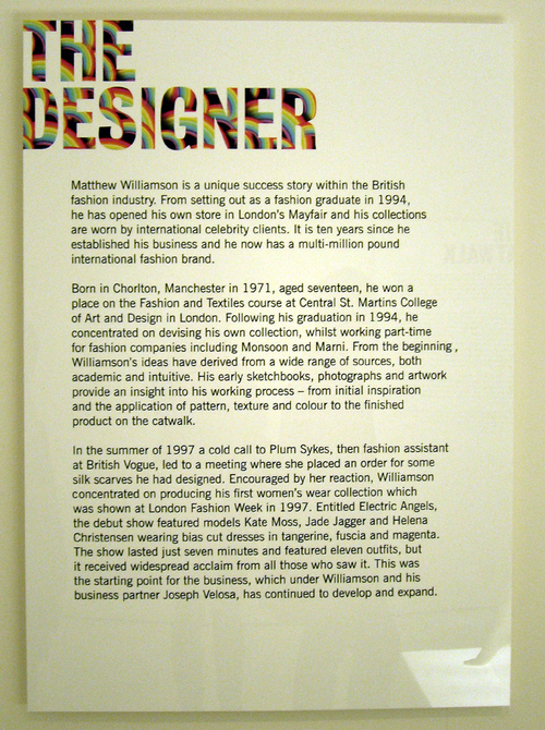
Matthew Williamson at the Design Museum
When she was director of London’s Design Museum Alice Rawsthorne got a lot of flack for putting on exhibitions about frivolous subjects such as Philip Treacy and Manolo Blahnik, and nominating the Gorrilaz for Designer of the Year. Her overly populist decisions had, if I remember rightly, something (although not everything) to do with her departure.
So I was pleasantly surprised when I heard that – under Rawsthorne’s successor Dejan Sudjic – the Design Museum was putting on a Matthew Williamson exhibition.
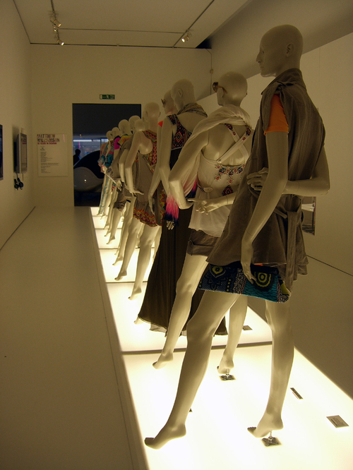
Sudjic clearly understands design and its audience, and I suspect he may be trying to make that point with Williamson. (Oh, and here - but that was a while back). I’m not sure you could get a more frivolous and populist fashion designer than Matthew Williamson. This is not an intellectual, fashion/architecture-fusion label like Hussein Chalayan or Issey Miyake. Williamson is all handpainted peacock feathers, georgette, frills and sequins – it’s pure, unadulterated, fashion fashion fashion.
I went along last week. I'm not sure if I was allowed to take these pics, but noone stopped me, so here they are. Exhibiting fashion in a way that ends up looking like an exhibition and not a posh shop is a skill that noone bar the V&A seems to have mastered yet. I think the Design Museum could have done better on this front, but it's nearly there. This is a sweet, compact exhibition, and I am so thrilled that it’s actually on that I’m not about to criticise it. (Much).
Fashion is one of the more accessible faces of design, and if it brings people to the end of Shad Thames to see it, therefore keeping the museum going, so much the better. I’d like to have seen a little more of Williamson’s processes and inspirations – more behind the scenes stuff, maybe take the intellectual content up a teensy bit at least... but the couture on display is impossibly intricate and lovely and provides more than enough eye candy to satisfy. And I believe that if the Design Museum is to really engage people, its directors need to know what people want to engage with.
Posted at 09:14 in Guests | Permalink | Comments (1) | TrackBack (0)
Oct 25, 2007
Leftover interiors
Barcelona is a city full of the most surreal scenes. Just today I met a woman who kept a live white rabbit in her handbag, for example. Yesterday I saw – defiantly flouting the new extra harsh cycling laws – a little boy cycling along Rambla de Catalunya with a man who must have been in his 70s standing up on the basket rack behind him – Castellers style. I wish I’d got photos of both but I was too busy laughing.
Another Barcelona twist on the everyday, however, can be seen in the architecture. Often, when a building has been demolished a collage of leftover bathroom, kitchen and bedroom walls is left, forming an odd façade to the neighbouring block. I know you see this in other cities as well, but in Barcelona it really is part of the landscape – perhaps because of the rate of demolition going on. The Raval district, needless to say, is a veritable exhibition of it.
It can be funny (especially when sinks and shower heads are still attached) and sad, ugly and strangely beautiful all at the same time. There is apparently a word for the phenomenon in Catalan - but I'm still trying to find out what it is... if anyone knows, please tell me. There are also whole Flickr groups devoted to the phenomenon, although without knowing the name for it, I've only found a couple of images: here's one.
Posted at 21:22 in Guests | Permalink | Comments (4) | TrackBack (0)
Oct 24, 2007
Designer shopping in BCN
Barcelona is great for shopping whatever you’re into, but if you like design or are a designer, two particular stores make it one of the best shopping cities in the world. I am happy because I got to visit both today.
The first is Servei Estacio. Particularly useful this morning because obscurely enough I needed some new legs for a bed, but as well as a huge selection of random furniture parts, it also sells pretty much everything else you might ever possibly need.
Here are some miniature “I Beams” that they sell by the metre:
And some of the hundreds of signage solutions:
Then I was told to stop taking pictures, but if that hadn’t happened I’d be posting (admittedly kind of blurred) images of the 50 different types of bubble wrap available, the rolls of Astroturf, the giant pipecleaners, the acrylic-in-any-shape-size-or-colour-you-can-imagine, the hammocks, confetti, cable, string, ribbons, lightbulbs, transfers, paint, and fake fur. Over five huge floors there is simply no equivalent to this store in the UK and you can’t leave without plans to start making things and buying all sorts of crazy shapes in polystyrene you’ll never know what to do with when you get them home.
The second king-of-shops is Vinçon.
If design boutiques can get a bit predictable in the UK (and they are always the same - the Flos lamps, Kartell chairs, Norman Copenhagen washingup bowls and Pantone mugs... enough!) then this is how it should be done. Vinçon – which has been going since 1973 – is where to come to find the stuff you can’t make even after a visit to Servei Estacio. It is beautifully laid out over two gigantic floors in a stunning historic building on Passeig de Gracia, and the low lighting and inspiring displays lure you in and keep you wandering around for hours.
Upstairs there’s also an exhibition of its famous limited edition carrier bags – which are always designed by a different designer, and often topical. The display is permanent by the way, so whenever you go you always have the excuse you are getting some culture in too. They've really thought of everything...
Posted at 22:23 in Guests | Permalink | Comments (4) | TrackBack (0)
Let them eat cake
On Monday I had a lunch do with Ian Schrager. The hotelier, who is responsible for The Sanderson and St Martins Lane Hotel in London, as well as a host of incredible luxury retreats around the rest of the world, is currently drumming up a little publicity for the hotly anticipated 40 Bond concept in New York.
And yes please can we all go and live there? At around the $9m mark per condo (basic rate) it looks quite comfortable. The idea is that it combines all the benefits of home ownership with the services, privileges and amenities of a world class, five-star hotel. And there’s no more of the Starck-raving Alice and Wonderland themed proportion distortion that Schager hotels are known for either – Schrager ditched Philippe a couple of years ago. The building, designed by the eminently more sophisticated Herzog & de Meuron, is widely billed as “an architectural masterpiece”.
Shrager was charming and millionairish, as you’d expect. But one point he did bring up was surprising. He explained that some people are questioning the ethics of creating such architecture that will only be experienced by a very small, very wealthy minority. “But I believe that this building is so extraordinary that everyone who walks by it will be able to enjoy it,” he said. “And in that way this architecture will benefit everyone – even if it’s only the very wealthy who can actually stay in it.”
I don’t agree all good architecture should be public necessarily, but I do think Schrager would do better to stay quiet on that one – it’s a little too “Let them eat cake!” not to grate.
Mind you, I'm happy to investigate further – I could maybe stay in one of the residences and watch the public’s reactions to the architecture as they go passed… Hmmm – might have to pitch that.
Posted at 21:20 in Guests | Permalink | Comments (1) | TrackBack (0)
InterSections Conference
Since noone's invented teleportation properly yet I’m annoyingly having to miss the InterSections conference which is currently happening in Newcastle Gateshead.
Luckily though, conference director Kevin McCullagh sent through a link to the blog he’s been penning for the conference this morning, so if you're not there either but would like to be you can still follow all the most interesting bits.
InterSections is full of “path-finding designers and thinkers” such as Dejan Sudjic, Clive Grinyer and Peter Saville. Between them they will discuss how best designers should be future-proofing their careers, because design is apparently transforming as it adapts to a world in transition.
According to Kevin, as the boundaries between design disciplines are breaking down, the skill-sets designers need are also evolving. While the nineties were driven by the integration of computer skills into the designer's toolbox, now the emphasis is on acquiring more multi-disciplinary and contextual skills.
Posted at 21:04 in Guests | Permalink | Comments (6) | TrackBack (0)
Oct 23, 2007
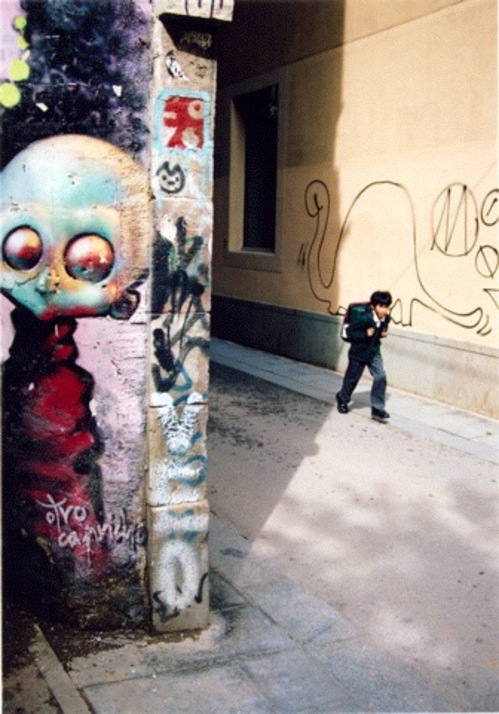
The death of Barcelona street art
I arrived (home) in Barcelona today. It's been two months since I was last here and while this is a city that is as famous for its urban change as it is for the Sagrada Familia, the difference this time is phenomenal.
The grafitti has gone.
Really. It has disappeared. The underground overground art that made every corner of Barcelona so extraordinary has been painted over, wiped off - wiped out. The Civismo laws have been dramatically tightened in the last few months, and the city's authorities have taken action to crack down on grafitti artists, imposing (among other penalties) huge fines on anyone caught in the act.
One of the reasons Barcelona's street art used to be so incredible was that La Guardia Urbana would turn a blind eye. Perpetrators could make their mark in broad daylight - taking their time over their work as they pleased.
The result, I'm told, is that the good stuff has been forced out of town, and anyone with a stray spraycan is resorting to quick - but ugly - tagging instead. Street art has become part of this city's cultural identity and - while it will always be moderated - should also be protected.
Posted at 21:01 in Guests | Permalink | Comments (7) | TrackBack (0)
7 Rules of Showcasing Architecture in Print
Architecture and graphic design relations are proving to be something of a theme for me this week. (That’s not really that surprising considering I am an architecture and design editor and writer, I suppose, but still.)
Yesterday I met with an author and a graphic designer to decide how best to layout the author’s latest monograph on a prominent Italian architect. His own experience in this field is vast, but the graphic designer, by contrast – while she has designed a lot of design books – has not done an architecture title before. The meeting was essentially a training session for her – so I took some notes.
This may be quite specialist, but I still thought it was worth sharing.
7 Rules of Showcasing Architecture in Print
1. The iconic shot
The first image of the building in question needs to be chosen carefully. Contrary to what many designers and editors believe the iconic shot does not actually have to show the whole building, or even be the most striking image available. It does, however, need to capture the essence of the building – even if that’s a detail, the designer needs to understand this architecture as if it were a one-liner, a punch line – you need to get the main concept before you can communicate it.
2. The walk through
All subsequent images should be arranged in a way that helps the reader to ‘walk through’ or ‘walk around’ the building – it sounds obvious but you’d be surprised how often it doesn’t happen. The last shot should be as carefully considered as the first – perhaps you end up outside again, perhaps in a courtyard, but think of it as being where the reader will ‘say goodbye’ to the structure.
3. The natural size of drawings
Architects' sketches – if they are to be included – can be both gorgeous and compelling. It is very tempting for a graphic designer to use them very large in a layout, but it’s also important to remember that there is a natural size for architects' sketches, and if you blow them up too large, they will look wrong. Use your instinct here.
4. The grand plan
Likewise, plans and elevations can really help a reader to understand the building, but their use should be carefully considered. For an architect reading the building, roughly 70% of their information will come from the plans – not the photographs. They should be selected and arranged with this in mind. If there is more than one being used they should be presented in a logical order, always at the same scale, and always with the same north point. Again, it sounds logical, but it's amazing how much it is overlooked.
5. The context
Where possible show the context of the building. This can mean showing the surrounding environment in plans and photography, but just as often it means demonstrating how the building is used: if it is an art gallery, it can help to show some of the collection, if it is a public space, show people in it.
6. The all important crop
Architectural photography is a great artform, but one that is often destroyed by a careless art director in print. Crop very carefully – the photograph should draw the viewer into the building and provide a realistic sense of space - loosing the foreground often makes an image loose its impact. Similarly if you have access to photographs that show a tactile element to the building – show it at the appropriate size that makes the reader want to touch it.
7. The rules
The rules are there to be broken, ultimately every layout is different, and every building will need individual treatment, and the most important thing is to find what works in each case.
Posted at 20:21 in Guests | Permalink | Comments (4) | TrackBack (0)
Oct 22, 2007
AA - what's all this then?
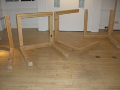
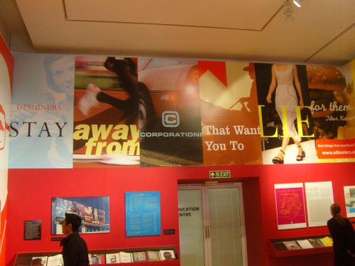
There is a show at the Architectural Association at the moment called Forms of Inquiry: The Architecture of Critical Graphic Design. I went to see it last week (thanks Lauren!). I do love the gallery at the AA. Although it's tiny, the exhibitions are usually 'intellectually rigorous', and fresh...
Forms of Inquiry is curated by Zak Kyes - a graphic designer and creative director at the AA. His idea was to present architecture as seen through the practice of graphic design.
In order to do this, he invited 19 contemporary graphic designers to contribute ‘inquiries’ into architectural subjects. The resulting works "exhibit a common desire to reframe the circumstances surrounding graphic design practise at the start of the 21st century".
Architects and graphic designers seem to enjoy a very special relationship that is built on vast and shaky foundations of misunderstanding. (One architect I know believes that graphic design is an entirely redundant profession - "Just use bloody Helvetica!" is his usual response if the subject comes up.)
There is some very good work here - most noteably James Goggin's Ellsworth Kelly Ground Zero Collage, which is the image used in much of the publicity. However, with much of the work it's necessary to cut through a sickeningly thick layer of pretension, which is sad because it doesn't do anything to help bridge the gulf between the two industries. Architecture is a profession in which you can get away with being billious but it doesn't work so well in graphic design, for obvious reasons.
My advice is if you go, give it time and be sure sit and read the designer's inquiries in the lever-arch files. There's also a fantastic reading room upstairs with further material which is worth a visit in itself. And then let me know what you think.
Here are some pics:
Posted at 18:48 in Guests | Permalink | Comments (2) | TrackBack (0)
Hello
Thank you for all your welcoming comments, I’m very excited that Ben’s given me this platform – he’s clearly a brave man.
Looking at the diary it looks like it might be an interesting week. I’ll be posting from Barcelona for the second half of it, and I’m really looking forward to having a good excuse to deconstruct the place in graphic detail (excuse the pun).
I'm sure most people know about this already but I just discovered Spell With Flickr and this morning I'm having as much fun with it (although it's slightly pointless otherwise) as last years Geogreeting and it seemed like an appropriate way to say hello.
More later!
Posted at 08:53 in Guests | Permalink | Comments (2) | TrackBack (0)
Oct 19, 2007
Guest Writer: Henrietta Thompson
In very rare moments of self doubt I sometimes worry that you lot will get bored of me.
I also worry that all this blogging is badly written, unspell-checked, grammatically deficient and not like proper writing. Because of this and because previous guests have been so popular I've asked Henrietta to guest write a whole week on this blog. So you'll hear nothing from me for a whole week.
Let me introduce you to Henrietta. She's a proper design writer, that's how she earns a living.
Just two weeks ago she helped write the Guardian's Pompidou supplement. She's written for Arena, Blueprint, Business Life, Dazed & Confused, Design Week, the Independent on Sunday, Monocle, Wallpaper* and the Architects Journal. She's curated several exhibitions including the annual '100% Norway' and 'Hearwear' at the V&A.
As if that wasn't enough she's also written two books; Phone Book and Simply Contemporary.
She'll be posting all week from Monday to Friday, I've no idea what she's gonna write about and I've given her a completely free reign. I'll just be sitting back and watching. I may even comment from time to time. So log on, enjoy, play nicely, comment and make her feel at home.
I'm really looking forward to it.
Posted at 08:53 in Guests | Permalink | Comments (12) | TrackBack (0)
Oct 18, 2007
Unacceptable
I've just read this in some brand guidelines, "A drop shadow effect is acceptable as long as it's not so strong that it impairs legibility."
Let me make this clear; a drop shadow effect is never acceptable. Especially when added to a logo.
OK?
Posted at 14:28 in Graphic Design Industry Stuff, Things I've Learnt About Design | Permalink | Comments (14) | TrackBack (0)
Oct 17, 2007
We're looking for a Business Development Manager.

Some company fruit, yesterday.
We're called The Design Conspiracy (in case you don't know anything about us have a look at our website here) and we're looking for a Business Development Manager.
Let's get one thing out of the way up front. Your job is about selling. There, I've said it. Horrible word. Selling.
That's your number one priority and we'll give you clear direction and sales targets. But we don't just want numbers. We don't want rubbish projects to make our figures look good. We want you to identify clients and projects that would fit well with our ethos and then facilitate those relationships.
We want you to understand, know and love design. We're going to ask you about this, so you'll need to know the difference between Peter Saville and Peter Sellers.
We want you to use your initiative and seek out opportunities rather than just following the crowd.
We want you to be energetic, tough, fun, lively and able to muck in. We want you to be organised, to love people and presenting. You will often be the first experience people have of The Design Conspiracy and so you'll need to embody all that the company stands for.
If we're being honest it's not all fun and glamour. We're a small company, we care about what we do immensely and we'll argue all night long about why something should be just so. We're very business focused and we have a very clear idea of what we want you to achieve and how we want to measure that.
In return we'll offer you a key role within a fast growing and exciting company. We're relaxed and flexible and you'll get to work with exciting brands such as 3 and adidas. We'll pay you a good salary (every month), we finish at 4pm on a Friday, you'll get a bonus on your birthday and you'll enjoy our Free Company Fruit Policy.
Interested?
Send your CV to me ([email protected]) or give me a call on 020 7405 0875 for a chat or a coffee, confidentiality guaranteed.
Posted at 12:19 in How To Start Up A Graphic Design Consultancy (Sort Of) | Permalink | Comments (7) | TrackBack (0)
Exhibition Review: Friendly Fire - Jonathan Barnbrook
When I went to this I should have mentioned that I also went to Friendly Fire - Jonathan Barnbrook.
I don't like Jonathan Barnbrook's work. I find it too style driven and Ray Gun for my liking. I don't like Adbusters either.
Still, he's a very good graphic designer and he does lots of interesting work. Squeezed behind the Hadid exhibition is an exhibition of his work and I really enjoyed it. It helped that lots of the work was explained better in the 'exhibition' context. Do yourself a favour and make a visit to both exhibitions soon.
There are some more pictures here.
Posted at 11:06 in Exhibition Reviews, Great Graphic Designers | Permalink | Comments (6) | TrackBack (0)
"I haven't spent the last lot yet"
When asked why he wasn't going to pay himself a (Bhs) dividend this year, Sir Philip Green said, "I don't need any money. I haven't spent the last lot yet."
Brilliant.
Posted at 10:42 in Quotes | Permalink | Comments (1) | TrackBack (0)
Recent Posts
- Years in the domain, like tears in the rain
- Printing is still too hard
- No innovation until everything works
- "They'll be dancing in the streets of Total Network Solutions this evening"
- It was a pleasure
- Public Digital has won a King’s Award for Enterprise in International Trade
- Kids describing fashion ads
- Art at Mount St Restaurant
- Post match squeeze
- Unbelievably tickets are still available











Recent Comments