There is a show at the Architectural Association at the moment called Forms of Inquiry: The Architecture of Critical Graphic Design. I went to see it last week (thanks Lauren!). I do love the gallery at the AA. Although it's tiny, the exhibitions are usually 'intellectually rigorous', and fresh...
Forms of Inquiry is curated by Zak Kyes - a graphic designer and creative director at the AA. His idea was to present architecture as seen through the practice of graphic design.
In order to do this, he invited 19 contemporary graphic designers to contribute ‘inquiries’ into architectural subjects. The resulting works "exhibit a common desire to reframe the circumstances surrounding graphic design practise at the start of the 21st century".
Architects and graphic designers seem to enjoy a very special relationship that is built on vast and shaky foundations of misunderstanding. (One architect I know believes that graphic design is an entirely redundant profession - "Just use bloody Helvetica!" is his usual response if the subject comes up.)
There is some very good work here - most noteably James Goggin's Ellsworth Kelly Ground Zero Collage, which is the image used in much of the publicity. However, with much of the work it's necessary to cut through a sickeningly thick layer of pretension, which is sad because it doesn't do anything to help bridge the gulf between the two industries. Architecture is a profession in which you can get away with being billious but it doesn't work so well in graphic design, for obvious reasons.
My advice is if you go, give it time and be sure sit and read the designer's inquiries in the lever-arch files. There's also a fantastic reading room upstairs with further material which is worth a visit in itself. And then let me know what you think.
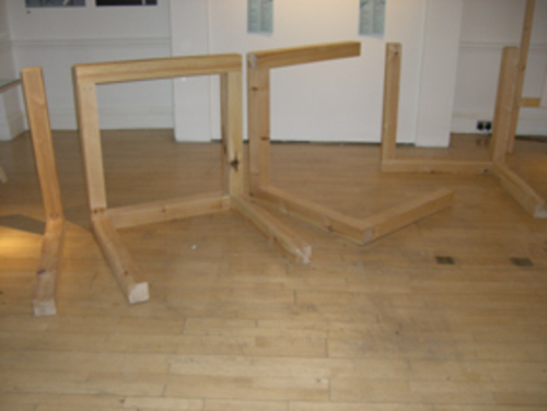
Here are some pics:


Yay! Thanks for posting about it Henrietta!!
i love both architecture and graphic design (...lucky!) and was excited to hear about the collaboration! perhaps i'm jumping the gun, but this exhibition looks and sounds like i would have been disappointed if i'd been able to go. as you said, it looks like they've done hardly anything to look at where the two areas really work together, or influence each other - like the structure of font development, or the common reliance on a grid, or composition.
maybe it's just me not getting the full picture, but it seems like they really could have gone a long way with it and have lost faith in the middle somewhere. I hope I'm wrong.
Posted by: lauren | Oct 23, 2007 at 05:09
Had a look around this today, found it initially pretty hard to work out what was going on, but a read through the binder (on your recommendation...) made the whole visit much more satisfying. Will try and have a second visit...
Was a bit disappointed in the Hektor work though, as I've they've done some stunning stuff with it in the past: http://www.hektor.ch/Work/William+Morris/
Posted by: george | Oct 23, 2007 at 22:59