I've been a big fan of The Independent's smaller design.
I think they've taken to the small size better than their rivals. The Guardian is still too big and The Times, to quote David Hillman, is "a total and utter fucking disaster".
One of the things I like the most is their graphic front pages. I've long thought that a broadsheet newspaper could take the same approach graphically as a tabloid does and do well. Use that front page is a dramatic way.
Problem is, again to quote David Hillman, "The problem with the front page being an idea is that some are good and some are bad. It's like saying you got to have six ideas a week — that's quite difficult." Whatever you think about The Independent it's hard not to agree with Felix Dennis , "At least they're bloody trying".
So, let's take a look at some front pages.
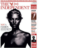
(Kate Moss) It would be easy to scoff at this one, but I think it's mature and elegant. It reminds of the covers The Face used to do when they produced good covers. Remember that this is a broadsheet newspaper doing this.
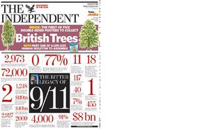
(9/11) They do this a lot. Some interesting facts nicely laid out. Impactful and easy to read. Good communication.
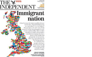
(Immigrant nation) A good way to make a point and stand out in a crowded marketplace.
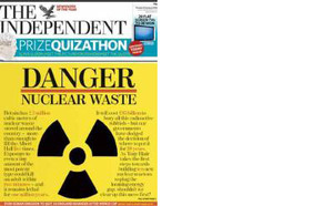
(Nuclear) OK, I don't really like this one, but it's brilliant to see a national newspaper finally putting those full colour presses to good use.
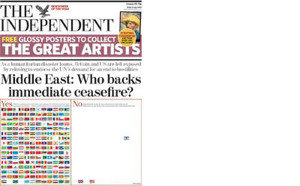
(Middle East) Again, this was a crowded news morning with everyone covering the same story. This makes the point in a simple, elegant way. A classic case of a picture saying a thousand words. If you can't make the picture out, it has the British, American and Israeli flags in the right hand box.
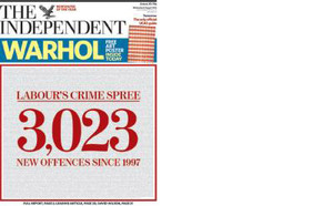
(3,023) Big numbers are always good. Wouldn't it be great if all news could be distilled down to simple facts like this?
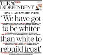
(Rebuild trust) You used to see this a lot in the 70's when they had all those long copy ads, big words with smaller text inbetween. You can still have a dirty big headline but you can put detail between. A useful typographic tool used well.
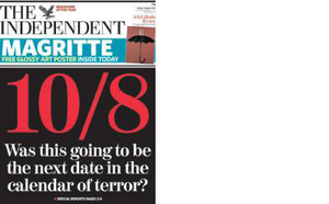
(10/8) Just another example of a good, graphic page showing great sensitivity to the propensity to use dates to name terrorist attacks.

I totally agree. Although I don't buy the paper every day, I would, whenever I can, go out of my way to check out the cover. The Middle East cover was brilliantly simple and powerful. I suspect Mr Fletcher might have approved.
I think their approach to cover design goes a long way to help the publication stand out, head and shoulders above the rest, as an intelligent, truly independently minded paper.
Posted by: Richard | Oct 03, 2006 at 14:16