Found a brilliant, fascinating blog called the History Of The Button via Fimoculous' splendid Best Blogs of 2006 That You (Maybe) Aren't Reading.
As if you didn't have enough to read already...
Big post coming up.
I've been meaning to write this for a while. I first mentioned it here and I've been thinking about it ever since.
I love my job. Absolutely love it. Not many people can say that, but then not many people get to do their hobby for a living. Ever since I was 13 I wanted to be a graphic designer (technically my school library careers guidebook called it an advertising artist, but hey) and ever since I was 13 I pretty much knew what I had to do to get there. It's not just me, I have friends who thought like that too.
It seems to me that if you're a designer, a proper designer not someone who learnt Photoshop in between phone calls, then design runs through your veins like Pantone 7418. But more than that, it's there in every aspect of life. You can't stop looking at things through your designer eyes. Everything you do is clouded by this thing that lives inside you.
Now, this is no bad thing. But I'm becoming fascinated by how this thing takes hold of us all and I'd like to share it with you lovely people.
So what's it like, living with this disease? What does it make you do that other people don't do? How does it affect you?
Let's say you took a trip in to town one day. First off, you'd be incredibly upset by the shocking kerning on this roadsign.

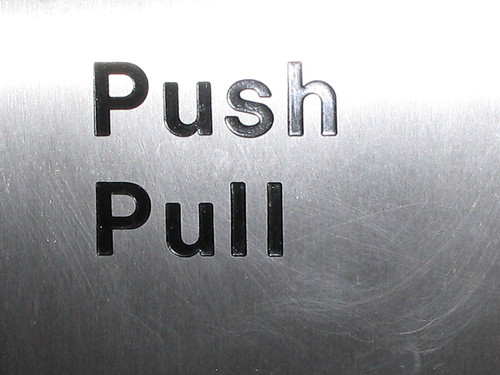
And if you parked your car in a multi storey car park the thing you'd be most struck by are these


And of course this.

We all love arrows and we all love collecting things, more about that later.

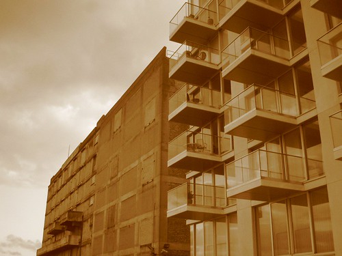
As you left the car park you'd see this

and it would annoy you, really annoy you, that it wasn't quite centred and it wasn't quite justified and it wasn't left aligned and it wasn't right aligned. You see sometimes the disease will stop you enjoying things. I know designers who will walk out of a room because the colour upsets them.
Or you might see this on the way to a gig

and spend the rest of the concert wondering why they distorted the type like that?
Back on your journey into town. You'd step outside and see this and wonder how on earth that can be allowed to happened. Who would space type like that?

Then you'd spot this and be puzzled by the logotype. Do Ferrari really have an estate agency?

On the drive home you'd take photos like this.

Just because.
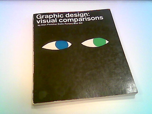
People with the disease will always choose books by their covers. Probably these covers.

Probably these covers and these colours, becuase you love colours, you worship colours which is why you collect things (you see, collecting again) like this

and why this website was so spot on.

But it's not just books, it's everything. You'll choose wine by the design of the label,

you'd stay here because of the sign

and you'd photograph the sign and a million others like it.

If you were good, really good, you'd collect all these photos of signs and store them alphabetically

because they may come in handy one day. Just like you collected these pencils

and they came in handy.

You'd also be obsessed with letters, or type as you've been taught to call it. Letters of any shape, size or description.
Like

or

or even

which means you start collecting things like this

and like this

as that magpie like bit of the disease seeps out through your keyboard into the finer reaches of eBay.
Again, if you were good, you'd pick up on this obsession and turn it into a project like this


which is Michael Johnson's brilliant Send A Letter thing. Or you'd have gates made like this (Alan understood).

It's not just letters, it's numbers too. You'd photograph and collect things like this

(thanks Russell, this goes without saying)
in fact, that inner magpie would make you arrange everything like this

and on the biggest day in modern history it would make you wander the streets looking for postcards. And then you'd do this.

(Told you Alan understood).
You see, it affects every aspect of your life. How you think, how you buy, what you see. If you're lucky you're friends and family will pick up on this and if you're lucky you'll get things like this for Christmas

which will be the best thing you receive all year because it gives you a quick fix.
Designers, does that sound familiar?
For all you kerning fans, there's been a brilliant discussion going on over on the lovely Ace Jet 170.

(Picture borrowed from Richard, the photo is of Dalton Maag's stuff, usual bumpf applies.)
Full of interesting useful stuff like, "you have to remember that the tighter you space (minus tracking) the darker the page becomes" and "Tracking completely destroys the rhythm, and has a surprisingly disproportionate effect on legibility."
Bruno Maag (who's a fantastic chap) and a few others explain why you should never track words, lines, paragraphs or God forbid pages.
Read it, you'll learn something.
I know some of you (yawn, yawn) are getting bored of the Fletcher posts. If that's the case, look away now.
Millions (well, not millions literally) of people are arriving at this blog looking for pictures of the AF exhibition. Mostly this is because they're overseas and can't make it to London.

Here's two places where you can find superb pictures of the show.
1. Go to Flickr and search for Alan Fletcher.
2. Click on this excellent post over at City Of Sound.
You can look back now.

Over on Ace Jet 170 there's a fantastic link to an illuminating blog called The Branding Of Polaroid - How we beat Eastman Kodak and it's little yellow boxes at point of purchase despite a clunky product and an irrelevant corporate name.

Written by Paul Giambarba who initiated Polaroid's corporate image development and product identity in 1958, it's the fascinating story of the Polaroid brand. I think the 'story' has finished now, so it's kinda not a blog. Just a very interesting story. Do take a look.
(All pictures from the blog, obviously. Usual stuff applies.)
Lebowski wants more posts that are strictly about graphic design. So here's one.
This is brilliant. This is what good design is all about. And I don't reckon it was created by a designer, do you?

It's a guide showing you which exit to use when you leave Westminster Tube station. Rather than just listing the local attractions/land marks and their relevant exits someone has gone to the trouble of photographing the attractions and sticking the pictures next to the exit numbers.

Let's say you couldn't speak English, chances are you wouldn't recognise the letters that form London Eye. But you'd definitely recognise a picture of it. Great design, great usability. Common sense. Brilliance.

On Monday a colleague and I will be speaking at the Cardiff Design Forum. We'll be sharing a platform with the design team from Torchwood, which should make for an interesting evening.
I'm not sure if it's open to the public or invite only, but if you're reading this in Cardiff and you'd like to come along let me know and I'll put you in touch with the organisers.
We're hoping to do something a little different to the standard 'patronising agency comes to provincial university' speech. If I get time I'll upload some of the stuff we're thinking of doing up here.

I've been messing around with Flickr since the summer. I really like it. It's especially brilliant for getting photos off my phone.
I've been trying to post pictures from Flickr to here, seamlessly. But
I can only get the pictures to be 500 pixels wide and all pictures on
Noisy Decent Graphics are strictly 400 pixels wide. Anyone know how I
can change the Flickr settings?
I'm really interested in photography and I consider myself pretty good at it (who said blogging was narcissistic?). I love the Magnum photographers and like Mrs Colman I'm a huge Martin Parr fan. He's a genius.

When I was much younger I had to go with my Mum to Cardiff, she had a
meeting or something, and left to wander round the city on my own I
found an exhibition by Sebastian Salgado, the infamous images from Serra Pelada, Brazil. I'd never been so moved by an exhibition before. The images are beautiful.
Rankin is still good, this picture of the Queen is a refreshing take on familiar face. I'm also a big fan of Elaine Constantine. We tried to use her for a project recently but it didn't work out. Shame.

In case you hadn't guessed, these photos are all by me. Photographers seem a little wary of posting images online and I'm a little wary of posting images by Rankin and Magnum.


Recent Comments