
Not graphic design related at all, but I know that lots of you would like to know that Life In The Middle is back.
Not graphic design related at all, but I know that lots of you would like to know that Life In The Middle is back.

Gratefully received from one of our readers.
I'm gonna start a new, loosely curated, series on Credit Crunch Graphics.

I love this Economist cover. This sort of stark, powerful illustration is the reason I first started buying The Economist.

This is a nice little in-joke from the FT. Promoting their well known, regular supplement 'How to Spend It' on the top left and promoting the one off Credit Crunch special with the line 'How to Survive It' on the top right.
I guess this is the first financial crisis in the era of "You can't move in London without someone giving you the news". That's why it has to have a catchy name and it has to be the biggest crash and the biggest bail out. This is also why it has to be happening NOW. Whereas history will probably have the Credit Crunch dated as 2007 -2010. Something like that.

Here's Robert Peston the unbiased bringer of many leaked scoops (you knew his father was a Labour peer, right?). But ignore him (go on, please) and look at that Global Financial Crisis logo. What's the point of the bloody arrow?

Sure the arrow signals down, which is the way everything is travelling, but is it necessary? Is it helpful? Surely the word Crisis communicates enough. A better use of the arrow would be on I in Financial and then we could lose the Crisis. Sort of.
To be continued.
UPDATE: Due to popular demand, I've created the Credit Crunch Graphics flickr pool.

Look carefully on the top left. Pizza Hut has changed it's name to Pasta Hut.
No joke of a lie. Pizza Hut is now Pasta Hut.
Go to the website and watch the cheesiest flash video (again top left) of two workmen replacing the neon Pizza with a neon Pasta. Unbelievable.
And here's a picture of a new Pasta Hut restaurant from the Daily Telegraph. I was starting to wonder why they keep saying, "these are strange times" on the news...

I thought I'd written about how much I love the Panic Room film titles before. Turns out I haven't.
I love the Panic Room film titles. You can now watch them here courtesy of a great site called Art of the Title which has oodles and oodles of lovely film titles and end credits online. Found via Design Observer.

It should be noted that the Panic Room titles owe an inspiration debt to Saul Bass' titles for North by Northwest.

I've noticed something recently; city kids play differently to country kids.

Picture taken by Russell. Usual rules apply.
This isn't Mumsnet so we'll skip over the societal aspects of that observation. What I mean is that city kids seem to play within a small self defined boundary. They are happy to play smaller.
I guess we can generalise and assume this is because they live in smaller spaces. But I don't just mean smaller houses, I mean the whole area they have available to play in is smaller. If they are lucky enough to have a garden, it's a small garden.
Everywhere they go, the space available to play in is smaller. If they eat out, they are probably more used to small coffee shops and restaurants. The Pizza Express on Great Portland St is smaller than the Pizza Express at Meadow Hall. So they learn to play smaller.

This brilliant photo was taken by Matt. Usual rules apply.
When I was doing A Level Art my Mum used to organise a 100 mile charity bike ride. At the bike ride one year I made a series of teeny weeny sketches. A montage of the whole day, no bigger than a postage stamp, in my sketch book. It was the best bit of work I'd done all year.
When I showed it to my Art teacher he encouraged me to make it in to a big A3(ish) size canvas. You know, in that A Level art way. I spent a few weeks scaling the sketch up. And it was shit. I thought I still had the picture but I can't find it anywhere... sorry.
When it was small, it was the best bit of work I'd done all year. When it was big, it was shit.
Working at a really small scale is something you'll be familiar with if you've been lucky enough to have done an Art Foundation course. Wil Freehorn is a master at this. Take a look at his business cards.

Picture taken from Wil Freehorn. Usual rules apply.
Gorgeous, aren't they? Wil is an expert at working with this scale. Interestingly, it's not just the scale that makes these images so great, it's also the speed. The quick, light touch. The immediacy of his work is exhilarating. Here's some slightly bigger (but still small) sketches made smaller.

Picture taken from Wil Freehorn. Usual rules apply.
They're great too aren't they?
It's not just the physically small that I find interesting. It's small ideas too. Here's a wonderful small idea featured on innocent's blog.

Isn't that great? A small, simple, quick, straight forward, good idea.
One thing that really brings home Play Small to me is iPhone web pages.
Most people would assume that a mobile web page is a compromise. Not as good or as rich as the main page. The thing is, more and more I'm finding I like the mobile pages better than the main pages.
Stripped of all superfluous content and navigation, devoid of over elobarate graphics, they're like raw 'what I came here for' in one handy pocket sized rectangle.

I now find myself opting for the small version even when the full sized is next to me on the laptop. I prefer the BBC News small. I prefer Typepad small. Flickr, Facebook, Twitter, Financial Times, Telegraph - I prefer them all small.

These aren't iPhone apps. These are web pages designed for the iPhone.
Dopplr is pretty much the only site where the big version works just as well on the small screen, I'd even say it was better than the mobile version. Dopplr is very well designed and it's also constructed around a very strict grid and I suspect this is why it works so well small.

The full Dopplr site is on the left, the mobile Dopplr site is on the right.
It's a design truth that it's better to design something with restrictions. And it maybe that size is just another restriction, but I think it's more than that. Just like Wil's sketches feel light and quick, so do iPhone web pages. Partly because they are quicker (quicker to load etc) but partly because they're demanding less of my attention. I can get to where I want to go much, much quicker.
Make no mistake, we're currently leaving the era of Baroque brands and moving into a new period of austerity in communication. And as we move towards Depression 2.0 maybe Play Small will become a vital tool for all designers across all forms of media.
Some of you know this already, but a lot of you don't. In June of this year I left The Design Conspiracy.

Before you ask; there was no big drama and no big falling out. I announced at the start of the year that I'd like to leave. It was time for a change. New challenges.
It's been odd not being there. I have lots of brilliant memories and stories to tell.

Along with four others I started that company in 2001 (a few months before 9/11). Anyone who has ever started a company knows how it consumes every part of your life. Starting a company is very exciting (thrilling really) challenging and fun. The learning curve is massive. The designing bit is easy, but have you ever tried reading a balance sheet? Or filling in a VAT form? Negotiating fees with the CEO of Big Scary Company PLC? That's where the real fun starts.
So. If you've tried emailing me @thedesignconspiracy - don't. If you've tried calling me there - don't. More contact details in the FAQ's and here.

I've been up to a few things over the summer, it's not been all holidays, and I've met with loads of interesting people.

Obviously there will be a New Thing. But I'll tell you all about that another time..

This is the best design book I've ever read.

This is the last Summer Of Design Books post. Have you enjoyed it? I have, although I've been disappointed that only Loic bothered posting anything! Especially as lots of people told me they were writing reviews and then didn't. Lazy buggers.
I'm also disappointed that I didn't manage to get through all the books I'd wanted to this summer. But hey, there are plenty more summers left.
Still, this is one book I did read. And I'm glad I did because it's brilliant. I made notes throughout and I'm gonna stick photos of those up here. That might not be much use to you. Which is tough, really. You should buy the book.

The problem with all the design books I've read feel like they've been written by wankers. They might not have been, but they feel like they have. Boring, self important people. Not the sort of people you'd want to be sat next to on a plane. You know the type.
This feels like it's been written by a mate. Or a really interesting bloke you met in a nice pub who happened to know a lot about graphic design.


Like the title says, it's 79 short essays about design. The key word there is short. Short is good in design books. It's more like a collection of blog posts.
It's humorous in places and laugh out loud funny in others. It's humble and personal but it covers the big debates of the day - Innovation is the New Black is a good example. It's been written with care and thought. It has plenty of head nodding familiar moments.


I couldn't put it down - and there's no other design book you can say that about is there?

Michael Johnson has written a more detailed, scholarly post about the book here. He even lists writing tips gleened from the book which are well worth a read and a bookmark.
You should buy it.
Not written by me, written by you as part of the Summer Of Design Books series. I know it's not summer now. This is the penultimate one. Not that you lot bloody care, it was only Loic who ever wrote them!
- - - - - - - - - - - - - - - - - - - - - - - - - - - - - - - - - - - - - - - - - - - - - - - - -
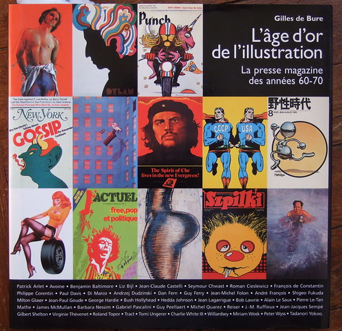
This book focuses on what the author, Gilles de Bure, calls the golden age of illustration: the '60s and the '70s.
Is this so true? Seen from France, it seems illustration is still alive in the UK press, but I'm not sure.
Anyway, what is true is that this era saw the rise of a generation of brillant commercial artists, mostly around the Push Pin Studio, and the main interest of this book is to offer a nice panorama of pictures from often long gone magazines.
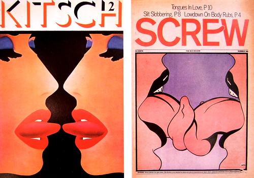
The is divided in a dozen of sections, each one dedicated to a social issue, like the american dream, war and violence, couple and sexuality, etc.
But the book ends with more monographic chapters, sometimes exciting (Paul Davis' theater posters or the ) sometimes too long for this book(Guy Pellaert's portraits).
What is amazing is to see the reflection of these days' occidental society in drawings and paintings. And not only in the subjects, but also in the style. I mean, no one draws like that anymore, right?
Turn the 200 pages of this book and you'll read a very precise story of these publishers, illustrators and designers, and there's a ggod reason for that: Gilles de Bure was there. He met almost all the people he names in his book, and some of them are still friends, allowing us to watch some rare original material (300 picture, yes sir!).
Unfortunatly, the main problem with that book is its layout: too much white space sometimes kills the picture, that's why you won't see plain pages here, only samples from these great illustrations.
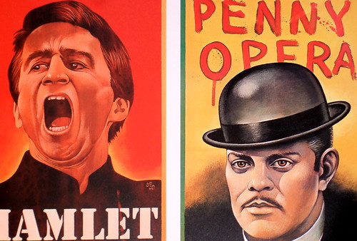
With this book you can see how powerful drawings can be and how a wise publisher with a talented artist can answer any challenge.
Despite its coffee-table style, this book is a rare item: not just a compilation of smart artworks, but rather a demonstration of what can be done in the press field with some graphic ambition.
Gilles de Bure
Vilo International, 1999
ISBN-10: 2909450422
ISBN-13: 978-2909450421
PS1: Yes, the cover shown is in french, but the english version is available.
PS2: Ok, Summer's leaving, so do I…
More exciting publishing news.

I've very flattered to announce that my map post has been published by GIS Professional magazine. It's a good magazine, you should subscribe. For those of you who don't know GIS is an abbreviation for geographic information system. So GIS Professional means hard core map people. And they liked my post. Good eh?

Whilst we're on the subject - sometimes people email me and ask if they can use something I've written, in a dissertation or a magazine. As I say in the FAQ's basically the answer is yes as long as it's not for commercial use and you credit me.
One of the occupational hazards of being a designer is that you want everything to be designed.
And worse than that you normally want everything to be well laid out, structured and with a good hierarchy of information.
I saw this the other day and whilst the typography leaves a lot to be desired it's a very useful piece of communication. Building number, street name and postcode. Brilliant. Common sense. Useful.

Because you see this a lot. It's a building number. This one happens to be 87A.

But what street is it on? Sometimes it's easy to work that out, but often it isn't. Especially if it's a big long street.
If you're one of those designers that's been a postman or a delivery boy you'll prefer street numbers to look like this.

Or, fuck it, let's go the whole hog. Name, number, rank, street, post code, inside leg. Yeah, that's better.

Let's pass legislation to make all buildings display their full address outside on metal plate. In the same colour, the same font. That would make life easier and it would look better. That's good communication, right?
But here's the problem. Scroll back up the page - all those signs are from the same street. Look at the difference. The inconsistency. The accidental. The unintentional. Looks great, doesn't it?
Sometimes it's better when things aren't designed. It took me a while to learn that.
Thankfully they thought of a better title.

I've written an article for a new magazine in the Design Week / Centaur stable. It's called Interiors and it's available in all good bookshops now. Helpfully the article is also available online and you can read it here.

Writing about Matt Dent reminded me of a post I've had saved up in my drafts folder.
When the coins first came out, I thought, it must be a great feeling to design currency. You could just reach into your pocket, toss some money on the bar and say, "That. I designed that." Yes, I'd like to design some coins, I thought.
And that started me thinking, what else would I like to design? So here's a list in no order. Feel free to add your own.
Err, coins. And notes.
A TV weather map, with symbols.
Film titles.
One of those great big letters that sit in the street (like this).
A D&AD Annual.
TV logo.
Stuff on the Tube, seat covers particularly, but stickers would do.
A museum thing, any thing, just something that's inside a building that's called a museum.
A credit card.
I Googled Pentagram today. Silly, I know. I know the address, but I navigate the web using Google, doesn't everyone? Anyway, I Googled them and I got this.

What the hell does that mean? That bit that says "4 visits - 15 Jul"? I've never seen that before? Have I Googled Pentagram 4 times since the 15th July? (No) Have I visited Pentagram 4 times since the 15th July? (More possible.) Eh?
Explain please.

Remember these coins? Designed by Matt Dent.
Matt's just been made a director of the design company 3 Fish In A Tree and I'm doing an interview with him next week. I wondered if you had any questions for him? Why aren't there any numerals on those coins for example...

Designers always want to use Polaroids in projects. Always.
It's very, very rare that you see them used well.
This is one good, relevant execution. This is from the window display in Ann Summers. It feels like the right media for the subject, it's nicely done and they're got the 'scatter' right.

Apart from the tiny red HSBC logo, that homepage is totally black and white. Brave, rare and it looks great.
This is a picture of me from a college trip to Prague in 1996. Published here in full without comment or edit.

This is my dissertation from 1997. Published here in full without comment or edit.
Over the last decade Graphic Design has changed forever, promting Lewis Blackwell to report, (1) ‘the emergence of designers as ‘content providers’ rather than simply packagers of other people’s messages’. How and why has this change occured ?
Change - make different. No-one will disagree that graphic design has changed forever. Only a fool will argue it will never change again.
This essay will explore why graphic design has changed, and how designers have emerged as ‘content providers’. Generally documenting the huge changes in the attitudes, thoughts and actions of current designers. Starting with why design has changed, leading in to how it has changed, then concluding the essay will essay will reference journals, books, music. C.D. roms, as well as internet sites and exhibitions, encompassing the multi-dimensional nature of the subject.
(2) ‘My Sony is about to burst’ (ANTI-ROM 96), now unplug and read on.
The invention of the home computer in 1975 was the tiny start of massive change in graphic design. The computer was to revolutionise everything to do with graphic design, first the process, later the thinking.
(3) ‘In 1984 PostScript and the LaserWriter turned the publishing industry upside down.’ (SEYBOLD 96)
The birth of desktop publishing packages meant that there was no need to employ a designer for simple jobs such as letterheads or business cards. This could be done on any personal computer. The development of such programmes has meant that the non-designer can create anything from logo types to fully blown magazines. The huge increase in computer sales over the last decade has seen the accessibility of such packages soar. Today everyone who owns a computer possesses a programme with the power to (in layman’s terms) be a graphic designer.
A little more money to put into slightly more sophisticated technology, and many owners of home computers have set up as graphic designers. There are now thousands of small ads offering to produce letterheads and business cards for low prices.
And whilst the ideas behind such business literature may not be of the same quality as a trained graphic designer, the output quality certainly would be.
This has meant that now we are faced with the reality that a small office and several thousand pounds of technology is able to deal with the graphic design needs of a small business. There is now a large number of these businesses in operation. They have taken a great deal of work off the graphic designer, and are starting to undertake more complex jobs. They offer the customer accessibility and low prices, and have given the traditionally trained designer serious competition.
(4) ‘Technology has given more responsibilities to fewer people - you’ve more to do. ‘ (SEYBOLD 96)
The increase in computer sales and our general craving for new technology has led to the rise of the internet, a global communications system which is promised (and probably) will change our lives forever.
Now with this, access to over 50 satellite channels and a new terrestrial channel, coupled with the trend for computers to be involved in everything we do has led to a huge increase in the information we have to deal with on a daily basis.
Radio One on November 4th 1996 reported the American discovery of a disease nicknamed ‘informationitus’. Suffers of the disease experience symptoms of nausea, tiredness and dizzy spells. This is due to an overload of information, particularly that received from the screen.
Recently there has been widespread criticism of the technological boom, or rather our sudden fondness for it.
(5) ‘Governed by love we have for useless, twisting, our new technology’ (JAMIROQUI 96)
This technological overload has created a need for communication that can stand out from the hoard of visual images and information that greet us daily.
(6) ‘The recession knocked the design industry for six.’ (SAVILLE 96)
The recession of 1989 sent many design companies to the wall, made others drastically reduce in size and limited the colossal fees of the corporate ‘80’s.
Every other industry was also feeling the pinch. This made them revaluate the need for costly design or even design itself. Why should they spend thousands of pounds to a design consultancy, when someone with a personal computer could do it in house? More than a change of attitude, there just wasn’t the money to fund expensive design groups.
Graphic design, often seen as the epitome of Y.U.P.I.E. culture, was brought down off it’s pedestal and would have to change to survive.
At the Mind The Gap conference in Holland, earlier this year, Peter Saville (one who enjoyed much success in the 80’s) acknowledged the effect the recession has had on design today. He stated that the larger design companies of the 80’s had fallen,
(7) ‘returning the focus of industry to smaller studios and creative values.’ (SAVILLE 96)
Designers have had to refocus to survive, and have had to change not just the way they work but the way their companies work.
(8) ‘Don’t work harder - just better’ (SAATCHI & SAATCHI 94)
As a planet we are now better educated than ever. More students are studying design with 15 000 graduating last summer in the U.K. One theory, voiced by Peter Saville regarding graduates, is that because of declining sales of new fine art, due to the recession, fine art graduates are looking for design jobs. The work of these artists/ designers is starting to filter through in the adverts and annual reports of large clients.
Graphic design is a new profession that only in the 80’s, lost the name ‘commercial art’. A whole generation is starting to emerge who have grown up with the term graphic design and these make up a large proportion of consumers today. consumers who understand and enjoy that they are being targeted. consumers who willingly play along with the marketeers. Consumers who are able to interpret complex, concepts, and are more visually aware than ever before.
Graphic design has had to change to survive. It has also changed because it has been given the opportunity to progress.
Certain factors outside of design have forced it to change such as the recession or the desktop publishing boom. Other factors such as the increased visual literacy of the general public and the need for clearer communication have been the step on which graphic design has raised itself. Graphic design is a very young discipline. It has only just reached the end of it’s first chapter. This was concerned with solving the problems of visually communicating a message on a flat surface. The second chapter is concerned with communicating in a more holistic way. A way which involves the receiver more, and requires more of the receivers input to work.
To notice a change in graphic design one of the first areas to look is advertising. Advertising is a fast paced, quick turnaround world where new ideas and a fresh approach are often more important than the validity of design solutions.
Due to increased competition and a need for communication to stand out from the crowd designers are involving the audience more. Getting the viewer to work harder. One popular method is interactivity.
Interactivity does not just mean multi-media, it means the involvement of the viewer in order to complete an advert. Interactivity can be applied to traditional media, for example, a scratch and reveal panel in a magazine,or an advert which has to be folded together in order to be read (Haagen-Daas and Sony).
But it is more commonly applied to television. A good example is the now frequent, telephone number at the end of an advert which you either need to ring to complete the advert, or to obtain extra information.
One of the first successful examples of this was Howell Henry Chaldecot Lury with the Tango ads of ‘95. The viewer was teased with tales of people addicted to Tango. at the end of the ad the viewer was given a help line number for addicts. On calling the participant was asked told that they had been Tango’ed themselves.
Involving the viewer in the advert, by having them carry out an action as as a direct result of the advert gives it added force and dimension. It builds the image of the product in more than just visual areas.
This method of interactivity has since been successfully used by companies such as Mazda. In 1996 Mazda asked, on 48 sheet posters,a question about their products.For example which was better their 323 or Volkswagen’s Golf. For the 323 dial XXX for the Golf dial XXY. The results were published a few weeks later.
A good example of a different kind of interactivity are the Army adverts of 94. One advert shown at prime time told the viewer that they had to get up early in the army. It then asked them to watch at 6am to see the rest of the ad, which was shown at 6am the following day.
It is no longer a surprise to see a full car stuck to the side of and advertising hoarding, along London’s Cromwell Rd. One extreme example of 3D advertising was in Germany, where a 69 year old lady was suspened from the side of a billboard to illustrate the power of a hoover.
This is truely multi-media.
There has also been a trend in advertising for complex often abstract concepts.
(9) ‘A idea can be a colour / a texture’ (WOOD 96)
The current Orange adverts, whilst at first may not seem that complex, are a very brave step for something as commonplace as a mobile phone. The ads simply show a blurred orange star motif spinning round, whilst a voice over explains the product. It is totally abstract to mobile phone advertising yet it stands out from the hundreds of other mobile phone ads.
It is proof of the increased visual intelligence of the general public that this advert is so successful. As abstract images do not lead the viewer down one straight forward path they are very complicated images to interpret and accept.
Such concepts are also finding there way into corporate identity.
(10) ‘The traditional Wolff Olins view of corporate identity is a static monolithic thing, that is no longer in keeping with the way the world is now. The world is constantly shifting and changing.’ (GARRETT 93)
We are seeing a move away from the precious identities of the 80’s, British Telecom and Midland Bank being examples. The new Channel Four identity is four circles. Four circles that appear at different sizes and thicknesses each time. Yet they are still instantly recognisable as Channel Four. Ten or Fine years ago such an ambiguous idea would have been laughed at. Now it seems natural. The MTV logo is another which is instantly recognisable yet appears differently each time you see it.
We are now used to viewing images on the screen. We are becoming used to dealing with concepts that are constantly shifting but have a coherent theme running through. We are becoming used to time based ideas.
Design companies (or groups as they are now called ) are changing their very structure.
(11) ‘Tomato is a cross between a space, and a space structure. Not a company in the conventional sense, nor an orthodox collective.’ (TOMATO 96)
By the very fact that a modern design house now needs musicians, video artists, 3D visualisers and others, something has had to change. Because design has lost a lot of its traditional form so has the office. New technology has meant that we all work differently anyway and this is one area where there is still a lot of change to take place.
Companies are also forming for different reasons. Referring to Saville’s quote concerning fine art graduates, design groups are now forming whose sole goal is no longer big bucks.
(12) ‘Anti-Rom was formed as an opportunity to create multi-media outside the constraints of the workplace and as a critique of the hastily established faux truths of the new media.’ (ANTI-ROM 96)
We are seeing a move towards design groups working independently and clients coming to them for ideas rather than the other way round.
(13) ‘Where agencies normally follow a brief, with the client setting the pace and agenda, Tomato just go on being Tomato, and it is for clients to decide if they want participate.’ (COLLINS 96)
The designer is becoming a content provider rather than a packager of others ideas. Graphic design has changed to embrace the new technology and the ever increasing visual sophistication of the audience. It has become more holistic in its nature, using more media to communicate and realising that we live in a 3D world with five senses.
It has become concept based and these concepts have become more complex. It is using interaction to make it’s messages more memorable and m,ore fun. It is moving away from the client led ‘80’s into a slightly more chaotic designer led age.
Graphic design has not changed, it has progressed. Graphic design is still about communication.
Graphic designers have changed.
Graphic designers are becoming ‘content providers’ rather than packagers of other ideas.
The world around us has changed dramatically in the last decade and it is continuing to change at an alarming rate. And it will always be changing.
Designers have had to change; to incorporate new technology, to communicate to a more educated, more demanding audience. An audience that has seen the old tricks before.
Designers have had to change; because people have learnt to value them differently and to be more suspicious of them, because they have polluted the world with information and yet they still need to provide more.
Designers have had to concentrate on the idea more than ever before, as a great idea can cut through a thousand images and a thousand words. And a great idea is still what shakes this business, and is still what we are all looking for.
A great idea is what keeps me interested in graphic design.
A great idea is, and always will be, the apple which tempts me into the garden of graphic design.
Further Reading
If interested in this subject the reader should actively digest the world around them, and in particular be sure to take information from all medias. It is impossible to list specific material as it will change daily.
Bibliography
JOURNALS
Creative Review June 96 - December 96 Vol.16 No.’s 6-12 Centaur Publications
Emigre Summer 96 No.39 Emigre Inc.
Emigre Winter 93 No.29 Emigre Inc.
Mac User 2 August 96 Vol.12 No.16 Dennis Publishing Ltd.
Vogue December 96 Vol.162 No.12 The Conde Nast Publications Ltd.
BOOKS
BLACKWELL L 95 The End Of Print Lawerence King Publishing
IMAGINATION LTD 95 Imagination Imagination Ltd.
PERKINS S 95 Experience Booth Clibborn Editions
WALTON R. 95 Typographics 1 Hears Books Intenational
WOZENCROFT J 88 The Graphic Language Of Neville Brody Thames And Hudson
WOZENCROFT J 94 The Graphic Language Of Neville Brody 2 Thames And Hudson
AUDIO C.D.s
JAMIROQUI 96 Travelling Without Moving Sony
REECE A 96 So Far Forth & Broadway
C.D. ROMs
Creative Review June-December 96 No.s 12-18 Centaur Publications
Independent 1995 Newspaper publishing Ltd.
INTERNET SITES
Fontworks
Fuse all at WWW. TYPE. UK
Fontnet
Guardian Online WWW. GUARDIAN. UK
EXHIBITIONS
JAM; A crucial mix of music, style and media 12 September-15 December 1996 Barbican Art Gallery
Citation
(1) BLACKWELL L (96) England 6 Holland ? Creative Review Vol.16 No.11 pp30
(6) SAVILLE P ibid pp30
(7) SAVILLE P ibid pp30
(9) WOOD G (96) ibid pp30
(2) ANTI-ROM (96) Jam Exhibition Barbican Art Gallery
(11) TOMATO (96) ibid
(12) ANTI-ROM (96) ibid
(3) SEYBOLD J (96) Inventing The Future Creative Review Vol.16 No.11 pp39
(4) SEYBOLD J (96) ibid pp42
(5) JAMIROQUI (96) Virtual Insanity Travelling Without Moving Track 1
(8) SAATCHI & SAATCHI (94) British Telecom Advertisement
(10) GARRETT M (93) Design Will Eat Itself Emigre No.29 pp6
(13) COLLINS M (96) Salad Days Vogue Vol. 162 No.12 pp109
It won't have escaped your notice that there's a crisis happening in the banking world. All the big household names are affected. It's slowly engulfing us all and it gets closer to home every day. I've resisted writing about it for a long time but I can hold off no longer.
Ladies and Gentlemen allow me to introduce the Kerning Crunch.
Let's look at Lehman Brothers first. A big, strong, confident piece of typography. Standing squarely at the helm, staring rivals in the face. No problems over here matey.
But look a little bit closer. In particular take a look at the A.
Is that acceptable? Too close for comfort? Should the authorities be called in? 
The O and T are gentler, but still a teeny bit close for my liking. The problem is that the Kerning Crunch causes us to question our existing value systems. Perhaps we've been sailing too close to the wind for a long time. How close do we want to get?

Lloyds are making the best of bad lot. They've done a decent job of rescuing that O, Y and D. But they can't save everyone.
The worst offender has been glossed over by the main stream media. But, have no fear, that's what this esteemed blog is for. Take a closer look at the L and A in Barclays.
Trouble lies ahead my friends.
Some of these banks are their own worst enemies. L, A, Y and S are never going to be an easy set of letters to kern.
But these guys are all about taking risks, aren't they?


Recent Comments