Lovely. From Tom T.
Remember I said I'd remind you of this? Well, true to my word I'm reminding you of this.

I'm very flattered and slightly apprehensive to be able to announce some forthcoming live dates, both at wonderful events.
On 24th March the Really Interesting Group will be speaking at the Eighth annual Friends of St Bride Library Conference, this year called Revival!
There are some great people speaking. David Pearson of Penguin fame, Yulia Brodskay who does that amazing paper craft lettering and Officina Tipográfica São Paulo who did that lovely Creative Review cover in January. That's a pretty amazing line up (and us). Tickets are a very reasonable £100 (look at the speakers, that's great value for money) and are available now.

The work of David Pearson, Yulia Brodskay and Officina Tipográfica São Paulo. Note to self; it's worth not being shit.
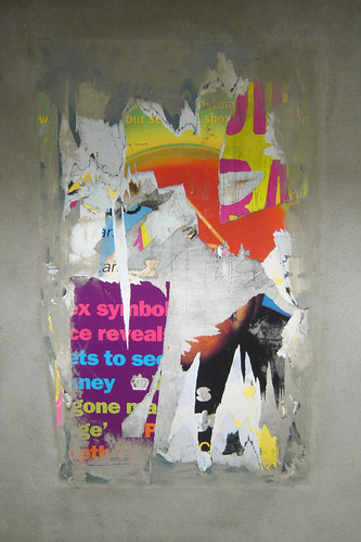
 Picture borrowed from and copyright of Moleitau, with many thanks.
We'll also be talking at This Happened on the 12th March at the BFI. This Happened is a series of events focusing on the stories behind interaction design. Past speakers have included Troika, Semitransparent and UVA. Speaking with us are Universal Everything and Artwise. That's a pretty amazing line up (and us). Tickets usually sell out on the day they're issued so keep your fingers on your buzzer.
Cripes. Hope to see you at one of those gigs.
I have very little rules for this blog, but one I try and stick to is 'never just link to stuff'. I hate it when people go, "Oohhh this is cool look at this!" That's lazy and it's what delicious is for.
Anyway, I'll break that rule now.
Mike Dempsey has written up a talk he gave to he RSA in 2005. It's about all sorts of interesting things but essentially it's an overview of graphic design from Caveman to Spray Can. Sort of, it mainly talks about RDI's, obviously.
It's very hard to find a coherent concise history of graphic design. Especially one that covers more than just the Sixties onwards.
You should read it.
If you're a graphic design student, you must read it.
From Caveman to Spray Can.
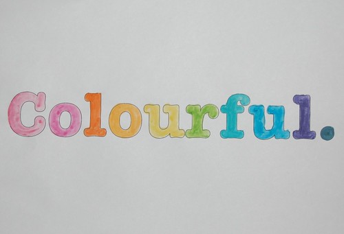
There is something so lovely about hand painted type. And a colour spectrum. Independently and together.
You may not be aware, but recently there's been a bit of a rebranding scandal in the world of domestic heating.
Since 1970 there has been an organisation in the UK called CORGI or the Council for Registered Gas Installers. Very quickly, for our overseas readers, this organisation operates the registration scheme for gas installers in the UK. If you're getting a gas boiler fitted or serviced you must only use CORGI registered engineers.
So you can check the validity of your local gas engineer Corgi have a neat little orange shield logo. Obviously the logo has undergone several face lifts over the years, but basically it looks like this.

You see it on ID cards, on letterheads, on vans and on uniforms. In fact, it's reputed to have a recognition rate of 93%. That seems a bit steep to me, but I'm sure it's still a very high number.

Last year the Government decided to put the contract for gas installer registrations out to tender. Presumably to save money, as Governments do. And Corgi didn't win. Capita won, the people who run the Congestion Charge.
After the celebrations were over and all the champagne corks had been popped, someone from Capita rang someone at Corgi and asked if they could have the logo. You can imagine how that conversation went, but to save you the trouble I've mocked up a version. Like the tabloids do.
Capita "Good morning, Capita here. We're just won that gas safety contract from you. I'm just ringing to ask if we can have a copy of the logo. One of the designers told me to ask for an Eepeess, but I've no idea what that means, so a jpeg will do. Needs to be in colour. Something like a word file would be better though, as we're going to print it."
Corgi "Sorry. We own that little shield, it's called branding and it's our intellectual property. You can't have it."
Capita "Oh. Can't we just have the one off your website?"
Corgi "I'm calling the lawyers..."
Anyway. You get the picture. Corgi won't let Capita or the Government use their logo. The one that has been going for 39 years and has a 93% recognition rate. They own that you see, even though it's always been a scheme associated with the Government. When the Government put the contract out to pitch, you'd have thought they would have considered that, wouldn't you?
So Capita have had to create their own brand. It's called the 'Gas Safety Register' and it looks like this.

Looks like everyone has learned something as the new "Gas Safe Register" brand is owned by the Health and Safety Executive, but is on loan to Capita for the duration of its contract.
Ann Robinson, director of public awareness at Gas Safe Register has said "This is not like Marathon changing to Snickers, because ours is a campaigning brand. Our aim is to support registered engineers throughout the changeover and beyond. We will make sure your customers know CORGI gas registration is gone and Gas Safe Register is the official stamp for gas safety".
To make sure that happens the Government has set Capita a target to achieve "an 'unprompted' public awareness percentage rate of 40% by October 2009." Ahhh, our old friend 'unprompted' public awareness. Watch out for people spontaneously shouting, "Gas Safety Register! It's a bloomin' yellow triangle!" over the next few months.
40% by October this year. Feels pretty small compared to that 93% doesn't it?
This whole episode raises several issues.
1. That yellow triangle thing is fucking horrible. It almost looks like a spoof logo. I presume it's been designed to fit on the corner of a boiler or something, but it represents a huge opportunity missed. That yellow looks like a web safe yellow not a brand colour and the type relationships are very odd. I know which logo I'd rather sew onto my overalls.

2. To me this debacle demonstrates the value of branding far better than any Interbrand ranking. As UK White Goods say, "The total cost of the HSE's rebranding exercise was not disclosed." but what's the value of that little orange shield to the Government? What's the value if there's an accident? The whole Corgi thing started after the explosions in Ronan Point in 1968.
3. Welcome to Intellectual Property 2009. Corgi may well have been better off selling the shield to Capita. Maybe they tried. The Government would have been better off owning the shield in the first place. Probably no one cared in 1970. Intellectual Property is a minefield and no agency has a decent grip on it. Certainly no design agency.
A cautionary tale in many ways.
Hat tip to Charles The Plumber who first alerted me to this.
There's a lot of navigation around at the moment. The future apparently is micro processors telling you (and everyone else) where you are.
But, today, let us concentrate on the posters.
I'm pretty sure that BT have absolutely no idea where anything is, but they're jumping feet first on to the band wagon.

Aside from that insipid blue what I really hate about this is the London Eye compass. Actually, using that circle for a compass isn't a bad idea, not necessarily a good idea, but certainly not a bad one. That shape says London and it says compass - that makes sense.
But we all know what a compass looks like don't we? And that funny star shaped thing in the middle, that thing you only get on compasses, that reinforces that it's a compass, doesn't it?

So why did they feel the need to add that silly N? I've never seen a more awkward, embarrassed N in my life.
It's a horrible font. It doesn't sit comfortably in the composition and it doesn't feel like it points North. Look at it again in the top picture. It looks like a mistake.
Further proof that what you leave out is as important as what you put in.
Found in The Design Disease Flickr pool which just gets better and better.
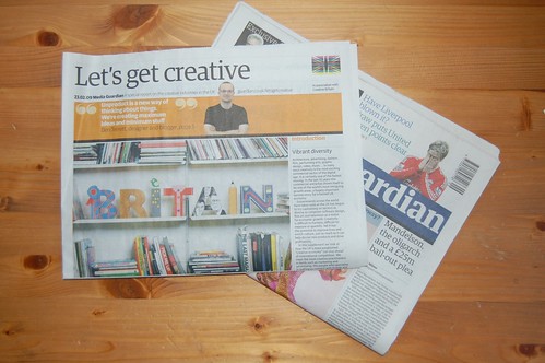
Seriously. There's a little thing on page 5 of the Let's Get Creative supplement that you might like.
UPDATE: The full article is online here.
You may remember, back in August, I blogged about my Samsung camera being broke.

Every picture had a purple line funky effect on it. Not good. I posted about it here and on Flickr. Chris searched on Fixya and came up with an answer. The image sensor was broken. Which sounded pretty accurate to me.

So, since August I've been using my iPhone as a camera. And you know what, it ain't bad. It ain't brilliant, but in the daylight it's fine. I've done a summer holiday, a kids birthday and a US trip armed with only an iPhone camera. And it's done the job just fine.

Meanwhile I called Samsung who said they would fix it for me, for free. Even though it was a month or two out of warranty. They posted me a neat little cardboard net which deftly folded into a secure box to send the camera back in. They even rang me to ask me why I hadn't posted the camera back yet. Now, interestingly, Samsung assign you a customer reference number which lasts your entire Samsung buying life. Apparently, every time you ring them, about any Samsung product, they'll call up all your details etc etc.
Now, there's a lot of this datastuffomatic around and most of it is rubbish but in my short experience (admittedly with only one product) it worked really efficiently. It's only a small thing but that's the kind of thing that would make me buy a Samsung TV over a Sony TV.
Anyway. It was January before I finally got round to sending the camera off. It was returned last week fixed. In fact, I think the picture quality may be better than before. Super job. I've missed that little fella.
Between August and January, I tried really hard not to buy a replacement camera, which would be the usual way of fixing something, obviously. And I did pretty well. For a bit. Until I spotted this beauty on Amazon with 50% off.

Yes. Half price. You gotta buy it if it's half price right? It's still available now for just over £200. It's a truly wonderful camera and that is a wonderful price. It's not a £5K MEGA SLR, but it's still great. You should buy one.
I've have loved using an SLR again. Looking through the viewfinder as opposed to an LCD screen.

Depth of field. Remember that? Wonderful.
So, to sum up. iPhone camera - not as bad as you lot say it is. Samsung - great customer service so far. Nikon D40 - fabulous camera at a fabulous price. More product reviews coming soon.
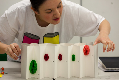
I spent a really good day this week assessing all the work on my LCC project.
A big thanks to Matt Biddulph from Dopplr who gave up a day of his time to help me assess the work and provided a helpful non-graphic designer viewpoint on things.
Let me explain very briefly the project. There were three parts to it. !. Collect some personal data about yourself. 2. Visualise that in a clear, beautiful and fun way. 3 Present your idea back to me.
These guys are on a Foundation Degree so it's before a BA (degree). You can go on to the 3rd year of the degree at the end of the course. A bit like an HND in old money.
I was really pleased with the work. There were some lazy buggers, obviously, but most people worked really hard and produced some great stuff. I have no concept of how helpful/useful i was but people seemed to enjoy the project.
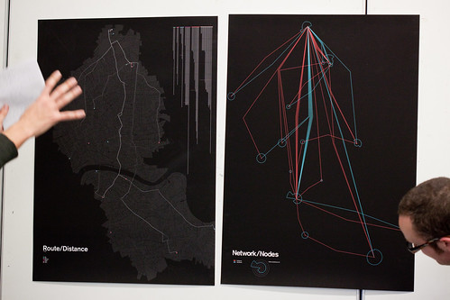
Matt took some splendid pictures, which means I can show you some of the work.
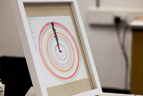
Kate made these lovely screenprints of her body measurements. She also did the same for her four siblings and has made a set of five screenprints which she's had framed and has given to her Mum and Dad. They're going up on the lounge wall. That's nice, isn't it?
Tom made the wonderful posters you see up above. Very elegant, sophisticated graphic design. Good enough to be 3rd year degree level, I would humbly suggest.
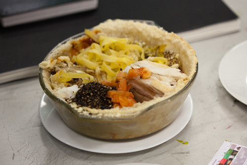
Jamie made a pie chart. He measured all the ingredients he ate in a week and then made a pie. In the presentation. Great fun.
Well done everyone. I enjoyed working with you. There are a few more pics here.
Every Christmas there is some design mag or, these days, high falutin' design blogger, who writes about the ugly visual nature of Christmas. Which is bollocks, obviously.
Christmas is a time for family and friends. For pausing. For over eating and for getting drunk. And Only Fools and Horses. Nothing to do with graphic design whatsoever. Your Christmas should be as naff, or as gaudy as you like. Similarly it should be as elegant and as well designed as you like. If your front room looks like an episode of The Royle Family that's fine by me. If all your decorations match the front cover of Elle Deco, then that's fine too. It's Christmas.
And besides there's a far more visually offensive festival just around the corner. May I introduce you to the graphic design horror show we have come to call Valentines Day.

I hate Valentines Day. For many reasons. We do not celebrate it. I judge you if you participate in it. But let's concentrate on the awfulness of the design.

I have never seen anything well designed in conjunction with this horrible occasion. Unlike Christmas there is no elegant Elle Deco version of Valentines.
Let's start with the colour. Red is possibly the most useful colour in the world. There are a lot of nice reds in the Pantone book. And I'm partial to a bit of pink. I'm even wearing a pink jumper today.

But Valentines designers never use a nice pink, or a nice red. If you looked up Unelegant Colour Combo in the dictionary you would see this.

Every single fucking cliché known to cupid is dragged out and used in February.

You want cheap and tacky, you got it. With most things in life, you pay more you get more elegant marketing collateral. Not Valentines. You get shit pink and shit grammar.
Lots of Love from Him. Him? The Good Lord Above? He sent you a Valentines card. Whoda thought?
I know what you're thinking now. Oh he's wrong, he's just picked some bad examples. There are loads of nice Valentines cards out there. Maybe some vintage ones would be nice? Wrong.

I'm sure you're all at home hand printing beautiful Valentines cards using Godfrey J Pantone's own special red. But they are not nice either. Trust me.
Lovely, lovely project in Bristol called Watermarks. Needs little explanation, ticks a lot of boxes. Very simple. Very good. Cheers drive.

I don't know what else to call this really.
You must have a look at this. A disgruntled designer has published the Pepsi band guidelines for the new logo online. They are truly hellish.

There are almost no words to describe the awfulness contained with the PDF. Have a look at the full story here. Via DO.
Lots of people say that a blog is just an online exercise in vanity. The normal response to that is, "Oh no, it's about sharing, learning, the interesting space where digital meets physical" Blah blah blah.
Me? I say fuck that, it's all about me, me, me. A whole website about me.
With that in mind, here's a vanity update.
First up, these little babies have been popping up all over Flickr. Which is smashing. They look really lovely. They've all been sent out now to as far afield as New Zealand and Mexico. You should have had yours, if you haven't drop me a line. But we don't have any left. But still drop me a line.

David has created a Flickr Group called One Thousand Covers and he wants everyone to try and track all 1,000 newspapers. Which is a great idea. Ideally he just wants the hand numbered bit. Read more about it here. Great idea David. Thanks.
The newspaper was also featured in Creative Review which was very kind of them.

Which reminds me, so far this year the Creative Review covers have been brilliant. If you ask me. I don't know why they made the Brazilian one yellow, when it was on white to start with. But hey, it still looks great.

And. CBC Radio in Canada interviewed me about the newspaper project last week. They make a very clever programme called Spark with is a bit like iPM over here. Should you wish you can listen to my interview here. I'm about 2 minutes in.
Lastly, The Journal Of The International Institute (you've heard of them, right?) used one of my Flickr pictures. They did everything right. Emailed me, emailed me again when I didn't reply. Asked nicely. Credited me. Very good.

I wasn't going to do a snow post, but everyone else is doing one, so you know.
Most people have had a fun day enhanced by Flickr and Twitter and the like. Which is good.
I invented a system of Personal Snowmatics, mainly to let my Dad know how much snow was up here. So it was nice to see Mum and Dad joining in via their Flickr account. Remember their contribution to the saucers debate?

I guess I'm embracing slow blogging.
I was surprised by how much attention The Long Car Purchase got, including some email chatter from Japan. But this is a long, slow process. There isn't much to report this month, except that I've had this email (from someone who wishes to remain anonymous) which is almost exactly how I feel. It's repeated below. There might be another post next month, possibly with diagrams.


* Yes, yes I know 'almost exactly' is a bad phrase. Sorry.
I was at the LCC yesterday.


They enjoyed seeing their stuff on the blog, so I thought I'd do it again. I'm not saying too much about the project, but you don't have to be a genius to work it out.


So here's some stuff. Sketches, ideas, workings out. Have a look, let us know what you think in the comments. As always there's more over on Flickr and on Ffffound!
Recent Comments