I don't normally do this, but I've just written about the Newspaper Club logo on the Newspaper Club blog and I thought you guys would like to read it as well.
- - - - - - - - - - - - - - - - - - - - - - - - - - - - - - - - - - - - -
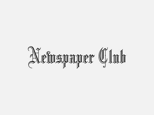
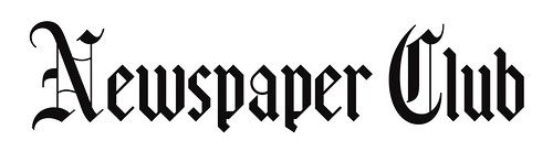
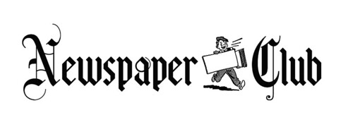
You may have noticed we've slightly changed the Newspaper Club logo. The previous one used a temporary paperboy graphic whilst we worked behind the scenes to create a bespoke one.
I'd like to tell you about the thinking behind the logo and show you some of the versions that didn't make the cut. Other start ups don't give you that level of transparency, do they? When you think of newspapers you probably think of that 'funny marmalade' font. And you'd be right. That font you're thinking of visually equals newspaper, so I elected to use that. Simple. I'm a huge fan of not over complicating design, as my old boss used to say, "you might say cliché, I might say crystal clear communication".
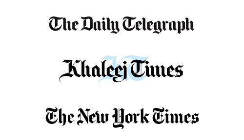
Most of the typography that would pass as crystal clear communication for a newspaper masthead is based on the font Blackletter. Blackletter has it's uses, but on screen is not one of them. In fact, it's more Duchy Originals than Daily Oregonian as over an incredible 1,000 years Blackletter has undergone many cuts and derivatives and most broadsheet newspapers today use stylised versions. Or typefaces based on a gothic Blackletteresque font, more accurately.
I needed a version that said 'newspaper' as instantly as Blackletter but worked well on screen.
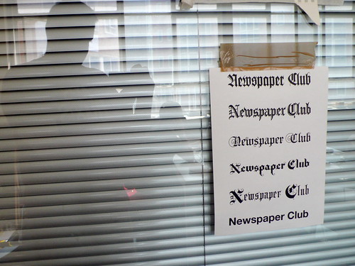
Back in June (on day one in fact) I looked at several versions and settled on Brauhaus . It has been simplified and is therefore better for online use yet it still retains the newspaper feel I was after. To make the letters more distinctive I opted to change the N and the C for slightly tweaked versions of the Blackletter N and C.
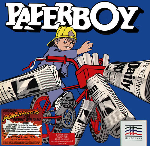
That's the word marque sorted but for a modern start up you need an icon for all those pesky 32x32 square icons you have to create. And that's where the paperboy came in. The original inspiration was the Paperboy Atari game from the 1984. That's a sort of digital newspaper joke for people of a certain age.
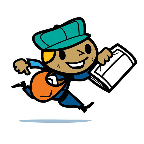
A little character would be handy for all those icons and also for guiding you through the newspaper making process. It feels right for Newspaper Club as we're a friendly tool for people and communities not a secretive, hard edged, spiky tech dot com.
We used this chap for a while, but it was just a place holder. We wanted our own, so we tasked the amazing Rexbox with creating one for us. Rex has worked on all sorts of cool stuff including co-creating LittleBigPlanet and stuff for Disney and MTV.
Here he is. The paperboy, not Rex.
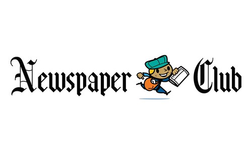
The result is a modern, friendly logo whilst hinting at the visual history of the newspaper masthead. We hope you like it.


Recent Comments