Next week Alex and Will have asked me to be a guest blogger over on It's Nice That.
All I have to do is review one piece of work each day. I thought I'd ask you if there was any work you'd like me to review? Anything you've seen recently that you'd like to talk about?
Over coffee DJ kindly showed me round the studio, let me take a few pics and we chatted about stuff. Topics ranged from SXSW to his excitement about the iPad and the possibilities for magazines and books We even talked about Silicon Roundabout.
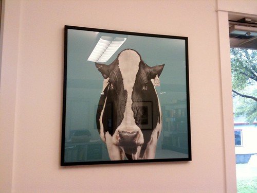
He showed me some stuff he was working on including an incredible project documenting the history of the Alpine Cowboys Baseball team. A beautiful and very personal project which you will hear about when it launches later this year. It's a wonderful, fascinating, delightful thing.
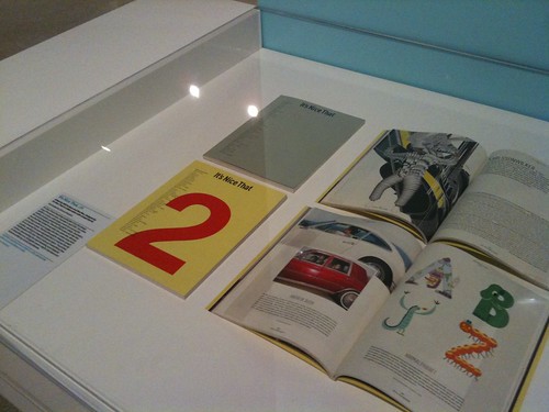
I've always been a fan of these photographs, taken for the covers of Dairy Today and seeing them big reminded me of the video that went round when the magazine relaunched.
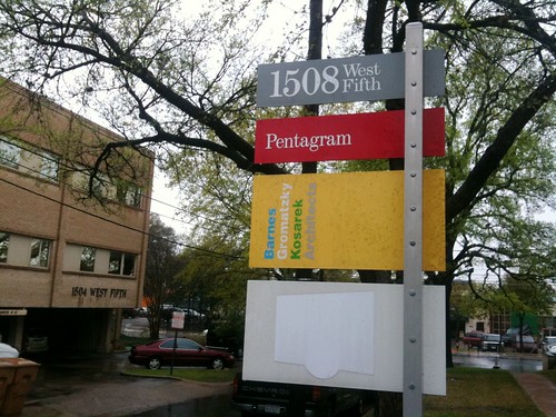
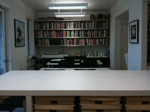
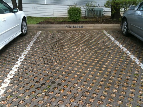
Pentagram Austin is different in many ways from the other offices but at the same time it has lots in common. Everything looks meticulously well designed. Even the dogs appeared to match the interior. How do they pull that off?
I had a lovely time, thanks to DJ and the rest of the office. And make sure you look out for that Alpine Cowboys project later in the year.
A good day yesterday. We're busy working on a thing for our panel but we found the time to go and see Clay Shirky speak. He was very good for lots of reasons but it was noticeable that he was better at the art of speaking than many others here.
He spoke loudly and clearly, he had actual jokes with actual punchlines and he had a well researched arguement. All good. But as well as that he very clearly sign posted his talk. Upfront he told us the three parts his talk consisted of and then he mentioned each chapter when he reached that point in the talk. So you always knew where you were. Superb.
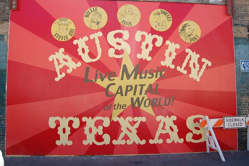
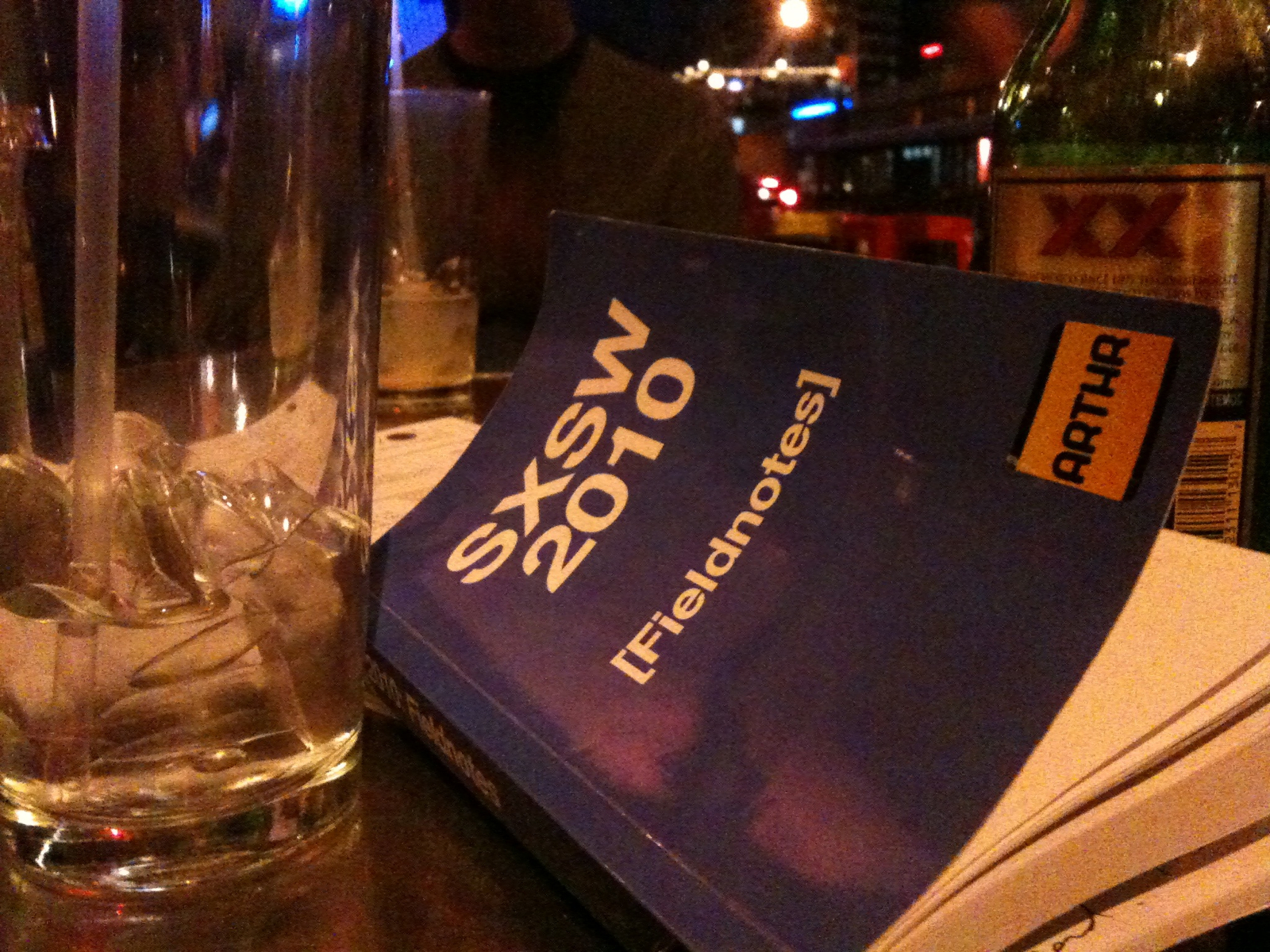
James very kindly made us all these wonderful books with lulu.com for use at SXSW.
It contains all the talks, a guide to Austin and Texas, space for notes and maps. And more. It's a lovely thing. And it fits coincedentally with my One Notebook Per Project strategy.
I've been using mine today to finish off my talk.
Wow. Tonight the category winners of the Design Museum Designs Of The Year awards
were announced. Amazingly we won
the award in our category, Graphics. That's pretty crazy.
I like those Supertelly ads you see kicking around for Sky. Not the full ad with the robot arms, I hate that one, but the simple one that's just colour and type.
I was hoping to post about it with a short description of why I like them. But I can't really work out why I like them. So I'm going to blog about it as very rough notes. Maybe we can work it out together.
1. I'm a designer. I'm a sucker for colour. We all are. Normally I hate those 3D glass effect logos, but the Sky one is well done and they use it effectively. And those colours so nice.
2. That song. Oh my Lord that song. So creamy and so rich. So gorgeous.
3. Something about the media dictating the creative in a good way that doesn't sound as shit as that. There's something in the sheer completeness of the execution that makes me think this is the bit leading the campaign.
What do I mean by that? Lots of screens are starting to appear, but they're not really tellys, they're more like animated posters. It's very rare to see any creative that's been adapted well for that format and that's probably the problem, they all feature creative that's been adapted for the format. These almost feel like they were designed with animated posters in mind.
Short little bits of moving image that work as 10 second idents after Sky News, work as silent posters on the Tube and work as 60 second ads on the TV at home.
And still looks good as a web page background. Yes, something like that.
4. Supertelly. A brilliant expression. Supertelly, you can imagine people saying that in pubs and cafes across the land.
Colour, sound, thoroughness, those alone are not recognised reasons for liking something. But who cares about that?
I picked it up badly and it slipped out of my hand onto a hard tiled floor. Then it wouldn't restart.
Thanks to IT I was able to work out that only the hard drive was broken so I bought a new one, we replaced it and it's working fine again now. But I'd lost all my data.
I dropped my Mac first thing on a Friday morning. I had backed up last thing on a Wednesday night. So I only lost one days work. A miracle, really.
I backed up via Time Machine, and restoring it was amazing. You insert the start up disk, plug the back up drive in and it gives you the option to Restore From Time Machine. Click OK and that's it. It took around 2 hours to restore 150GB. EXACTLY AS I LEFT IT. All preferences, passwords, settings, even the desktop, exactly as I left it. Amazing. Stunning.
Why am I telling you this? Because you should back up right now.
Creative Review has reached 30. They've celebrated with a special issue featuring this lush colourful cover.
And a piece where they've asked 30 people what they're excited about in the future. Including me.
You'll have to buy the mag to see what I said.
But when I opened this issue I actually felt really proud. I love Creative Review. I remember it through various points in my life as a designer. I have fond memories of my uncle's copies when I was a youngster. We all looked forward to it when we were at college. We fought over it in my first job.
It has good periods and bad periods, but this is a great time for the publication. The blog is one of the best in the industry. I'm glad it's 30. Long may it continue.


Recent Comments