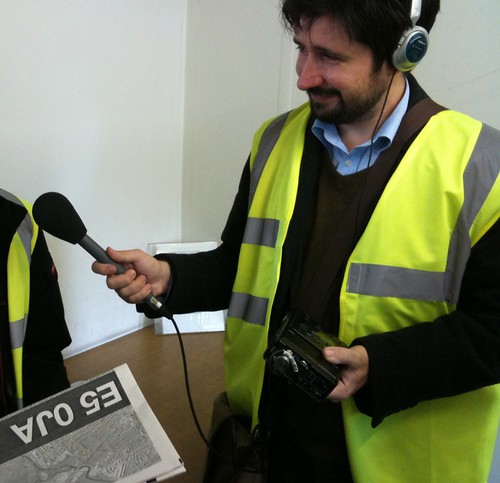
In case you missed Saturday's PM programme, click here to listen to the short feature they did on Newspaper Club.
« September 2009 | Main | November 2009 »
In case you missed Saturday's PM programme, click here to listen to the short feature they did on Newspaper Club.
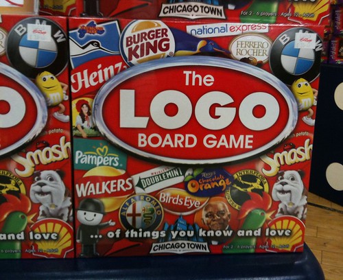
I used to think this was the biggest marketing overclaim I'd ever seen.
Until I spotted this.

How about that for a brand truth. "As useful as a 3rd hand".

This food staple was being handed out at Liverpool St. home of London's finance industry. I know there's been a banking crisis, but I'm confident the commuters rushing through that station can afford a loaf of bread.

Does anyone know anyone who works at HP? Particularly in the print-on-demand bit. Either in Europe or in the US? Can you drop me a line?
Thanks.
You might have already seen this, but in case you haven't.

I especially like, "the more complicated the format of the album... the more fucked-up the reproduction and agonising the delays" and I like "he will probably look nervous and say "Hurry up" but take little notice."
But the best bit by miles is "please write back saying how much money you would like."
Wonderful.
I don't normally do this, but I've just written about the Newspaper Club logo on the Newspaper Club blog and I thought you guys would like to read it as well.
- - - - - - - - - - - - - - - - - - - - - - - - - - - - - - - - - - - - -
You may have noticed we've slightly changed the Newspaper Club logo. The previous one used a temporary paperboy graphic whilst we worked behind the scenes to create a bespoke one.
I'd like to tell you about the thinking behind the logo and show you some of the versions that didn't make the cut. Other start ups don't give you that level of transparency, do they? When you think of newspapers you probably think of that 'funny marmalade' font. And you'd be right. That font you're thinking of visually equals newspaper, so I elected to use that. Simple. I'm a huge fan of not over complicating design, as my old boss used to say, "you might say cliché, I might say crystal clear communication".

Most of the typography that would pass as crystal clear communication for a newspaper masthead is based on the font Blackletter. Blackletter has it's uses, but on screen is not one of them. In fact, it's more Duchy Originals than Daily Oregonian as over an incredible 1,000 years Blackletter has undergone many cuts and derivatives and most broadsheet newspapers today use stylised versions. Or typefaces based on a gothic Blackletteresque font, more accurately.
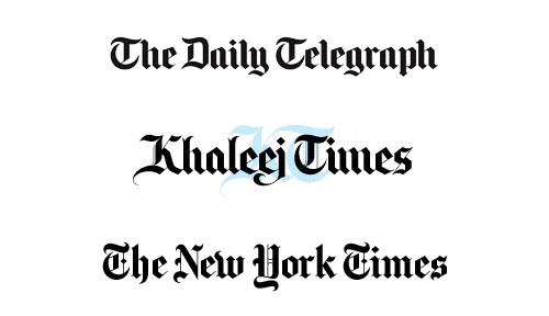
I needed a version that said 'newspaper' as instantly as Blackletter but worked well on screen.
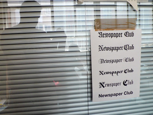
Back in June (on day one in fact) I looked at several versions and settled on Brauhaus . It has been simplified and is therefore better for online use yet it still retains the newspaper feel I was after. To make the letters more distinctive I opted to change the N and the C for slightly tweaked versions of the Blackletter N and C.

That's the word marque sorted but for a modern start up you need an icon for all those pesky 32x32 square icons you have to create. And that's where the paperboy came in. The original inspiration was the Paperboy Atari game from the 1984. That's a sort of digital newspaper joke for people of a certain age.
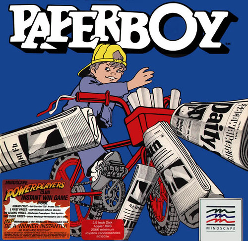
A little character would be handy for all those icons and also for guiding you through the newspaper making process. It feels right for Newspaper Club as we're a friendly tool for people and communities not a secretive, hard edged, spiky tech dot com.

We used this chap for a while, but it was just a place holder. We wanted our own, so we tasked the amazing Rexbox with creating one for us. Rex has worked on all sorts of cool stuff including co-creating LittleBigPlanet and stuff for Disney and MTV.
Here he is. The paperboy, not Rex.

The result is a modern, friendly logo whilst hinting at the visual history of the newspaper masthead. We hope you like it.


How about this for a fab recession busting unproduct digital idea?
Folksy are doing a thing called Upcycling. You take second hand / charity stuff and make it into something ‘new’ and desirable to be sold at an online auction starting on the 7th December. All proceeds from the auction will go to Sue Ryder Care.
That's good isn't it?
There will also be a winner - the person that makes the best thing in various categories. The winners get to display their work in the Sue Ryder Care Camden store for one month from the middle of Jan to the middle of Feb in a specially constructed Folksy set. That's a fantastic opportunity.
Find out more here.
Because I have a few blog posts in my draft folder that don't seem to get finished and because I saw someone else do this the other day, here are a few things in no particular order.
* There is a recession going on. A big horrible one. Friends of mine have lost their jobs. But generally speaking everyone I know who is very good is very busy, everyone who is average or worse is quiet. Possibly there are two reasons for this; firstly in difficult times clients go for safe bets, secondly talented people are better are making themselves busy.
* I keep hearing people say the internet is going to change, nay revolutionise, politics. A new dawn is coming. Fine, except I see an Eton educated Tory Prime Minister coming over the horizon. That doesn't feel very new does it?
* People keep telling me that no-one is interested in politics any more. Wrong. Go and speak to some constituents of a Duck House MP. Go and speak to some Tories. They are all very engaged with the forthcoming election. The world is not full of Labour voting social media consultants.
NB I imply nothing about Eton, Tories, Labour, social media consultants or ducks. This is not a political blog.
* More and more it appears to me that small companies are good at innovation and big companies are good at Getting Things Done. Both of these are attractive at different times. Very few companies (Google being a clichéd example) are good at both. £££££.
* That fucking Philippe Starck programme is awful. Lots of people say it's good that design is on the telly. Not when it's design like this. Mind you, designing does not lend itself to exciting TV.
* They should bring the two Dicks back. Do not Google that, the reference is here.
* Advertising agencies are much better at account management than design companies. This matters and is one reason why ad agencies have the relationship many design agencies grave.
* If you say, out loud "the internet is going to change my business" you are fucked. It already has changed your business. All that is over. But there's some good news, it probably hasn't changed that much. All you need to do is work out which bits of your business are good and then concentrate on those.
* You work too late. Really. It's no good for you. Stop it.
* Sir Harold Evans, famous editor said last week, “I’m in love with the craftsmanship of print. But I have to say I’m intoxicated by the speed of the web”. He's right and that gives me a cute link to remind you Newspaper Club launches in January.
* Anish Kapoor is worth a visit.
That is all.
And now it's time for annual review of the D&AD Annual.


Looks great - difficult to use.
These little info graphics are particularly gorgeous.


Each section is covered by an extended page that's on slightly thicker stock and folds in to wrap around a section.


Neat idea you might think? Certainly looks cool from the outside. But when you're reading the book and you move on to another section it does this.

Which is annoying. I'm sure the pages will soften over time and it's not so annoying it would stop you reading the book. But still, it's a book in a book format that didn't really need messing around with. Seeing that those section dividers add very little I don't see the point of them. Like I said, annoying and classic Saville.
The rest of the book follows the standard design we've grown used to.
There's some great work inside, but there's very little stuff that stands out. Actually I remember very little of the work when flicking through the book. That has nothing to do with Saville, or D&AD or the judges, that's a quiet year.If you don't fancy membership you will soon be able to buy the same book, designed by Jeremy Leslie and printed by Taschen for about £30. That's a very good idea and a very good deal and I'm sure it won't have silly section dividers either. We'll announce that when it gets released.
I've picked out some stuff that caught my eye below. It's very hard to credit everyone involved, so I haven't. Apologies for that. Seriously, it's hard to credit everyone on a blog and yet I ought to really. Sorry.


What have we done?
Found via The Design Disease Flickr Pool
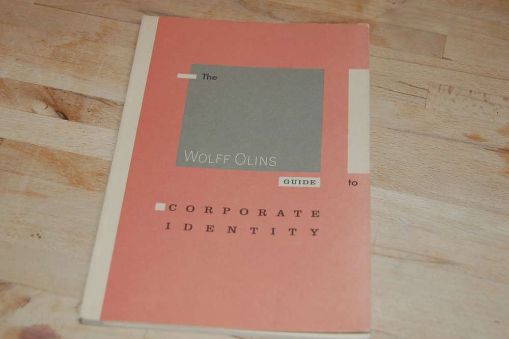
I acquired this book the other day.
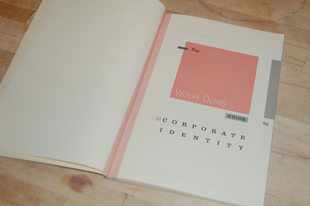
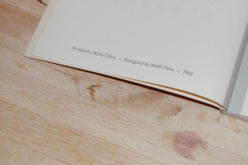
It's very Eighties. Very November 1983 to be precise. 26 years old. That's older than some of you reading this.
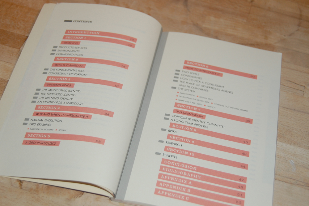
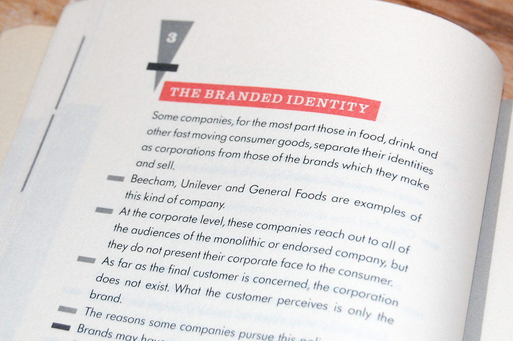
There are no designs in the book, just words. Very good words too. Most of them still relevant today.
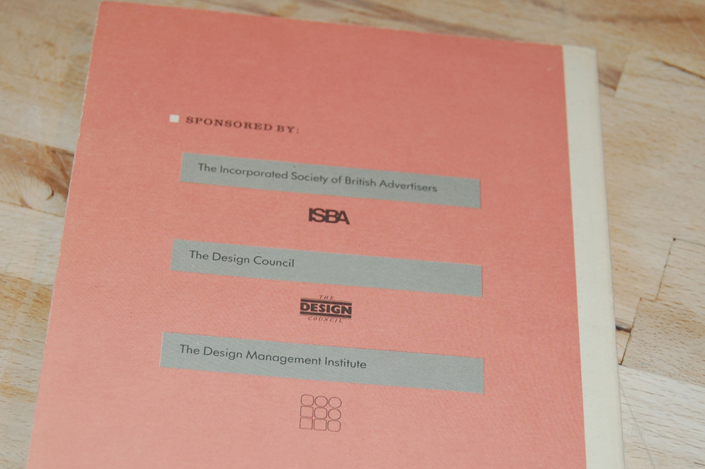
Unlike these organisations.


Recent Comments