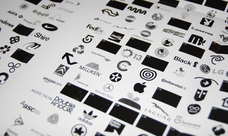
I'm working on a couple of identities at the moment where their primary usage is online. You could call them digital identities.
Sure, they will be used offline at some point, people still have business cards, but the over riding majority of times they will be seen online. At least 95% of the time.
A couple of times whist working on these identities we've discussed a black and white version, that's a normal thing to do. And every time someone has asked, why?. Every time it's been a struggle to answer that question.
Lots of you will be horrified by that, but most of the time, I think I'm a pretty traditional designer. Function before form, ideas will always win, etc etc. And I can put together a decent case for a black and white version of a logo. But if you start to look at the evidence it becomes harder and harder to defend. We need to be clear that in the example above I'm specifically talking about digital companies that operate in the digital world. They don't have shops or vans. I don't know if you've noticed, but there's some pretty big money in this arena these days, Amazon, Facebook, Skype, Yahoo! et al. Do they need b+w versions of their logo?
Let's have a look at both sides of the argument.
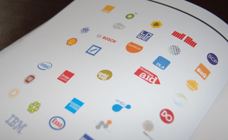
The case for having a black and white version of your logo
1. It's good discipline.
If your logo can work in b+w it can work in any situation, ever. It's the mark of a good mark that it can be stripped of colour and still work. Think of the classic logos, V&A, Shell, Apple, Kelloggs, VW, IBM, whatever - they all work just as well in b+w.
2. It's practical.
At some time in your companies life you will need a b+w, or single colour, version of your logo. Whether it's to send to the company that makes polo shirts or for the sides of the vans or for the NCR invoices, one day you'll need a b+w logo.
3. It's cheaper.
Put very simply one colour is the cheapest form of production. If you need to produce a full colour logo on every single piece of collateral costs are going to rise. Considerably if you're a large firm.
4. It's a mark of quality.
Often, if a logo can't be produced in B+w that's becuase it's some hideous 3D spinning globe of a thing. And we want to avoid all that, don't we?
The case against having a black and white version of your logo
1. Everything is full colour now.
Almost all printing these days is full colour. With the exception of till receipts it's rare to see a big brand using black and white printing. Do you ever see single colour vans? Do you ever see single colour logos on polo shirts? Come to think of it, does your company have any vans? Would you ever produce polo shirts? And in any case all that media can be full colour, at not much extra cost.
2. You're online almost all of the time
If you're an online firm, like say Google, then you hardly ever exist offline. You don't have shops, or vans or carrier bags. So why do you need a black and white logo? Have you ever seen a single colour version of the Google logo?
 Full colour Google logo on stickers, bags and err, a tin of mints? Picture borrowed from Mex Beady Eyes, usual rules apply.
3. It doesn't affect quality.
I've never seen a single colour version of the Google logo. Or the eBay logo. The Tate have a single colour logo, but it's always used in glorious full colour. It doesn't seem to affect them.


Sure, there are some companies who will always need single colour versions of their logo, a brick making company for example. But more and more we're going to see firms who simply have no need for a black and white version.
So, what do you think? Should we retire the black and white logo in 2009?











Recent Comments