Noisy Decent Graphics
A series of blog posts by Ben Terrett about me | archives | atom feed
« June 2008 | Main | August 2008 »
Jul 31, 2008
Children's Interaction Designer Wanted
I met Jeremy the other day and he's looking for an interaction designer that specialises in stuff for kids. Not just web design, actual interaction - if that makes sense. He can't say much more about the project here, but it's very exciting. If you've got a passion for children's stories and interaction design this would be your dream project.
Importantly he's not necessarily looking for an agency, it could be a student or graduate that's been working on this type of stuff. There's got to be a recent graduate out there who's got a children's interaction project in their portfolio? Someone who's got a passion for both things. Anyway. Here's what Jeremy has to say.
Do you know how to push children's buttons and which buttons they will push?
A major publisher is looking for an interaction designer to work on an exciting digital storybuilding project for 5-11 year olds. If you have an interest in designing compelling experiences for this age group email interactivestories@googlemail.
com, ideally with an example of your work.
Contact him on that email address above. Don't contact me.
Posted at 07:42 in Graphic Design Industry Stuff, How To Get A Job In Graphic Design (Kind Of) | Permalink | Comments (2) | TrackBack (0)
Jul 30, 2008
Silicon Roundabout
The hottest place for the coolest cats at the moment is Silicon Roundabout.
I was fortunate enough to be in the Dopplr office the other day when Matt Biddulph had a eureka moment. "Silicon Roundabout!" he exclaimed. How we laughed.
But look! He's made a Google map of all the cool Boom 2.0 companies working off Silicon Roundabout and he's started a social networking site (that's what they do after all...) for Silicon Roundabout residents.
But the meme isn't just self propagating. The FT featured it on their blog and London's Evening Standard ran a story on page 11 today.
Silly season? You must be joking.
In other logo related news; whilst I was at Dopplr, Russell and I dropped off a present of some mugs.
Been meaning to do that for a while.
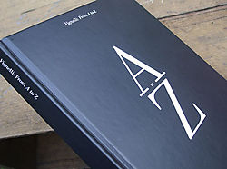
Summer of Design Books: Vignelli: From A to Z
Not written by me, written by you as part of the Summer Of Design Books series. You can write and post a review too, go here and follow the simple instructions.
- - - - - - - - - - - - - - - - - - - - - - - - - - - - - - - - - - - - - - - - - - - - - - - - -
For holiday reading this year I took away Vignelli: From A to Z. To be honest, I didn't know much about Massimo Vignelli before reading this: there was the Subway Map of course, Helvetica and the Michael Bierut connection. Now, I feel I know lots and while I can't say I totally agree with everything the great man has to say in his book, I really feel I've learned useful stuff and been reminded of many vital aspect of being a designer; things I perhaps already knew but lacked the elegance and insight of Vignelli to be able to express as clearly.
The book is a collection of short essays, cunningly ordered to follow the 21 letters of the Italian alphabet and there's something of value to be gleamed from almost every one of them.
So what I've done is attempt to extract just that, something of value, from each essay. Not necessarily the only useful or interesting thing and possibly not even the most important you may feel if you read it yourself; certainly, great benefit would be gained from taking the plunge rather than relying on my sorry attempt to summarize.
But here goes anyway, helpful or unhelpful: extracts, thoughts, observations or misunderstandings taken from Vignell: From A to Z...
A) Ambiguity:
Fun to play with, it can enrich work and instill "a sense of timelessness"...but handle it with care.
B) Books:
"The task of the designer is to transform an ordinary object into an extraordinary experience."
C) Chromotype:
Vignelli's term used to represent "identification by the consistent use of colour connected to all graphic aspects of a company's communication media". Also: Phonotype for sound (think Intel Inside) and Morphotype for a form identifier (as in the shell for...well, you know what).
D) Discipline:
"...what makes us responsible towards ourselves...our clients...the society in which we live."
E) Education:
"The best education is generated by an insatiable passion to learn more..."
F) Furniture:
Here he mentions his theory of "Identity and Diversity" in which a limited number of elements can be arranged and rearranged while a clear and recognisable identity is retained.
G) Garments:
Applying a modernist/reductionist approach Vignelli designed a range of cloths to suit his own needs. Some still look cool,elegant and timeless; others look like they're costumes for a 70s sci-fi film. In the context in which I read the book, our rainy holiday in Donegal, this bit highlighted just what a superb but underrated garment the pack-a-mac is; a great and unfashionable example of form and function.
H) Helvetica:
I didn't know that Vignelli was, literally, the man responsible for Helvetica reaching the US.
H) History:
"...artefacts generated without knowledge [of history] ultimately express their ignorance, shallowness and fundamental uselessness."
I) Interiors:
"The real challenge is to design a space in a way that will create an impact and remain forever ingrained in the mind..."
L) Lighting:
"To control light is to darkness, as well as articulate and manipulate emotions, objects, spaces, feelings, life."
M) Magazines:
"Magazine design means organising information in the clearest way possible; to achieveimpact, memorability; to involve the reader...to establish a relationship...a bond."
N) Newspapers:
To design a newspaper means to organise in such a way that it will facilitate the make-up of each issue, its production...and then (see Magazine).
O) Objects:
"To design objects is to play with light."
P) Packaging:
"If protection is the primary function of packaging, deception has been more often the motivation...packaging can sell once, but only a good product will ensure continuous sales."
Q) Quality or Quantity:
"The moral imperative should be to reduce the ugliness around us...and replace it with decent, unselfish design."
R) Responsibility:
"Responsibility is not only an ethical attitude but an approach that stands for quality and is economically sound as well."
S) Structure:
In graphic design, "...without [structure] the content is loose and in that randomness, the message is lost."
S) Style:
Style = Intellectual elegance
T) Typography:
Structure comes first. Typeface comes second.
U) Universities:
"University training will provide...the proper cultural level to give depth to [a designers] work...to make...the responsible designers that society needs."
V) Vignelli Associates:
In this last bit Vignelli gives a brief overview of his studio and takes the opportunity to commend and thank his most notable empoyees.
Posted at 08:30 in Summer of Design Books | Permalink | Comments (1) | TrackBack (0)
Jul 28, 2008
Bad Apple
I love Apple. Effectively my salary gets split in 3 equal ways; Alistair Darling, Tesco and Apple.
You might be aware that they launched a major new product recently. There were a few problems, some of which I suffered. But I know it's impossible to have such a huge global launch without a few glitches.
There's one thing I couldn't let slip though. I bought a MobileMe account the other day. I bought it from Apple online. I was expecting an email confirmation and a registration key and then I'd be in. But no, this huge box arrived.
I've worked on products where the thing you're buying is intangible and so the customer needs to get something physical at the point of purchase, but that box is a ridiculous size for this:
That's basically the size of a CD. That little CD sized box would have easily fitted through my letterbox, but this big box had to be left at the depot for me to collect at my convenience. What makes all this worse, is that when I opened all that packaging I got a simple registration key.
That's bad isn't it? Bad Apple.
Whilst I'm complaining. My new 3G iPhone can no longer be charged whilst listening to music on my Bose iPod thing. That's very annoying.
When I took this picture I didn't register what song was playing, but I Want To Tell You seems quite appropriate.
Posted at 13:45 in Complaints Dept. | Permalink | Comments (5) | TrackBack (0)
Jul 27, 2008
The blueness of Heat
I reckon there are only four films I've seen more than once, properly, all the way through, Breakfast at Tiffany's, The Lion King, Lord of the Rings and Heat. Breakfast at Tiffany's used to be my favourite film but now I think it's Heat.
One of the things I love about it is the attention to colour. Almost everything in the film is cold steely blue colour. Sure, it's easy enough alter the grading but they've also used blue lights, blue clothes, the sky and the sea. All to add to the subtle blue effect.
It was on telly last night so I tried to take some pictures to prove my point. You can't really see what I mean because the tungsten lighting of my lounge alters the colours. But there are some more pics on Flickr if you're interested.
Posted at 00:48 in Seen and heard, What The World Would Look Like If It Was Run By Graphic Designers | Permalink | Comments (13) | TrackBack (0)
Jul 26, 2008
The Summer of Design Books: Print Liberation
Not written by me, written by you as part of the Summer Of Design Books series. You can write and post a review too, go here and follow the simple instructions.
- - - - - - - - - - - - - - - - - - - - - - - - - - - - - - - - - - - - - - - - - - - - - - - - -
This time in SDB, no history of design, no theory of design, no beautiful forgotten design.
So what's let left to talk about, you may wonder.
Well, what about screen print technique?
Plenty of DIY here, and I know you like it.
You may have noticed that there's a tradition of screen print shops in the US. Creating posters mostly for touring rock bands, these local designers produce an amount of fresh graphics.
This book will teach you how during the great depression the government sponsored (amongst others) artists and printmakers in a program that allowed to them to publicize concerts, plays and community events, and also made artwork accessible to the people.
But it's not the main topic of this book.
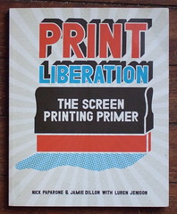
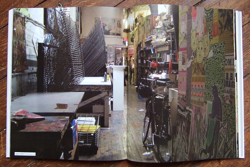
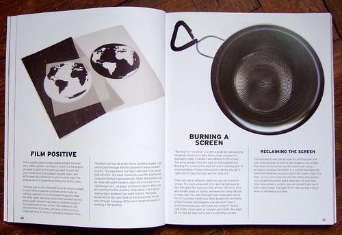
Written by the Philadelphia-based duo Print Liberation, it will teach you how to print, wich tools you need, how to build your studio, and even how to be successful.
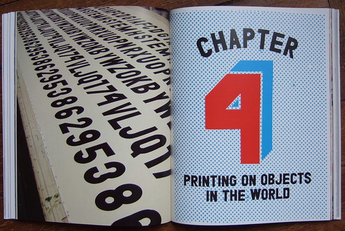
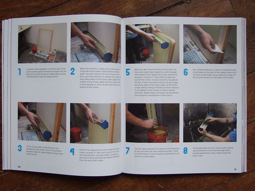
No need for a lot of money to start (they say 40$ and a bathroom) and a lot of step by steps in pictures, covering a large range of situations: print on t-shirts, print on the walls, print on thick objects, etc.
Very helpful if you want to make it through this technique, or even if you just wanna dream that one day you'll do it (as I do).
Print Liberation
The Screen Printing Primer
Nick Paparone & Jamie Dillon
with Luren Jenison
North Light Books 2008, Cincinnati
ISBN 1600610722
Posted at 07:59 in Summer of Design Books | Permalink | Comments (3) | TrackBack (0)
Jul 23, 2008
The best headline ever
Spread round Flickr (and other places) like wildfire. How much did the beauty of the headline move the story up the news agenda?
(Pictures from secretlondon123, shihlun, blackbeltjones, Martin Deutsch, MykReeve and my bad self.)
Posted at 11:14 in Seen and heard | Permalink | Comments (1) | TrackBack (0)
All your eps needs
I've been seeing these vans for years, but never managed to get a photo until the other day.
I know it's a very geeky designer joke but it always makes me smile when I see one. They used to have a division called eps maintenance. Wouldn't that be brilliant? Your eps is corrupted so you ring eps maintenance and they race round and fix it!
The divisions they have now are called EPS Social Housing, EPS Building Services, EPS Security, EPS Refurbishment. Very funny.
(For the non geeky designers reading this, eps is a file type like a jpeg. It stands for Encapsulated PostScript.
Jul 22, 2008
"The importance of the unimportant"
Posted at 12:37 in Great Graphic Designers, Quotes | Permalink | Comments (0) | TrackBack (0)
So you think you can, erm, you know, present?
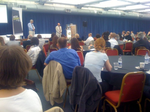
A couple of weeks ago I went to the BBC's Media Futures Conference. The best bit of the day by miles was Peter Day.
That's Peter over there, top left in the blue shirt and the cream trousers. There's a better picture here and his BBC biog is over here. But you all know who Peter Day is, right?
He didn't speak, he only chaired a session. But he was very well briefed, very well prepared and he spoke persuasively and intelligently. He had this great quote from Paul Saffo, "Just because something is inevitably going to happen, it doesn't mean it's going to happen any time soon".
What struck me most was how he never once said, err.
Granted, Peter Day is a professional broadcaster and he's been doing it for years and years, but still, he never once said "err". Not once. No umm's, no erm's, no you know's. I was so startled by this I counted erms and umms for the other speakers. On average (and my survey wasn't very scientific admittedly) no speaker could get through one minute without and an erm or an umm or a you know.
I realise that dropping countless 'you knows' into a presentation is mainly a stylistic issue and in the right circumstances it can be effective, but more often than not it's just lazy. It's very easy in this industry to convince yourself that you're a good presenter when actually you're just average. Good speakers are people like Peter Day, Tony Blair or Winston Churchill. As Jon Steel points out in his brilliant book (you have read that book haven't you?) Winston never needed any PowerPoint to get his point across. Neither did Peter Day.
I know Blair and Churchill and the like are talking about much more important things than the difference between Arial and Helvetica, but even your local MP could stand up for 45 minutes and give a competent speech about the local door knob society. No notes, no PowerPoint, no erms. John Dodds once saw Seth Godin stand on a char (in the middle of Buckingham Palace or somewhere) and talk about funny coloured cows for nearly an hour. Could you do that?
Next time you speak, try and do it without any erms.
Posted at 12:32 in Complaints Dept., Conferences / Speaking, Quotes | Permalink | Comments (3) | TrackBack (0)
Jul 17, 2008
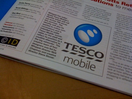
Dreadful logo
Posted at 15:30 in Complaints Dept., Graphic Design Industry Stuff, Graphic Design Reviews | Permalink | Comments (14) | TrackBack (0)
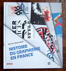
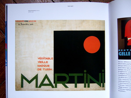
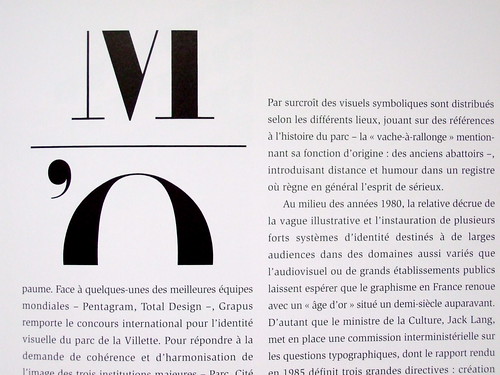
Summer of Design Books: The Story of Graphic Design in France
Not written by me, written by you as part of the Summer Of Design Books series. You can write and post a review too, go here and follow the simple instructions.
- - - - - - - - - - - - - - - - - - - - - - - - - - - - - - - - - - - - - - - - - - - - - - - - -
I've read this book in the french version, but the english one should be (and looks) the same, so here we go.
You all know that the Didots used to be pionneers at the XVIIIth century, and you also know how gorgeous M/M 's work can be.
But what happened in between?
It's time to discover french's specific timeline and masterpieces, and how after the golden years (until 1880) the avant-garde had to fight to be heard (and seen) and how 20 years after the WW2 the swiss style and the modernity will make it through the design schools.
But wait, here are the '70s and in the whole western world, this modern thing is getting boring, turning into the so-called international style.
So, how will designers working in France manage to jump into a New Typography train that's 40 years old, while postmodernism is making its way everywhere?
Michel Wlassikoff, graphic design historian, will tell it to you - and much more, as his book starts in 1500 and ends in 2005.
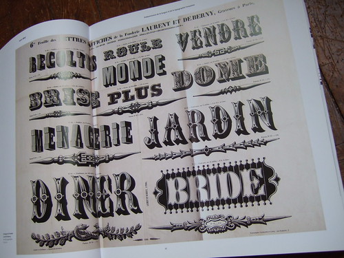
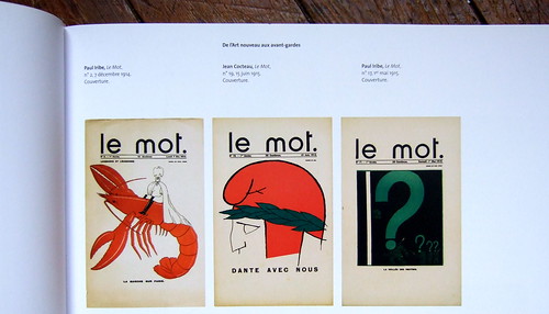
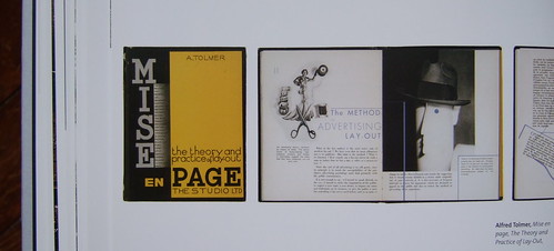
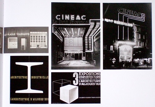
Plenty of pictures here, with the finest exemples and high quality reproductions.
You guessed it: what we have here is the ultimate book for graphic design in France.
The Story of Graphic Design in France
Michel Wlassikoff
Gingko Press
Posted at 11:52 in Summer of Design Books | Permalink | Comments (1) | TrackBack (0)
Exciting Publishing News
If you ask me Creative Review are doing a pretty good job of bridging the gap between print and online. Lots of good stuff from the magazine finds it's way onto the blog in an accessible fashion. There's enough of a gap between the print version so subscribers don't feel cheated, yet it still feels like fresh content. Good.
On that note, my ten years article is now on the Creative Review blog in full. Since the article was published lots of people have emailed over their ten years stories. It might be nice if people started adding these to the CR Blog.
In other exciting publishing news I think a cartography publication are going to reprint the map post.
Posted at 11:46 in Graphic Design Industry Stuff, Just Me Doing Stuff | Permalink | Comments (1) | TrackBack (0)
Jul 16, 2008
The Penguin Collectors’ Society
I've just joined The Penguin Collectors’ Society. They sent me this lovely postcard.
You should join too (you don't have to collect Penguins to join). It only costs £16 in the UK and you get good, free things every now and then. AceJet170 explains it better than me.
As an aside, on that postcard it says, "Penguins, taken on the train, elevate and entertain". I wonder what a format that could elevate and entertain and be taken on the train would mean today...
Posted at 13:53 in Graphic Design Industry Stuff | Permalink | Comments (2) | TrackBack (0)
Marti Pellow Sings The Hits Of Wet Wet Wet
Posted at 07:43 in Complaints Dept., Just Me Doing Stuff, Seen and heard | Permalink | Comments (14) | TrackBack (0)
Jul 14, 2008
The Rhizotron at Kew Gardens
Rhizotron originally means "clear-walled chamber through which one can observe roots as they grow". This version is a little different as it climbs through and over the tree tops at Kew Gardens.
I was impressed by how it seemed to fit into it's surroundings. It would have been an obvious (aesthetic) choice to make it from wood but I prefer it in metal (iron?). It looks stronger for a start. I know wood can be as strong as metal, but I can imagine that those of a vertigo disposition would feel better knowing it was made from metal. The rust colour looks organic and even bolts have a natural feel about them.
I loved the way they've mirrored the look of tree branches for these supports. It's got that nice exciting engineering Brunel look about it. It doesn't look threatening. It looks cool.
The view are pretty cool too and you get to walk amoungst the trees. Little plaques tell more about the trees as you pass and there's even a Bluetooth game.
Actually the Kew website is pretty good and there is a good interactive map of all the trees. Exactly the sort of thing Kew should be doing. Good.
All good fun. At the moment it's a temporary structure but I hope they make it permanent. More pictures on Flickr.
I liked this as well. Reasonable, common sense, non preaching, on brand message, environmentalism. One last full stop wouldn't hurt though.
Posted at 11:04 in Exhibition Reviews, Seen and heard, Sustainability In Design | Permalink | Comments (3) | TrackBack (0)
Jul 11, 2008
The Fastest Art In Town
I went to see Martin Creed's Work No. 850 the other day.
A person runs through the main gallery of Tate Britain, as though their life depended on it, roughly every 30 seconds.
Is it art? No. Is it a great, fun, interesting way of getting people into an art gallery? Yes. So is it art? God knows. It is however tremendous fun and it's free. Therefore I commend it to the House.
Posted at 09:51 in Exhibition Reviews, Seen and heard | Permalink | Comments (4) | TrackBack (0)
Jul 09, 2008
Faumaxion Slippy Map
I tried to find this when I wrote that post, but I'd misplaced it. Mike's kindly emailed it to me so all is well.
The best, best map is Mike's moving version of Bucky's Dymaxion Map - the Faumaxion Slippy Map. It's hard to explain, but click through and have a go. You'll soon get the idea.
Recent Posts
- Years in the domain, like tears in the rain
- Printing is still too hard
- No innovation until everything works
- "They'll be dancing in the streets of Total Network Solutions this evening"
- It was a pleasure
- Public Digital has won a King’s Award for Enterprise in International Trade
- Kids describing fashion ads
- Art at Mount St Restaurant
- Post match squeeze
- Unbelievably tickets are still available












Recent Comments