
Copyright London's Transport Museum and probably loads and loads of other people. No harm intended.
A complete classic from the late, great Mr Abram Games. I just thought I'd have a little look again. Nice isn't it?
« April 2007 | Main | June 2007 »
Copyright London's Transport Museum and probably loads and loads of other people. No harm intended.
A complete classic from the late, great Mr Abram Games. I just thought I'd have a little look again. Nice isn't it?
The Postopolis! thing that Dan has organised (with some others) looks fucking brilliant.

Picture borrowed from Dan. Usual stuff applies.
It's in New York which is a good start. Dan is blogging it here and the talks seem fascinating. More fascinating than they look on paper, and I mean that in a really good way.
If you're not in New York then you can follow the proceedings through Dan's blog. Already there's a brilliant post about what's happening in NYC right now including the Militarily induced sexual tension (there's a link you won't be able to resist clicking on). There's Robert Krulwich who talks about framing and how the media use and abuse space, including some illustrations from a craftily arranged political "crowd".
There's Tobias Frere-Jones who's photographed over 40,000 bits of street typography in New York.
"A favourite sign is that of the Manhattan Railway Co., which ran the elevated trains in New York. Frere-Jones notes that the last El was torn down 50 years ago, yet the lettering is still there - on Division St".
And there's also Stanley Greenberg who photographs things like New York's water system. Amazing stuff. I wish I was there.

1. You're all ego.
2. Has his Prius broken down? - No, his Hummer.
3. Only half a dozen mills left in this country.
4. I thought you meant me; small, sweaty and hot.
5. You need to adapt to the new generation, son.
6. Wait until June? Why? Will it be cheaper?
7. I ought to make up some words.
8. Visuals. For. The Internet.
9. I don't want to upset you. - Well don't then.
We're beginning to screen print the Interesting tshirts in earnest this week.
Yes, I said, "in earnest".
Thanks to all the people who've already sent one in. If you'd like one (and you would like one, trust me) then get sending 'em asap. Time is running out. We haven't issued a cut off date yet, but obviously we won't be printing on the 15th June.
So pop down to your local Post Office and get sending.

In my first job they used to take me to a lot of meetings. This was a novelty as they'd never taken an art director to meetings before, it was always the CD or the deputy CD.
They took me for two reasons; firstly I can pronounce most words properly and secondly they had a bit of an image problem and wanted to show off the youngest member of staff. My role in these meetings was to sit there and say nothing.
Time after time I found myself listening to utter rubbish and wanting to blurt out, "but why don't you" or "you ought to do it like" but never saying anything. Almost every time someone would say what I was thinking and the assembled marketing brains would nod in approval. How I wished I'd spoken up.
So, if you're thinking something in a meeting - say it. Chances are everyone else is thinking it too.

The colours of the flags of the world as pie charts. Via the wonderful infosthetics.

So Thursday night saw the annual D&AD Awards.
First off, let's get the complaints out the way. I know you may think it's harsh to criticise what is obviously a very difficult event to organise with an impossible to please audience, but a little bit of constructive feedback never did anyone any harm.
The food was bollocks, the ceremony was too long, the bloody water wasn't free and the price is too much.
I don't actually think the price is too high, just that I think you need to get more for your money. I'm sure it's an expensive event to put on but to me it doesn't feel like a £300 bash. I hate all types of food (I wish I didn't have to eat at all, eating is a major interruption in my day) but sushi doesn't exactly feel like value for money, does it?

The ceremony will always be too long, I don't know what they can do about that. Tony and Dara O'Briain went as fast as they could. Lastly, surely it's not too much to ask for a free glass of tap water?
Moan over.
As you've probably worked out (you're a clever lot) Dara O'Briain was the celebrity host. As w+k say, he broke with tradition by being very funny. His joke about buying a mobile phone was spot on and he berated one lad for not bothering to take the stage to get a silver but bounding up to collect a gold. That said, I'm never sure why they need a host at all? (Surely there are enough egos in the audience who could host an awards ceremony?) Usually the President is good enough to stand up and host. Tony has been great at all the other talks and stuff and I think he could have done a good job all on his own.
Two golds and 59 silvers. CR Blog got the scoop on the full awards list.

D&AD Celeb host in "actually funny" shock
This nice chap from Qubibi (sorry, didn't catch his name) was sat on our table and won an award for this website. Well done.

Those pencils look nice, don't they?

This picture above is what it looks like behind the scenes, after all the pencils have been given out. You see, here at NDG we constantly strive to reach the parts other media can't quite stretch to. No need to thank us.

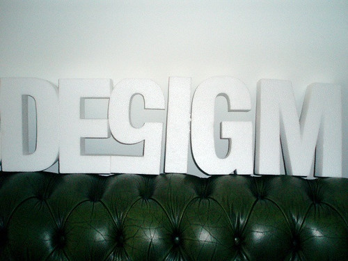
Wacky design and advertising types messing around with the letters.
As you know I judged Writing For Design and I also did Black Pencil judging. Black Pencil judging (like silver) is secret so you don't know what's going to win until the night. I guessed that the Concrete Shelters, the War illustrations and the Nintendo Wii would win. One out of three.
A good time had by all. More pictures on Flickr. Read the view from one of the organisers here.

I was talking to a hairdresser the other day. Talking in an 'over the Gold Blend at a dinner party' kind of way, not in a 'where are you going on holiday' kind of way. He said when he says he's a hairdresser the two questions he always gets asked are; are you gay and what would you do with my hair?
So, when you tell people you're a graphic designer, what's the first question you get asked?

As promised I've written a fair and balanced review of last night's talk. As a little surprise I've written it over here.

Do you remember this post where I tried, in vain, to find out more about "the British Rail train identification system that won loads of awards and they always used to go on about when I was at college"?
David, who is good at remembering these kinda things, thought that the identity system was designed by Roundel in the 80's.
Looking through an old D&AD annual at the weekend I have finally found out the truth about the mysterious scheme! David was correct that it was designed by Roundel in 1989. Here's the full list of actors.

Is Jane Priestman related to Paul Priestman?
And here's the D&AD Annual spread.

According to the splendid C58LG website I've found out that the individual symbols were based on the major commodity carried by that particular bit of the business. They also explain that the top left of the symbols were designed to look like an F, for freight. Although the F is easier to see in the first picture above.

Nice aren't they? I like them a lot.
C58LG go on to say:
"The Coal sector logo (black diamonds) represents coal.
The Construction logo (blue/yellow squares) represents building blocks.The Metals logo (blue/yellow chevrons) represents corrugated iron.
The Petroleum logo (blue/yellow wavy lines) represents the fluid nature of the oil.
From what we understand, the Railfreight Distribution (RfD) logo (red diamonds/yellow) was supposed to show the four corners of the UK, but on the other hand, it might well simply be a design not based on anything…!"
Yes, the 'four corners of the UK' is a bit tenuous.
Apparently Roundel also designed a series of Depot Plaques for each of the major maintenance depots, some based on staff suggestions. They're interesting too, but I don't really have any strong affection for them.

Another great website called DepotPlaques.com has much more information on this. Bizarrely they claim that Roundel still own the copyright to the designs which means that replica plaques "are not currently legally produced". I wonder if that is (still) true?
The scheme didn't win a D&AD award, in fact it looks as though only the 'Environment Identity Guide' made it into the Book. 1989, page 217 should you fancy having a look yourself.
This is what the kids do now, instead of leaving a Post It note.

I've been to Chicago maybe 11 times since 1997, but took me until 2004 to finally get round to going on an architecture tour.
I'm just going through some old photos and uploading them to Flickr and I found these pictures of an amazing Rem Koolhass building I saw on that tour.
The pictures are from the McCormick Tribune Campus Center which is already pretty special because the original campus was designed by Ludwig Mies van der Rohe.
There's no trickery in that photo above it really is that orange. On the right hand side are a series of orange glass panels which producing that gorgeous effect. The whole building is exciting, colourful, playful and clever.

This picture is of some stairs that are designed to be easy to access by wheelchairs and prams. A simple, elegant way to solve the 'badly designed stuck on ramp after thought' problem.

From certain angles they look like 'normal' stairs. It's a nice visual trick. In this day and age we should be designing buildings with things like access ramps built in automatically. It shouldn't be an after thought or a problem.

The outside of the building has pictures of famous architects. When you get closer the pictures are made up of great little graphics like this.

Fantastic. A few more pictures in this Flickr set here.

David Airey has written about my (or should that be our?) post on typographic advice for 3rd year design students. His listeners leave some helpful comments too.

God, I hate telephone directories.
Surely telephone directories are one of the worst environmental crimes committed at the moment? The waste of paper is breathtaking. To make it all worse, most councils won't let you recycle them in your home recycling because they're too heavy. Although you can take them down to your local recycling centre.
Who the hell uses telephone directories anyway? People either use the internet or they get ripped off on one of those 118 numbers, don't they?
I'm aware that not everyone has the internet, but surely you should be able to request one of these things? Or at least you should be able to request that you don't get one. The way they are distributed to everyone is disgusting.

Next week is a busy week for the nice people at D&AD.
On Monday night there's a talk by Mr Wieden and Mr Kennedy, on Tuesday there's a talk by some/most of Pentagram and on Thursday night it's the awards ceremony.
Rest assured, beloved listeners, that the entire NDG team will bring you full reports from the Pentagram talk and the Awards night. I can't make it to the w+k one so if you are planning to attend and then blog perhaps you'd be so kind as to promote your impending review in the comments section below.
Thank you.
Take a look at this. A 4x4 manufacturer is offering to offset the CO2 created by the first 45,000 miles of your brand new 4x4.

That's a load of bollocks isn't it?
I'm deliberately not mentioning the company because I don't want to get hung up on that.
We're going to see a lot more of this. Companies making a token effort towards placating the green questions customers are starting to ask. Let's call it paying green service.
I'll be keeping an eye out for it.
Whilst we're talking about typography, take a look at this.

Ahhhh, the dangers of Forced Justification.
Recent Comments