Noisy Decent Graphics
A series of blog posts by Ben Terrett about me | archives | atom feed
« July 2006 | Main | September 2006 »
Aug 31, 2006
Aug 30, 2006
Obsessive Consumption
I really love this.
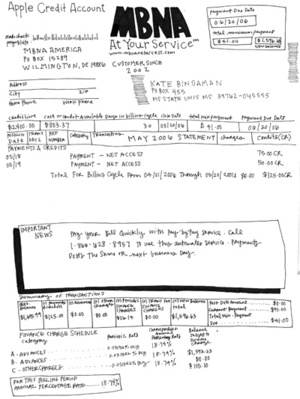
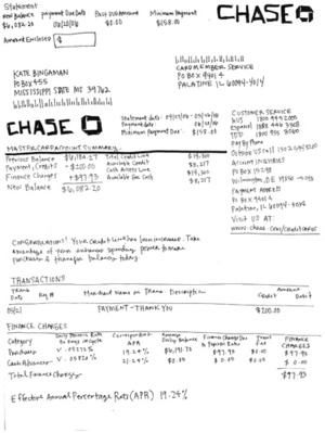
Kate Bingaman runs a beautiful site called Obsessive Consumption which started as a way for her to document (usually in beautiful illustrations) everything she bought. 
The drawings are lovely, really nice. Now she's hand drawing all of her credit card statements until they are paid off.
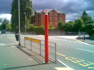
Which sounds like a good thing to add to this list and may possibly be an entrant into What The World Would Look Like If It Was Run By Graphic Designers because Kate is Assistant Professor of Graphic Design at Mississippi State University.
That's interesting because it's one year on from Katrina and MSU is taking an active role in the rebuilding of New Orleans. All this thanks to your friendly accountant blogger Graham Salmon.
There you go - five great links in one post.
Posted at 20:34 in Seen and heard | Permalink | Comments (0) | TrackBack (0)
Tags: drawings, drawn by hand, illustration, Obsessive Consumption
Lamp Posts
Posted at 11:26 in What The World Would Look Like If It Was Run By Graphic Designers | Permalink | Comments (4) | TrackBack (0)
Aug 29, 2006
Fake tube station
Viacom have set up a fake tube station to show off their ad sites.
I must see that. How can I get a visit? Can anyone help?
Posted at 12:42 in New Thinking and Ideas | Permalink | Comments (2) | TrackBack (0)
Tags: tube ads, viacom
Smile on departure
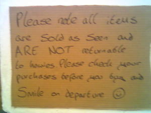
This is nice. I saw this a while ago at one of those sample sale things (I hate those, but a mate of mine dragged me along). The sample sale was for Howies and on the way out they'd stuck up this little sign.
In this world where we're all talking about "living the brand" it's nice to see some people (I mean employees I s'pose) really living the brand.
Just a nice thing, that's all. Move along.
Posted at 11:38 in Seen and heard | Permalink | Comments (0) | TrackBack (0)
GR2 Sticky Show
I've no idea what this about, but it looks bloody marvelous.
Picture taken from Color Deficient with huge thanks, usual stuff applies
Via Jon from, well I'm not really sure where you're from Jon. Jon?
Posted at 11:09 in Seen and heard | Permalink | Comments (3) | TrackBack (0)
Tags: GR2, post it notes
Aug 27, 2006
What is Kinja?
Does anyone know what Kinja is? Does anyone use it?
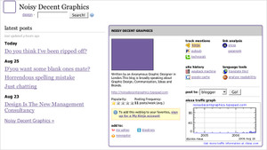
This morning I stumbled across the Noisy Decent Graphics Kinja Card. It seems like a public, ziki or something? It's got a collection of recent feeds, some related links and some mildly useful traffic info. Apparently I write 11 posts a week. I might look at it regularly.
Posted at 21:17 in Stuff I'm Reading | Permalink | Comments (1) | TrackBack (0)
Tags: do these tags work?, kinja
My Photo Usage Policy
I thought it was about time I clarified a few things, especially in this world of IP issues and the challenges the digital era presents. I also ought to be an advocate for best practice in this area. If you see what I mean.
1. Wherever possible I will try and use my own images.
Stuff that I've taken with my camera, or stuff I've created in Photoshop or similar. You are free to use these images, but please drop me a line and please give me a little link in return. Thanks.
2. Sometimes, I might use an image from Flickr.
Like this post where I'd driven past the Unicorn Theatre but not had enough time to get a decent photo. If I do use a photo, I'll credit the photographer and provide a link back. If for any reason you don't want me to use your pictures drop me a line and I'll take it down.
I realise that's not perfect, or comprehensive, but I hope it's sufficient for a blog in the 2.0 world. And no, that's not me in the picture.
Posted at 20:05 in My Photo Usage Policy | Permalink | Comments (6) | TrackBack (0)
Tags: ip, photo policy
Do you think I’ve been ripped off?
I wrote this post (What makes a good viral?) back in June. Compare that with this (5 Secrets to a Good Viral Campaign) on the Digital Conversations website, posted 25th July.
Me: Virals need to be funny, rude or useful. Very funny, very rude or very useful. Web 2.0 useful.
Them: Good virals are funny or rude. Sometimes both. Once in a while, they’re just incredibly useful.
Me: Funny - remember that being funny is very, very difficult. Ricky Gervais is funny and Steve Coogan is not. Disagree with me? Agree with me? Then you understand the problem
Them: Funny. This is harder than it sounds. Funny means something different to everyone. Think Dave Chappelle. Now think Dennis Miller. Chances are if you think Dave is funny, you don’t laugh as hard at Dennis. And vice versa. See the challenge?
Me: A viral is not a video that gets emailed round. A true viral campaign is an idea that has a life of its own and spreads in the same way a virus does, prolifically and exponentially.
Them: A good viral is more than a video with a tell-a-friend button. A true viral campaign is an idea that has a life of its own – gaining momentum the same way a virus does.
If you search for “good virals” on Google, my post comes up top. Maybe this explains it. What do you reckon, have I been ripped off? (I'm flattered by the way.)
Posted at 15:01 in Complaints Dept. | Permalink | Comments (1) | TrackBack (0)
Tags: viral, viral campaigns
Aug 25, 2006
D'you want some blank ones mate?
Here’s something that’s always really badly designed.
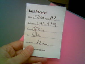
If you work and especially if you run you’re own thing or you’re quite senior you’ll be overly familiar with the London Taxi Receipt. I always have hundreds of the damn things. What’s wrong with it? They are not designed to contain any of the information I really need. Have a look at one.
What information do I need? I need ‘date’, tick. I need ‘fare’, tick. I definitely don’t need call sign! What I need is the date, the amount, a from and to bit and somewhere to write a job number or a project reference or a client name. Everyone needs that don’t they? Surely the only people who need taxi receipts are people that are travelling for business and those receipts will have to be matched up to a client account somewhere one day. I always write job numbers on mine, and I’m sure accounts and procurement people in agencies up and down the land do the same.
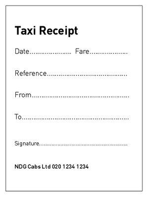
Now obviously we can’t design a taxi receipt just for me, but I think we can reach a consensus. Good design is about using concise information to communicate complicated messages. What do you think to this?
And here’s how I imagine it being filled in.
That’s better isn’t it? You lot use receipts, so what do you think?
Posted at 12:24 in Graphic Design Reviews , New Thinking and Ideas | Permalink | Comments (6) | TrackBack (0)
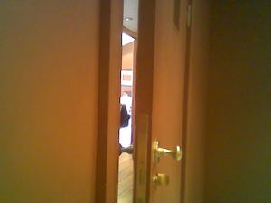
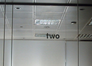
The view from inside the meeting room
Posted at 12:08 in Seen and heard | Permalink | Comments (0) | TrackBack (0)
Horrendous spelling mistake
Posted at 11:30 in Complaints Dept. | Permalink | Comments (0) | TrackBack (0)
Just chatting
Had a long night out with a friend of mine from college yesterday. He works for Poulters in Leeds.
Topics of discussion.
How great this Coke ad is.
How all the people we thought would do well after college all have non design/advertising type jobs. (How easy it is to track people down via Google, Flickr, Youtube etc).
How design is seen as just a process in most ad agencies.
How a D&AD pencil still means so much to creatives.
What was our proudest achievement of the last five years.
How ideas have to be robust enough to work across all media, from TV to a beer mat. And how ideas matter.
Posted at 11:14 in Graphic Design Industry Stuff | Permalink | Comments (0) | TrackBack (0)
Aug 23, 2006
Design Is The New Management Consultancy
This is something I've been thinking about for a while. I've been discussing it with a few people including Russell, who deserves equal credit for spotting this trend and for helping me formulate this post.
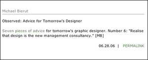
I think I first mentioned Design Is The New Management Consultancy in my post about The Future Of Graphic Design. It seemed to strike a chord with most of you and was picked up by Michael Bierut on Design Observer.
(By the way Design Observer has got a lot, lot better since that redesign).
I keep reading things that elude to this theory, but nothing that's explicitly concentrated on it. So here goes. Deep breath.
Why is Design Is The New Management Consultancy?
Because true design thinking means that design is a verb and not a noun. It's a better way of thinking and not a production process that's applied at the end of a project.
Design is so much more valuable when it's brought in at the start of a project or the start of a problem. As Clive Grinyer (director of Orange's Design & Usability Innovation team) says in his current RSA Journal article, "Design is habitually brought in too late, used simply to paint and decorate products for which the major decisions have already been made. Thus we have products that are easy to build, designed by technically minded people, but that are not desirable or usable."
How is Design The New Management Consultancy?
Think back to the 50's. If you were bright, intelligent, had a slight eye for the unusual and wanted to earn decent money you went to work for an ad agency. The CDP's of this world. Nowadays you work for one of the big consulting companies, PwC, KPMG, Deloitte or Accenture. Discard your prejudice management consultants and what this means that these places are full of bright, entrepreneurial thinkers. Think about it. When Tony Blair wants to "reform" something his first thought is to call in one of the big four. It's the same with most of the PLC's in Britain. I'm not proposing that Tony Blair rings Interbrand and asks them how to reform the NHS, but what I am saying is that designers are natural problem solvers and a new type of design (and designer) is emerging from the dark days of DTP.
Post DTP and post Brand (as Trade Marked by Wolff Olins) designers have turned to innovation and strategy as a new revenue stream. Some design firms are brilliant at this, IDEO and Imagination spring to mind, whereas some are bad like Interbrand and pretty much every packaging design firm.
A good designer / client relationship will already have an element of Design Is The New Management Consultancy, they just won't know call it that. I'm talking about those moments when a design company suggests things that don't involve a specific below the line outcome. For example we were recently asked how to increase attendance at some employee feedback events. We suggested holding them at 4pm instead of 5.30pm so that employees felt they were getting some extra 'time off'. Really simple and it worked well. This is a small example of what I'm talking about.
Here's another, much more brilliant, one. I posted this a while ago but it's worth revisiting.
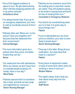
John Sorrell (who founded Newell & Sorrell) runs a thing called the Sorrell Foundation. They worked on a project called Joined Up Design For Schools and now they're working on one called Joined Up Design For Health. Take a look at some of their initial research.
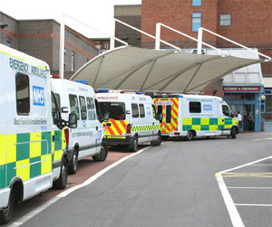
An ambulance driver said, "One of the biggest problems is space to turn. We get obstructed by other vehicles dropping patients off, or by police vehicles." So a designer in his role as management consultant could design a bigger turning area, the ambulances wouldn't get obstructed and lives might be saved. Sure, anyone could have made that suggestion after talking to that driver, but what I'm saying is that a designer is much more likely to think like that than an Accenture employee.
It's really hard to write this post as I see so many examples of this but they're all really hard to collate. I'll start a new category and try and add them as I go along. Here's another one.
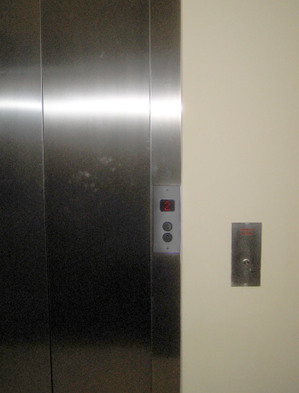
I stayed in this hotel last week, here's a picture of the lift.
The button on the far right is actually the 'emergency alarm' button, although in real life it looks very much like the 'call lift' button. I almost set the alarm off every time I went in the lift and I'm sure it must have been set off loads of times before. This kind of stuff will be affecting their business and yet good design and good usability could solve the problem.
Here's another slightly obscure example. We worked on a project once with a massive catering firm. The managing director of this firm was a dynamic, inspiring lady whose proudest moment was that she'd changed the recipe for sausages in the Little Chef and managed to shave 1p off the cost of the sausage. This saved Little Chef millions and millions of pounds every year, and she reckoned the sasuages tasted better too. That's not design related, but can you see how designers could contribute in a similar way? By changing the way customers move around a supermarket or by changing the way the door of the AA van opens or by making more space for the ambulances to turn around.
Here's another example. Wayne Hemingway famously acted as design consultant for the Straiths South Bank housing development in Gateshead. A bold move by the developers. If you every hear Wayne talk (and boy he can talk) he gets really animated about this project. One of the things they wanted to do was to bring back the idea of communities, neighbours that actually know each other. Yeah, yeah, yeah, you'll be thinking, every house builder says that. Wayne (a designer by the way) identified that one of the big problems was that parents were afraid to let their kids play outside because they couldn't see them from their lounge windows. The reason they couldn't see them from their lounge windows was because their cars were packed right outside their house. The reason their cars were parked outside their houses was because they were worried about them getting nicked.
George Wimpey had discovered that if they built homes where you couldn't see the car from the window people were less inclined to buy. Really. All subliminal stuff that people would never mention in a focus group, but true none the less. So, driveways in front of houses meant no gardens and therefore nowhere for kids to play where parents could easily keep an eye on them, therefore kids played inside or in the back garden, which meant less social interaction (if you've got kids you'll know what a brilliant conversation opener they are) and no community.
Solution? They designed homes with a garden right outside the front windows. Cars were put in a secure underground car park under the estate, so parents could stop worrying about their cars and keep an eye on the kids. I might be a little bit wrong on this bit because I'm trying to remember a talk from a few years ago, but you get the point.
That sounds so simple, doesn't it?
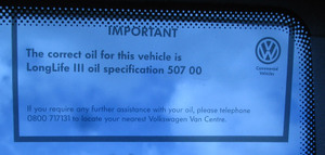
Here's yet another one. I was in a van the other day. A Volkswagen van. In the top corner of the windscreen, drivers side, they had a little sticker that told you what oil the van took.
Isn't that a brilliant idea? They ought to put more useful info on there, like tyre pressures (I always forget tyre pressures) and service intervals and stuff.
Am I making sense? There are already designers doing all this and there are already people talking about this kind of thing. I think this is going to be huge in the coming years and the good designers, the successful designers will have to start thinking like this.
What does everyone else think?
Posted at 21:57 in Design Is The New Management Consultancy, Graphic Design Industry Stuff, New Thinking and Ideas | Permalink | Comments (12) | TrackBack (1)
Tags: design, design is the new management consultancy, thinking
How To Get Your First Job In Advertising by David Trott
Posted at 11:37 in How To Get A Job In Graphic Design (Kind Of) | Permalink | Comments (1) | TrackBack (0)
Tags: jobs, portfolios
The view from meeting room three at WCRS
Posted at 11:00 in Graphic Design Consultancies / Creative Companies, Seen and heard | Permalink | Comments (0) | TrackBack (0)
Tags: wcrs
Aug 22, 2006
A funny sort of client relationship
At the end of our street is the best sandwich shop in London (according to me). It's run by Lou who makes a mean sandwich, is a Portuguese football expert, likes a drink and falls about laughing if I ever have a hangover. We went out for a beer once. A truly hilarious night.
Lou has sold his share of the business to his partner and he's moving to Kennington to open another sandwich shop. More of a deli, he tells me.
A few years ago Lou needed a new menu sign. We happily obliged in return for food. Lou kept us in fry ups for weeks. Then last year we persuaded Lou to put his prices up (he's still too cheap in my opinion) and we did him another sign. More free sandwiches.
So when Lou told me he was moving he asked if we would design him a new sign. He'll be needing two this time, one big and one small. Once again we're more than happy to help.
Posted at 21:15 in Graphic Design Industry Stuff | Permalink | Comments (1) | TrackBack (0)
"You do not mix type faces. It's stupid. That is mannerism, trendy stuff, doing it because someone else is doing it. The only reason to do it."
Paul Rand. A legend.
Posted at 10:30 in Quotes, Typography | Permalink | Comments (3) | TrackBack (0)
Tags: paul rand, type faces, typography
Bad, bad, bad logo
Posted at 10:00 in Complaints Dept., Examples of Bad Communication, Graphic Design Reviews , Typography | Permalink | Comments (5) | TrackBack (0)
Recent Posts
- Years in the domain, like tears in the rain
- Printing is still too hard
- No innovation until everything works
- "They'll be dancing in the streets of Total Network Solutions this evening"
- It was a pleasure
- Public Digital has won a King’s Award for Enterprise in International Trade
- Kids describing fashion ads
- Art at Mount St Restaurant
- Post match squeeze
- Unbelievably tickets are still available






Recent Comments